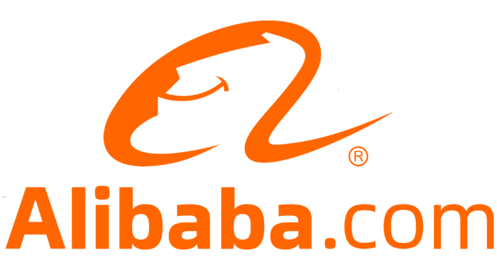
The Alibaba logo has nothing to do with the fairy tale, despite the mention of the fairy-tale image in the marketplace’s name. The company is engaged in online sales of various things, so it takes a business-like approach to visual identity. And for marketing, the most important thing is a legible inscription with the store’s name.
Alibaba: Brand overview
| Founded: | 28 June 1999 |
| Founder: | Jack Ma |
| Headquarters: | Hangzhou, Zhejiang, China |
| Website: | alibabagroup.com |
Meaning and History
The huge organization owes its origin to the Chinese students and acquaintances of Jack Ma, an English teacher. They organized an Internet platform Alibaba.com, where small and medium-sized enterprises could sell their goods. Legally the service was registered in the Cayman Islands, but it was present in China and operated from the founder’s apartment in Hangzhou.
In 1999, the new commercial structure that had established itself in the virtual world received two major investments. It was these that helped it become a serious competitor. The first large profits came already three years later, confirming the company’s determination to become a participant in global trade. And for a long time, it worked at a loss – to attract users en masse and eliminate competitors. This was the case with the American site eBay, which intended to dominate the Chinese segment through Taobao, a subsidiary of Alibaba. However, it had to curtail its activities.
Gradually the area of interest of the corporation increased, covering various directions. In addition to commercial activities, it engaged in other projects, implementing them through its brands and subsidiaries. Now it is a giant in the Asian economy, which has a huge impact on all world trade. When it opened the divisions, it still wanted to keep its identity, so it almost did not modernize the logo. The symbol exists in approximately the same form as it appeared in 1999.
What is Alibaba?
Alibaba is a Chinese corporation that owns several subsidiaries of wide renown, including the virtual shopping service AliExpress. It was formed in 1999 by a group of people headed by English teacher Jack Ma. The location of its headquarters is in the city of Hangzhou in Zhejiang province.
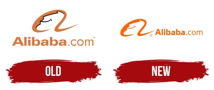
Old
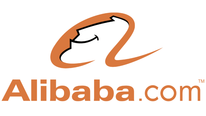
Despite the criticism that has poured in from many designers, the logo of Alibaba has proved its viability. One, it’s versatile. Two, it’s practical. Three, it’s memorable. It depicts a lowercase “a” the inner space of which is made in the form of a human face.
And, according to the idea, it is the face of a satisfied customer. He’s smiling broadly, even though he’s positioned in profile. This can be seen in the long arc, which imitates a closed lip and the horizontal line at its end. In addition, a strong-willed chin, a straight nose, and upward bangs are visible within the letter. They are outlined in black on a beige background. Below is the name of the marketplace with the domain name, Alibaba.com. Both fragments have their style: the first part is typed in bold, the second in thin.
New
The modern version of the logo can be confidently called old because virtually nothing has changed. Well, except for a few small details. For instance, the black outline of the face disappeared, the beige color was replaced by orange, and one of the fonts was corrected. And another thing: the icon with the lowercase letter “a,” which conveys the name of the Alibaba corporation, is now placed in front of the text instead of above it.
The Chinese company takes its visual identity, like its work, incredibly seriously. It does not try to adapt it to the existing market but pulls users to itself – not only buyers but also sellers. This is how the corporation demonstrates reliability, emphasizing that it has come to the global market for good.
The first time the logo was dominated by a beige and orange palette, a friendly orange shade of the warm spectrum came. The name of the corporation is an inseparable part of its logo. This name was given to it in honor of the main character of the cycle of oriental fairy tales, One Thousand and One Nights, whose name was Ali Baba. This idea came to Jack Ma in a cafe in San Francisco and seemed to him just great because the whole world knows this character. And the word is easy to pronounce and even easier to remember.
Font and Colors
The emblem of Alibaba combines two types of typefaces. One of them is the Univers Com 740 Extended Heavy from the Linotype family. It’s a modified version of the original, introduced almost 80 years ago by Adrian Frutiger. The second version is the Pluto Sans Regular. It appeared in 2012 and was designed by Hannes von Döhren. Despite the architecture of Pluto, this font is very readable, even at a small size. Thanks to the increased distance between the central line and the baseline of the lowercase characters.
The transition of the logo to a pure orange color was undertaken to inspire confidence among buyers and sellers. After all, this is the shade present on life vests and is visible even at dusk. According to Alibaba’s management, it is perfect for its emblem because it belongs to the warm spectrum.
Alibaba color codes
| Orange | Hex color: | #ff6600 |
|---|---|---|
| RGB: | 255 102 0 | |
| CMYK: | 0 60 100 0 | |
| Pantone: | PMS Bright Orange C |
