The SAIC Motor logo is modern and light. It speaks of development and the pursuit of dreams. The emblem encrypts the environmentally friendly technology of the future that the company is focused on.
SAIC Motor: Brand overview
| Founded: | 1955 |
| Headquarters: | Anting, Shanghai, China |
| Website: | saicmotor.com |
SAIC Motor is a Chinese automobile company with revenues of $113 billion, founded in 1955 as Shanghai City Power Machinery Manufacturing Company. During its existence, the company has had four name changes. SAIC produces every fourth car bought in the country. The corporation includes 50 companies, which employ 148 thousand of people. It belongs to the State Property Committee of SASAC.
Meaning and History
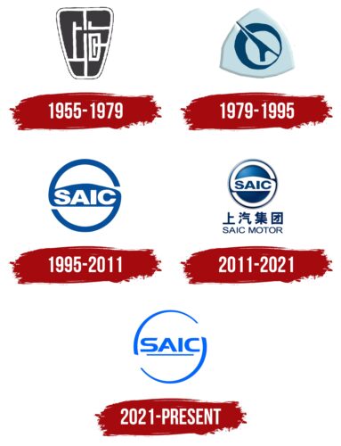
The company logo changes as the names change, demonstrating the corporation’s development and increased sales. The gradual appearance of English words emphasizes the focus on the international market. The main symbol of the giant is the steering wheel, which is present in most signs. It indicates the management of the future and the movement toward goals.
What is SAIC Motor?
A Chinese manufacturer of cars, trucks, buses, farm machinery, and motorcycles. In the list of the largest companies, Forbes ranked 204th. Has joint ventures with Volkswagen, General Motors, and Liuzhou Wuling.
1955 – 1979
The emblem reflects the first postwar steps in the development of the automobile industry. The Shanghai City Power Machinery Manufacturing Company was just formed after the merger of its two predecessors. The logo’s shape resembles a car mirror, which immediately indicates the direction in which the corporation is working.
Inside on a dark black background, are white lines that create a labyrinth. They are reminiscent of:
- Roads.
- Marking strips.
- Microchips.
The lane system represents engineering and technology, transportation, and travel.
1979 – 1995
In 1969, the corporation changed its name to Shanghai City Tractor & Automotive Industry Company. The new logo has a completely different concept.
The logo consists of a triangular base with convex sides and looks like a petal. Inside on a light blue background, is a blue circle with a white circle inscribed in it and a design piercing them, resembling:
- Rocket. The ship soars upward into space against the backdrop of the moon. The image tells of the heyday, foreshadowing deals with European and American companies for expansion across the globe (in 1982, the first agreement with Volkswagen was created).
- The car’s windshield wipers. The wipers work and leave behind a clean white glass: the composition – a prototype of the road to a bright future and new perspectives.
The blue background demonstrates lightness, spring, progress, and prosperity. It predicts the corporation’s immortality.
1995 – 2011
The company changed its name to Shanghai Automotive Industry Corporation. Therefore, the logo uses the acronym SAIC for the first time. The emblem acquires a well-established appearance, which is retained throughout the following years with minor changes.
The new sign represents a circle. The figure is a prototype of harmony, self-sufficiency, and a closed cycle. After 1995, the corporation established a system of producing spare parts, which no longer needed to buy abroad, getting the full production cycle.
Inside the circle, in large letters on a special backing, is written the corporation’s new name. The capital letters and solidity indicate a rapid increase in productivity. The number of cars coming off the assembly line reaches 300-500 thousand per year, which makes the company the leading Chinese manufacturer.
The emblem resembles the car’s steering wheel, indicating the main products. Small gaps in the circle above and below the inscription create a stylized S from the emblem, emphasizing the first letter of the acronym. Shanghai is the location of the corporation’s headquarters and the name of the leading car brand of the same name.
2011 – 2021
The corporation changed its name to the modern SAIC Motor Corporation Limited and got a single logo, which uses a transcription of the name below the image in English and Chinese.
The emblem of the previous period is slightly transformed. The stylized S that creates the car steering wheel becomes white, and a blue volumetric background appears inside. The transformation makes the image look like a klaxon button.
The words SAIC Motor and the characters below the image are in a thin blue font. The saturated color demonstrates the energy and vitality that the company is gaining (the corporation has developed so much that it sells 5.6 million cars annually).
2021 – today
The image of the logo became more refined and modern. Chinese characters were removed from the badge, as the company is focused on the world market. It is the leading export company in the country.
The circle, which symbolizes the steering wheel or wheel, comprises two unbroken lines. The breaks show the willingness to go beyond the usual limits, the desire to spread, and the use of new technologies.
The name is inscribed inside the circle in thin, elegant letters and underlined with a light line. The composition replaces the stripe on the steering wheel of the car.
The emblem has completely lost the massiveness of past signs, demonstrating that it takes only useful ideas into the future, updated to create machines of another level. Light colors reveal the corporation’s course towards electric cars that do not pollute the environment. Already, more than 300,000 such cars a year are coming out.
Font and Colors
The main color of the logo is blue. In China, it is a symbol of spring, the sky, bloom, and life. It predicts economic prosperity, new perspectives, and the rise of sales and production to the sky.
The font of the inscription is unique, similar to Handel Gothic Regular. The letter A has an open glyph that speaks of the company’s openness to change, while the S and C have slanted ends as a movement prototype. The lettering conveys that the corporation is not frozen and continues constant transformation.
SAIC Motor color codes
| Bluetiful | Hex color: | #0166fe |
|---|---|---|
| RGB: | 1 102 254 | |
| CMYK: | 100 60 0 0 | |
| Pantone: | PMS 2728 C |
