The company offers a full range of services related to mechanical engineering—this is the main message of the emblem. The General Motors logo is an example of minimalism and completeness. Its lines and symbols leave the impression of a self-contained and harmonious structure.
General Motors: Brand overview
Meaning and History
In the 1900s, entrepreneur William Durant owned a Durant-Dort Carriage company, which made horse-drawn transport and was a leader in its industry. She was in Flint, Michigan. In 1904, James H. Whiting, the Flint Wagon Works owner, sold him the Buick Motor Company. Then, the new owner enlisted Charles Stewart Mott, his business partner, and four years later opened the General Motors Company holding company. He had previously agreed on the name with General Electric.
The company’s first acquisition was Buick. It then bought out Oakland (the predecessor of Pontiac) and the brands Elmore, Cadillac Reliance Motor Truck, and Rapid Motor Vehicle (GMC’s predecessor). A year later, an attempt was made to get hold of the Ford Motor Company. For the transactions, the head of GM took out loans from banks, which succumbed to the panic of 1910-1911 and demanded that Durant be removed from office because, according to bankers, the company was too young and could not cope with the repayment of loans. The Board of Directors followed her instructions.
William Crapo returned to the automotive industry, founding Chevrolet Motor Company with Swedish race car driver Louis Chevrolet. Since 1915, he managed it himself, and in 1916, GM re-registered the General Motors Corporation. A year later, the founder of the Chevrolet Motor Company, which quickly became successful, acquired its controlling stake. In the spring of 1918, he merged the two firms, leaving the name GM. However, two years later, Pierre S. du Pont, who had supported the General Motors purchase, deposed Durant and replaced him with Alfred P. Sloan.
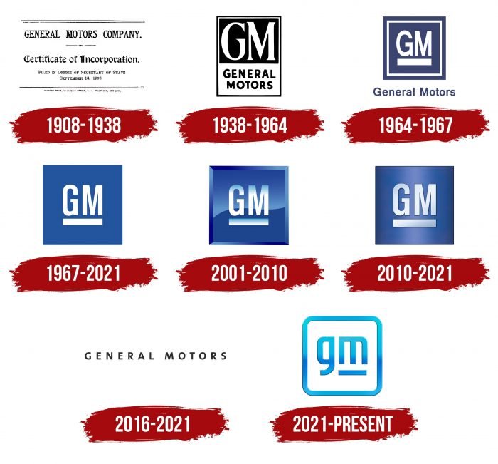
The new leader introduced a rule to change the style of cars every year and used the latest pricing strategy, ranking all models according to a cost grid. That is, they ungrouped the expensive and inexpensive series. His policies led to the company’s heyday, which, from 1931 to 2007, occupied more than 50 percent of the United States car market and was the largest manufacturer. Naturally, each step of the organization was reflected in its identity, which changed seven times.
What is General Motors?
It is the largest American carmaker with well-known brands such as Cadillac, GMC, Buick, and Chevrolet.
1908 – 1938
The corporate logo was simple in the early years and looked more like an information plate than a graphic emblem. It contained the main information: name, foundation year, registration date, and more. It was black lettering on a white background.
1938 – 1964
In 1938, the car manufacturer got a real logo. It was a vertical two-color rectangle that was divided into two parts. Above was the designation “GM” – an abbreviation for the full name of the enterprise. The letters were large, elegant, and serif. They were painted light gray in contrast to the black background. On the contrary, the lower zone was light, and in two lines, there was detailed decoding of the name – “General Motors.” This inscription was made in a more modern font – smooth, bold, grotesque.
1964 – 1967
In the second logo, the designers focused on the abbreviated version of the name and moved the expanded name outside the icon. The letters “GM” were in the center of a square with a double border of alternating white and blue stripes. The developers changed the font of the acronym: they removed the serifs and added a “G” curly element at the bottom.
1967 – 2021
The following emblem has been in use for a very long time. It was as simple as possible since the authors removed almost all elements. All that’s left is the abbreviation and the white rectangle below it on a blue background. The designers also removed the edging of the square. Only the colors have survived – blue and white.
2001 – 2010
At the same time, another logo was introduced – a glossy analog of the sign, which has been used since 1967. It had a three-dimensional frame that resembled a ledge with edges. In the center, against the background of “GM,” there was a horizontal wave, dividing the emblem in two. Both the letters and the background had a gradient.
2010 – 2021
In 2010, the developers added a metallic shade to the sign, enhancing the 3D effect. The rearrangement of shadows and highlights gave the logo volume. The color was softened, but the gradient remained (both on the letters and the square).
2016 – 2021
The automaker has approved a new lettering style. The company name was written in a wide-spacing sans-serif typeface, and all characters were in uppercase. This option was mainly used on the official website, while the branded square with the abbreviation was flaunted on the machines.
2021 – today
For the first time since 1964, General Motors undertook a major logo redesign, focusing on sustainability and the latest technology. With its sign, the company emphasized its focus on producing electric vehicles. The updated version moves the abbreviated name to lowercase, placing it in a square box with rounded corners.
Such a soft design with a blue and white palette emphasizes the desire to protect the sky, air, and clouds. Especially for this, the developers have depicted the letter “m” as an electrical cord plug. The stroke at the bottom of the letters also has a functional use: it is an impromptu socket. Located next to them, “g” has a shortened tail section, which looks harmonious in height.
General Motors: Interesting Facts
General Motors (GM), started by William C. Durant in 1908, is a major player in the global car industry, headquartered in Detroit, Michigan.
- Brand Variety: GM has managed several well-known brands, such as Chevrolet, Buick, GMC, Cadillac, and more. Although not all are still made, each brand has helped define GM.
- Safety Firsts: GM led in vehicle safety, conducting the first crash test in 1934 and introducing airbags in 1973, setting new standards for car safety.
- Early Electric Cars: In the 1990s, GM made the EV1, one of the first mass-produced electric cars. Despite its end and the following debates, it marked GM’s early steps into electric vehicles.
- World War II Contribution: GM supported the Allied forces in World War II, making military vehicles and equipment. President Roosevelt called it “the arsenal of democracy.”
- Worldwide Operations: GM operates in over 30 countries and sells cars in about 140 countries, showing its global reach.
- Sales Leadership: GM was the top global car seller for 77 years, from 1931 to 2007, showcasing its long-term industry dominance.
- Bankruptcy and Comeback: In 2009, GM filed for bankruptcy but came back stronger, focusing on making profitable, innovative, and electric vehicles. This period earned it the nickname “Government Motors.”
- Electric Future: GM plans to go all-electric, hoping to launch 30 new electric models by 2025 and cut emissions from new light-duty vehicles by 2035.
- Self-Driving Cars: GM is developing autonomous vehicles through Cruise Automation, showing its commitment to future car technologies.
- Cultural Impact: GM cars have appeared in movies, TV shows, and songs, making the brand a part of American culture and innovation.
GM’s story is one of pioneering, adapting, and pushing forward, reflecting its significant impact on the car industry and its direction for the future.
Font and Colors
General Motors has always used an abbreviated version of the name comprising the first letters. In each version of the logo, the abbreviation is central and has an underscore in the form of a miniature rectangle.
The main typeface for the text part is Gothic FB Cond Medium. To add visual stability, it is a sans-serif typeface with straight letters and a curly “G” at the bottom.
The color scheme is standard: at any time, it consisted of a combination of white and blue, the shades of which were repeatedly changed. An early version used black.
FAQ
What is the General Motors symbol?
The company logo has been changed. The most noticeable change is transforming the letter “M” into an element reminiscent of an electric plug, symbolizing the uniqueness of electric vehicles and new automotive technologies.
The new logo features a brighter blue sky color scheme. This modern and simple design is intended to resonate with a global audience. The logo change is part of the “Everybody In” marketing campaign, which promotes a new direction and line of electric vehicles.
What is General Motors known for?
The company is a major player in the global auto industry, known for owning and manufacturing Chevrolet, GMC, Cadillac, and Buick. Each brand targets different market segments and appeals to many customers.
Chevrolet offers a broad line of trucks, cars, and SUVs known for their reliability and value. GMC specializes in high-performance trucks and utility vehicles that combine reliability, comfort, and style. Cadillac is the company’s luxury brand, offering high-end sedans and SUVs with advanced features and sophisticated designs. Buick combines luxury with affordability, offering well-equipped vehicles that feel upscale without the premium price tag.
The company has been a dominant force in the automobile industry. In 2022, it was the largest automaker in the United States by sales and held the title of the world’s largest automaker for 77 years.
What is GM’s new logo?
The new logo features a lowercase “gm” in a square frame with rounded corners, symbolizing the brand’s accessibility and future readiness.
The underline now appears only below the “m,” creating a balanced and modern look. This emphasis can represent a path or road consistent with the brand’s automotive core and future direction. The logo uses a blue gradient from light to dark, creating a sense of dynamism and hinting at movement and progress, aligning with the company’s electric and autonomous vehicles goals.
Who designed the new General Motors logo?
The company created its new logo with the help of an in-house design team led by Sharon Gauci, executive director of industrial design.
Internal design development allowed the logo to capture the essence of the brand’s future goals, focusing on electrification and advanced technology. The design team considered the brand’s history and future, creating a logo that resonates with traditional customers and new markets. The new logo departs from traditional automotive branding and reflects a modern, accessible, and dynamic personality.
When did General Motors change its logo?
The company unveiled its latest logo redesign in 2021 alongside its new “It’s All In” marketing campaign. This change marks a shift in the brand’s journey toward an electrified future. The rebrand aims to reach a wider audience by making electric vehicles accessible to everyone, in line with the inclusive message of the “Everybody In” campaign. The new logo symbolizes an exciting new chapter in the company’s history.
