The aspiration for new horizons is the core concept conveyed by the emblem of this automotive company. Therefore, the Mazda logo carries a deep meaning while being concise externally. Its style precisely matches the characteristics of the company’s vehicles – quality, reliable, and forward-looking.
Mazda: Brand overview
The Japanese automotive brand Mazda is known worldwide, ranking among the top 15 largest auto giants. Annually, over one and a half million new vehicles are sold, and the company’s logo is recognized even by children, although it has often undergone radical changes.
Meaning and History
The company was founded in 1920 in Futo, a suburb of Hiroshima. Its founder, the son of a simple fisherman, Jujiro Matsuda, bought a factory to produce construction materials but decided to manufacture products for building traditional Japanese houses and engineering equipment. During this period, several motorcycles were produced at the factory, one of which became the winner of local races in 1930. In 1931, the first truck named Mazda appeared on the streets of Hiroshima.
The word Mazda has a dual meaning. It’s how Americans pronounced Matsuda’s surname, from whom he adopted knowledge in the field of automotive engineering. It’s also the name of Ahura Mazda, a deity of wisdom, harmony, and light, which is highly revered in Japan.
What is Mazda?
Mazda Motor Corporation is one of the largest car manufacturers, named after the Zoroastrian deity Ahura Mazda. This Japanese company emerged in 1920 and initially produced corks. Eleven years later, it started producing autorickshaws, and in the 1960s, it began developing the Wankel engine. Then, the company faced financial difficulties, leading to a partnership with Ford.
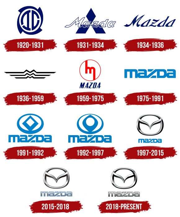
1920 – 1931
In the early years, when the plant produced only machine equipment, its emblem was a stylized image of a milling cutter and machine parts.
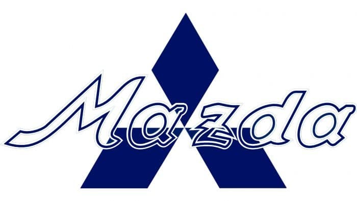
1931 – 1934
Then, in 1931, it was replaced by the well-known triangle with white and blue sectors, visually forming a star with three rays. The company’s name was written in italic script with transparent letters consisting only of a frame.
The first logo of a full-fledged automotive plant appeared in 1934.
1934 – 1936
The first emblem placed on the front radiator of a car was only the company’s name, written in elegant italic calligraphy in the Japanese style of writing – with thickened letters and pointed edges with small serifs – in dark blue.
1936 – 1959
The emblem created in 1936 underwent significant changes as it was based on the symbol of Hiroshima, resembling the flow of the river of the same name within the city. Designers took three such parallel lines, in the center of which the bends form the letter “M,” meaning the new name “Mazda Motor.” Visually, this logo resembled an aviation sign of that time.
1959 – 1975
The logo underwent radical changes again. 1959 was a landmark year for the company – the first Mazda passenger car was released. The emblem was a white circle in a thin red frame. In the center was a handwritten letter “m” in lowercase with stretched sides – the left upwards, the right downwards. The bright red letter attracted attention with its soft, soothing lines and unusual presentation. Below the circle was the name MAZDA, written in capital letters but at an angle. The color of the inscription was blue.
1975 – 1991
In 1975, the company’s owners decided to return to a simpler and more spacious logo – only the company’s name, but executed in an original minimalist and stylish font. It was custom-designed and had no analogs. This font was named “Mazda” and is still used today. Its features are:
- The low capital letters.
- The first letter “m” is in lowercase.
- The letter “z” has white diagonal stripes.
The color was light blue.
1991 – 1992
The company’s name was decided to be complemented with a symbolic badge. Initially, it was executed as a diamond inside an oval.
1992 – 1997
In 1992, the strict geometric shapes of the symbol softened, and the lines became smooth.
1997 – 2015
During this period, the current brand symbol was created, which is used today. The diamond-shaped sign was replaced with the English letter V (a symbol of victory), whose descending wings, together with the oval frame, form an M (the symbol of Mazda). This badge seems to fly into the future. The color of the badge was gray metallic with white, executed in 3D technology, which gives it three-dimensionality. Below it was the name Mazda in blue.
2015 – 2018
The logo underwent minor changes: the badge remained the same, but the name became larger and of a more gray shade, with emphasis on the upper part.
2018 – today
Changes again affected only the company’s name at the bottom of the logo: it became the same color and 3D image as the badge, raising the brand name to a higher level.
Experts recognize the modern emblem as flawless in design and one of the best in automotive symbolism.
Mazda: Interesting Facts
Mazda is a Japanese car company started in 1920 in Hiroshima by Jujiro Matsuda. Its name comes from a god named Ahura Mazda, who was about harmony and wisdom, and also from the founder’s name.
- Rotary Engine: Mazda made a special engine different from most other cars. This engine is smaller, lighter, and can produce much power. Cars like the RX-7 and RX-8 have these engines.
- First Vehicle: In 1931, Mazda’s first product was a three-wheeled truck. It helped people and goods move around more easily in Japan after the war.
- Racing Win: Mazda won a big race called the 24 Hours of Le Mans in 1991. It was the first time a Japanese company won, and they did it with a car that had a rotary engine.
- SkyActiv Technology: Mazda worked on making cars that use less fuel but are still fun to drive. This includes making better engines, transmissions, and the car’s body and frame.
- Design: Mazda’s cars are designed to look like they’re moving even when they’re not. They call this “KODO – Soul of Motion,” which is about capturing the beauty and energy of movement.
- Environment: Mazda wants to be good to the environment. They’re working on making cars that pollute less and are even making electric vehicles.
- The Miata/MX-5: Mazda started making this small sports car in 1989. It’s famous for being fun to drive and not too expensive.
- Ford Partnership: Mazda and Ford used to work closely together, which helped Mazda during tough times. They made some cars together, but now they work more independently.
- Safety: Mazda is focused on making cars safe. They have a lot of technology to help prevent accidents.
Mazda is known for making cars that are different and fun to drive. They’re always trying to develop new ideas and care a lot about making safe and good cars for the planet.
Font and Colors
The modern version of the logo consists of two main parts. The first is the letter “V,” a victory sign; the stylized letter “M,” conveying the name of the auto giant, and a symbol of the Hiroshima River, on which the eponymous city is located. This element was borrowed from the emblem of 1936. The second fragment is the oval, which appeared in 1991. Their combination allowed the creation of the most recognizable and successful emblem in the automotive industry.
The emblem’s design emphasizes Mazda’s transportation identity: the logo has a metallic sheen, which visually makes it three-dimensional. The 3D effect is enhanced thanks to shadows in the lower part of the letter “M,” whose legs harmoniously fit into the circle.
In early logos, the company’s name was written obliquely: the letters resembled a handwritten style. In 1975, the word “Mazda” took on a stricter form – it became thicker and squat. Since 2018, a corporate font based on the classic Optima font has been used.
The emblem’s color has never been bright: it includes dark blue, light blue, gray, black, and silver. They emphasize the strictness, restraint, and “metallic” character of the products. A unique combination of light and dark shades of gray creates a three-dimensional effect.
Mazda color codes
| Quick Silver | Hex color: | #9f9f9f |
|---|---|---|
| RGB: | 159 159 159 | |
| CMYK: | 0 0 0 38 | |
| Pantone: | PMS 422 C |
| Black | Hex color: | #000000 |
|---|---|---|
| RGB: | 0 0 0 | |
| CMYK: | 0 0 0 100 | |
| Pantone: | PMS Process Black C |
FAQ
What does the Mazda logo mean?
The Mazda logo has several meanings and looks like a serrated circle with two connecting lines inside. Firstly, its elements by shape resemble the letter M – the first letter of the brand’s name. Secondly, the central bands mimic the wings of a bird. They symbolize freedom, speed, and ascension to new peaks.
Why did Mazda change its logo?
In 2018, the automotive company changed not the entire logo but only part of it – the word “Mazda”- so that it matched the design of the round sign. As a result, the inscription became the same silver color and received similar dark outlines.


