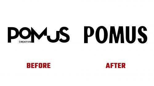
Pomus, a distinguished creative production studio, has introduced a fresh logo and brand identity to better reflect its film production and advertising specialization. Known for its expertise in live-action, stop-motion, and mixed-media productions, Pomus works closely with leading creative talents to develop unique narratives for various brands.
The studio’s previous logo, which aimed to project creativity, included elements like awkward cuts and odd proportions that didn’t quite succeed. The redesigned logo is more effective, featuring a variable wordmark that adapts to different entertainment genres. This flexibility allows the logo to morph into versions that accurately represent Sci-Fi, Comedy, Fantasy, Drama, and Action, each designed to capture the essence of its specific genre.
While the genre-specific logos are distinct and playful, they require captions to ensure clear recognition. The Action logo variation, for instance, might benefit from angled strokes to avoid resembling the visual style typical of the 1980s-90s comedy posters, which could enhance its appearance and dynamic feel.
The new logo utilizes a customized version of the Franklin Gothic typeface, adding unique touches that enhance the studio’s identity. This tailored typeface supports the logo’s versatility, ensuring it works well across different media while maintaining a unified appearance.
In terms of practical application, the updated branding continues to use condensed typography for movie poster credits, adhering to industry norms but with a colorful twist that enhances its appeal. This method preserves readability and enriches the visual experience, aligning with Pomus’s commitment to innovative storytelling.
One creative and unusual application of the new branding is using SD card mock-ups. This choice highlights Pomus’s innovative spirit and linkage to practical filmmaking elements, presenting a playful and technically relevant medium.
Additionally, Pomus has rolled out a custom typeface named Pranklin Pothic, a homage to famed typographer Morris Fuller Benton. This new typeface is vibrant, robust, and versatile, reflecting the studio’s flair for typography in its online presence and printed materials. Described as colorful, powerful, and fruitful, it embodies Pomus’s mission to engage, provoke thought, and make a lasting impression through its storytelling.
The revamped brand identity showcases Pomus’s role in entertainment, blending humor with professionalism. The new logo and custom typeface illustrate the studio’s ability to innovate while adhering to industry standards, enhancing its visual appeal and affirming its leadership in creative media production.


