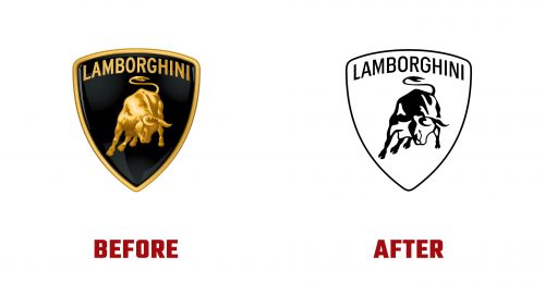
Automobili Lamborghini, the renowned Italian super sports car manufacturer, has recently updated its logo for the first time in twenty years. Located in Sant’Agata Bolognese, Italy, Lamborghini is celebrated for crafting some of the most coveted super sports cars globally. The new Lamborghini logo is part of an effort to modernize the brand while preserving its storied elements.
The new logo streamlines the previously intricate and gold-detailed bull into a single-color, flat design. This reflects a trend in corporate branding that favors minimalism. The design ensures that the bull maintains its original stance and proportions, keeping the brand’s legacy intact. This simpler design aims to be more adaptable and effective across digital and physical formats.
Alongside the updated logo, Lamborghini introduced a new custom typeface. This typeface contrasts the previous one, which had rich, elaborate features reflecting the brand’s luxury and performance. The new typeface features straight vertical lines on characters like “O” and “G,” giving it a more industrial and straightforward appearance, aligning with modern luxury branding trends emphasizing subtlety.
The typeface complements the angular lines in Lamborghini’s vehicle designs, especially in its uppercase, condensed form. This look is robust and dynamic, aligning with Lamborghini’s reputation for high performance and advanced technology. However, the wider, lighter, lowercase versions of this typeface may not convey the same level of luxury, potentially diluting the brand’s prestigious image.
The move to a flat design simplifies the logo and sparks a conversation about balancing modernity with tradition in luxury branding. While the new bull icon continues to honor the legacy of Lamborghini’s founder, Ferruccio Lamborghini, who had a passion for bullfighting and was a Taurus, it may lack the depth and luxurious feel of the previous, more detailed version. The richness of the old logo signified exclusivity, which might be perceived as lessened in the new design.
This branding update is part of Lamborghini’s strategy to remain relevant in a market where consumer preferences increasingly lean towards cleaner and more versatile visual identities. The design aims to be functional across various media, ensuring the brand stands out in a competitive environment.
The new logo and typeface have elicited mixed reactions from fans and branding experts. While some appreciate the contemporary style that aligns with current design trends, others believe it may not fully capture the distinct luxury traditionally associated with the Lamborghini brand.


