


![]() Lamborghini Logo PNG
Lamborghini Logo PNG
The Lamborghini logo conveys convenience, power, and a sense of belonging to the automotive elite. Only a brave toreador racer can cope with a car racing forward. The sign represents fast driving and fearlessness.
Lamborghini is a renowned manufacturer of the world’s fastest cars. It is the creator of the first legendary car, the Lamborghini 350 GT, a high-performance luxury car in the post-war period. Ferruccio Lamborghini, an industrialist and businessman, founded the most powerful production car at the time, which achieved overwhelming success in its first 10 years.
Lamborghini’s story in Italy’s Motor Valley began with Ferruccio Lamborghini, a successful tractor manufacturer. Dissatisfied with his Ferrari, he decided to start his own car company. After a heated discussion with Enzo Ferrari, Lamborghini aimed to reshape the sports car market.
The company started in 1963 in Sant’Agata Bolognese with the launch of the 350 GT and 400 GT. These cars were known for their superior craftsmanship and performance, paving the way for a new era in sports car history.
The arrival of the Lamborghini Miura in 1966 set a new standard as the first supercar. Its mid-engine layout influenced future designs.
The 1970s saw the introduction of the Lamborghini Countach, a supercar known for its sharp, angular design. Despite financial difficulties and ownership changes in the following decades, Lamborghini continued to innovate. Models like the Diablo and the Murcielago were developed, leading to a partnership with Audi AG in 1998. This partnership revitalized the brand and led to the launch of new models like the Gallardo, Aventador, and Huracan.
The 2010s brought technological advances with the Aventador and expanded Lamborghini’s range with the Urus, a super-SUV combining luxury and performance.
Today, Lamborghini symbolizes Italian craftsmanship and innovation, drawing car enthusiasts worldwide with its powerful performance and fascinating history.
Meaning and History
![]()
The European trade brand “Automobili Ferruccio Lamborghini SpA” was registered in 1963 in Italy. During the same period, the company’s logo was designed by the production company’s owner.
A three-sided shield with an angry bull’s image (in a non-classical pose) and its owner’s name above it immediately attracted attention. Some found similarities in the emblem’s shape and size to the closest competitor’s logo, “Ferrari.” Others were convinced that the bull is the astrological sign of the zodiac (Taurus) of Ferruccio Lamborghini himself.
The animal was associated with strength and unbridled power, which, in principle, corresponds to Lamborghini’s description. The company’s owner did not comment on this score.
What is Lamborghini?
Lamborghini is an Italian car manufacturer officially registered as Automobili Lamborghini SpA. It is owned by Audi AG, which, in turn, is part of the Volkswagen Group. The automotive brand is best known for its luxury sports cars and SUVs.
1953 – 1963
![]()
The logo of this period consisted of a triangle. But it was not just a geometric figure formed from three equal segments that connected three points – it also contained several internal lines. The stripes docked in the middle and exited exactly from the corners, dividing the space into three acute-angled, elongated triangles. Due to the visual-spatial effect, a pyramid was created. Each sector contained one capital letter. It was an abbreviation for the car company’s name: “Ferruccio Lamborghini Cento.” The symbols were thin and grotesque, with a slight slope.
1963 – 1972
![]()
From the company’s inception to the present, the Lamborghini logo has not changed, only slightly corrected.
At first, the logo was black and white, which was directly related to the limited production capabilities. The colorful and bright emblem could be seen only in printed publications. In them, the emblem’s background was red, and the bull was black.
A beautiful black outline of the shield, an additional logo, and a special handwritten inscription in black or silver looked very presentable and harmonious.
1972 – 1974
![]()
In 1972, the company logo was modified. The letters were enlarged so that the manufacturing company’s name consisted entirely of capital letters, set in Univers Black Oblique against a yellow rectangle.
The inscription was located directly inside the shield, above the bull’s image on a black background, which remained in the same position as before.
1974 – 1998
![]()
During its history, the Lamborghini company experienced several crises. One of them was the decline of the 1970s. Then, the company was declared bankrupt, after which the Mimran brothers bought it.
In 1987, Lamborghini passed into the hands of the American concern Chrysler. In this connection, the brand emblem is being modified; it now has a completely different outline. The brand logo becomes laconic. The sign is now in bold italics; each letter has clean outlines. The lettering resembles the Neue Helvetica Paneuropean 83 Extended Heavy Oblique font. This car sign was used for only seven years, during the period when an American company owned the Lamborghini brand.
In 1994, the original logo was restored.
1998 – 2024
![]()
In 1998, the shares were sold to Audi, the new owner. This entailed fundamental changes to the company’s principles. The innovations affected both the production process and the car’s design.
The management also decided to rebrand the logo. The work was entrusted to the German agency “KMS Team.”
The innovations aim to increase attention to ultra-modern cars and attract new customers to purchase super-fast cars. The shield’s proportions and the bull’s size were changed during the work. But, as before, the car sign embodies strength, grace, and power.
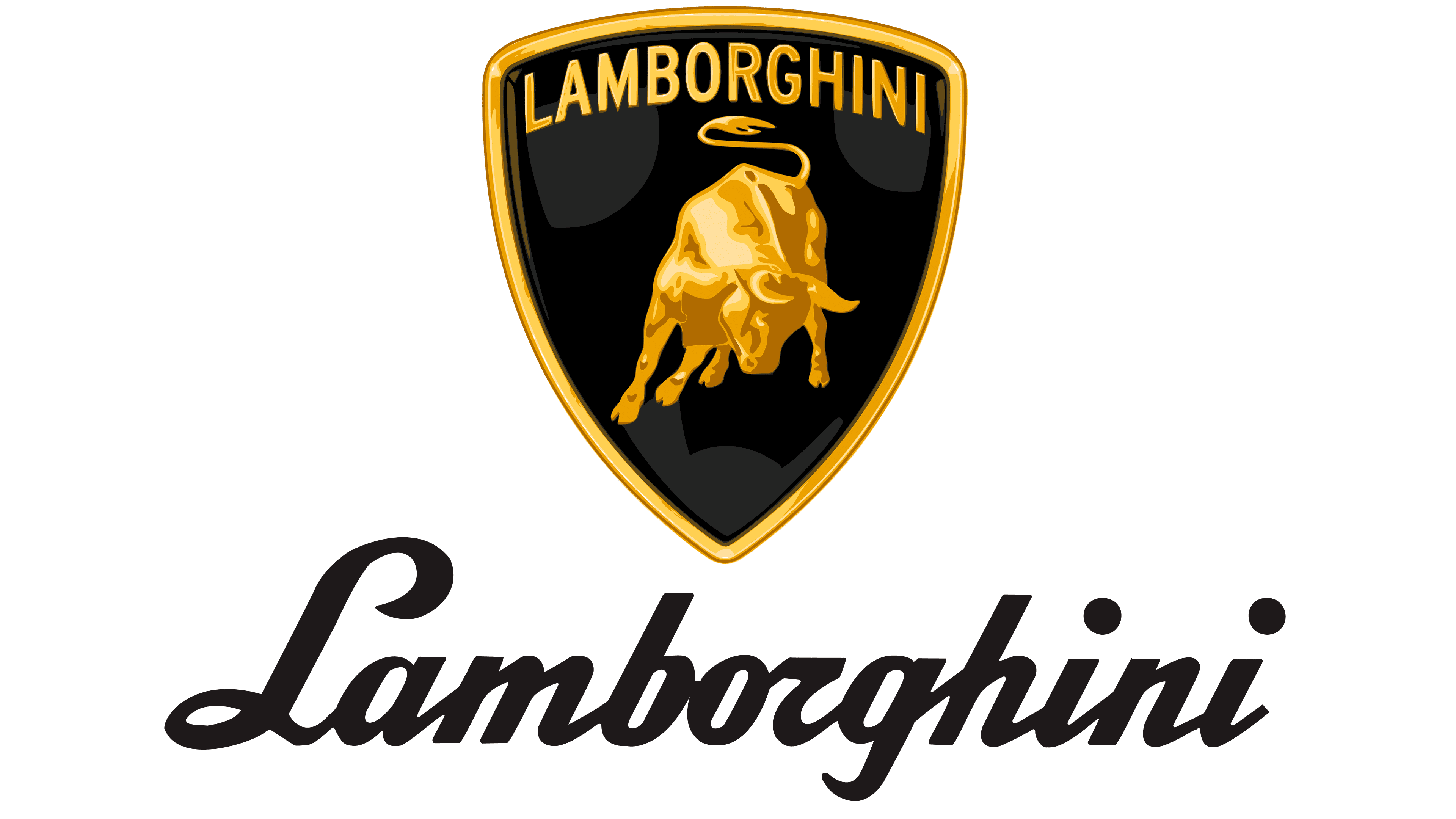
2024 – today
![]()
Automobili Lamborghini, the renowned Italian car manufacturer, has unveiled a refreshed logo, marking a significant evolution in the brand’s identity. This redesign, the first in over two decades, aligns with Lamborghini’s new strategy focused on sustainability and forward-thinking under the Direzione Cor Tauri program. The updated logo symbolizes Lamborghini’s dedication to pushing boundaries and reflects its core values of bravery, unexpectedness, and authenticity.
The new logo sports a cleaner, more modern look with a broader typeface for “Lamborghini,” emphasizing the brand’s strength and directness. It simplifies the traditional colors to black and white, symbolizing clarity and distinct identity while adding vibrancy with yellow accents and a new shade of gold. These colors underscore Lamborghini’s luxury and high standards.
In a notable change, the iconic bull has been separated from the traditional shield for digital use, enhancing its prominence and allowing it to stand on its own as a powerful symbol of the brand’s prowess and heritage. This modification highlights Lamborghini’s adaptation to the digital age, ensuring relevance in both traditional and digital realms.
The logo redesign is part of a broader transformation that includes a new official typeface inspired by the angular lines of Lamborghini cars. This typeface will be used across all corporate communications to reinforce brand style and consistency. Additionally, new icons were developed with Lamborghini Centro Stile to achieve a unified, contemporary look across all digital platforms.
This strategic redesign supports the goals of Lamborghini’s Direzione Cor Tauri program, with a focus on decarbonization and sustainability. The visual updates signify a public commitment to future generations, reflecting Lamborghini’s ambition to lead innovation and sustainable progress in the automotive industry.
With this refreshed logo, Automobili Lamborghini is redefining its visual identity and reinforcing its leadership in the luxury automotive sector. The new logo embodies bold innovation and a departure from the past, perfectly aligning with the brand’s “Driving Humans Beyond” mission and setting a new direction for the future of high-performance automobiles.
Font and Colors
As for the font, the Lamborghini brand’s lettermark is just one way to draw additional attention to cars capable of reaching speeds over 350 km/h. The creator pursued this goal, which focused on this special attention.
At different times, the inscription became more noticeable and expressive, then slightly smaller relative to the animal’s size on the logo. Everything depended on various factors, including the wishes of the company’s then-owners, who numbered at least eight since 1963.
Each color element of the car logo is symbolic. Black and gold are identified with reliability and aristocracy; these are classic colors that many people like.
The red in the original Lamborghini logo, often used in the manufacturer’s advertising campaigns, is directly associated with bullfighting, which Ferruccio Lamborghini was partial to. This is most likely the reason for the non-standard position of the animal in motion, similar to the movement of an angry animal on the field at the sight of a matador with the muleta.
By the way, it’s a coincidence, but the company has released more than one car, the names of which are correlated with the bullfight:
- Lamborghini Murcielago is a supercar produced from 2001 to 2010. The name of the car translates as “famous bull.”
- Miura Lamborghini, cars produced from 1966 to 1973; Lamborghini Islero (years of manufacture: 1968 – 1969); Lamborghini Bravo, a car that was not released into mass production due to the crisis; Lamborghini Urraco, a car produced by Lamborghini for nine years, from 1970 to 1979; and Lamborghini Jalpa, one of the modifications of earlier models, was a car produced from 1981 to 1988. Each name is nothing more than a variety of breeds of the most powerful and agile fighting bulls.
- Lamborghini Espada cars were produced in three different series from 1968 to 1978. The name translates from Spanish and means “matador’s sword.”
That is why many believe the animal’s location on the Lamborghini emblem accurately indicates each car’s elitist nature, regardless of when it was produced in the company’s history.
FAQ
Why is the Lamborghini logo a bull?
The Lamborghini logo, a raging bull, represents the interests and background of its founder, Ferruccio Lamborghini. He chose the bull, symbolizing his zodiac sign, Taurus, and his love for bullfighting. This choice reflects the brand’s powerful, robust vehicles.
Born under Taurus, Ferruccio saw qualities such as strength and determination reflected in his cars. The bull logo was meant to convey power and an unstoppable spirit.
Additionally, Ferruccio was captivated by Spanish bullfighting, a sport that symbolizes courage and artistry. He felt the powerful bulls in the arena resembled the performance of his sports cars. The logo features a Miura bull, known for its size and strength, linking to Lamborghini’s high-performance nature.
This blend of astrological elements and personal passions shaped Lamborghini’s identity. Names like Miura, Diablo, Murciélago, and Gallardo reflect this bullfighting theme, tying Ferruccio’s interests to his cars.
What is the meaning of the word Lamborghini?
The name “Lamborghini” is synonymous with luxury, performance, and Italian craftsmanship. It comes from Ferruccio Lamborghini, the founder of the company in 1963. Born in 1916, Ferruccio was initially successful in the agricultural sector, making tractors. He decided to build sports cars driven by a desire to offer a refined, powerful alternative to existing cars, especially those from Ferrari.
Naming his company after himself, Ferruccio followed a tradition among many Italian auto brands, such as Ferrari and Pagani, in which the founder’s surname became the brand name. This method links the founder’s reputation directly with the quality and identity of the vehicles.
What country owns Lamborghini?
Lamborghini, also known as Automobili Lamborghini S.p.A., is an Italian luxury sports car and SUV manufacturer based in Sant’Agata Bolognese. The brand is renowned for its high-performance vehicles and distinct Italian craftsmanship. While Lamborghini is distinctly Italian, its ownership is international.
Since the late 1990s, Lamborghini has been a part of Audi AG, a subsidiary of the Volkswagen Group. Audi acquired Lamborghini in 1998, providing the stability and resources needed to expand its model range, including the development of successful models such as the Gallardo and the Huracán.
Despite the German ownership, Lamborghini has preserved its Italian essence in design, engineering, and production, all carried out at its historic facility in Sant’Agata Bolognese. This fusion of Italian tradition with German precision has enabled Lamborghini to continue thriving as a leading manufacturer of stylish, high-performance sports cars and SUVs equipped with advanced technology.
What is the shape of the Lamborghini logo?
The Lamborghini logo, shaped like a shield, embodies strength, heritage, and protection, fitting for a brand known for high-performance sports cars. Using a shield in automotive logos suggests durability and reliability and recalls medieval heraldry associated with courage and prestige.
The logo’s bold black background highlights the enclosed elements, enhancing their visual impact. A striking gold border outlines the shield, adding a touch of luxury and reflecting Lamborghini’s high-end positioning in the market.
At the top of the shield, “Lamborghini” is displayed in all capital letters using a modern sans-serif font, emphasizing the brand’s contemporary style.
The logo centers on a stylized bull in mid-charge, depicted in gold, ready to leap forward, symbolizing dynamism and formidable strength. The gold color enhances the sense of luxury and high value. This bull represents the founder Ferruccio Lamborghini’s zodiac sign, Taurus, reinforcing themes of power and tenacity that are crucial to Lamborghini’s identity.
What was the original Lamborghini symbol?
The original Lamborghini symbol, introduced in 1953, was part of Ferruccio Lamborghini’s initial ventures before he established his luxury sports car brand. This emblem featured a pyramid shape composed of three interconnected triangles, each bearing one of the initials “F,” “L,” and “C,” representing Ferruccio Lamborghini’s full name and his hometown of Cento. This design was simpler and more geometric than later versions.
The pyramid and triangles symbolized stability and innovation, reflecting Lamborghini’s intent to push the boundaries of engineering and design. Using a modern sans-serif typeface for the initials emphasized clarity and forward thinking, which would continue to define the Lamborghini brand.
This logo was primarily used by Lamborghini Trattori, Lamborghini’s tractor-manufacturing business. As Ferruccio shifted focus to high-performance sports cars in the early 1960s, the logo evolved to better suit the new direction of the automotive business. This change led to the adoption of the now-familiar bull-and-shield logo, which connects with Ferruccio’s passion for Spanish bullfighting and his zodiac sign, Taurus.
What badge does a Lamborghini have?
The Lamborghini badge, featuring a distinctive bull symbol, stands out in the automotive world. It represents the brand’s identity, values, and Italian heritage. The badge is shaped like a shield and is commonly used in the auto industry to symbolize strength, tradition, and protection. At its center, a charging bull against a black background suggests power and aggression, reflecting Lamborghini’s bold, assertive, high-performance cars.
The choice of the bull relates to Ferruccio Lamborghini, the company’s founder, whose astrological sign was Taurus. This sign is known for its rugged strength and determination, qualities shared by Lamborghini cars. Ferruccio’s interest in Spanish bullfighting, which combines elegance and fierceness, also influences the design philosophy of his cars.
The badge’s black-and-gold color scheme enhances its elegance and luxury, with black representing sophistication and gold denoting success and high quality. These colors make the emblem visually striking on car hoods and marketing materials.
Beyond just the auto industry, the Lamborghini emblem has become a cultural icon, symbolizing a lifestyle and aspiration. It reflects the dreams of its admirers and showcases Lamborghini’s engineering prowess, known for speed, innovation, and technology.
The bull motif is consistent across all models, including the Aventador, Huracán, and Urus, reinforcing the Lamborghini brand identity with each new vehicle and maintaining the heritage associated with the name.
What are the colors of the Lamborghini logo?
The Lamborghini logo is iconic and striking, primarily featuring black and gold, colors that align with the brand’s identity and values. Recently, Lamborghini updated its color palette to reflect its evolving brand and mission.
Primary Colors:
- Black: The Lamborghini logo’s background is traditionally black, symbolizing sophistication, power, and elegance. It serves as a strong backdrop, enhancing the impact of the gold elements and evoking a sense of mystery and luxury.
- Gold: The bull and the border of the shield are rendered in gold, representing wealth, high quality, and achievement. Gold underscores Lamborghini’s luxury status and commitment to excellence.
Accent Colors:
- Yellow: Referred to as “Giallo Midas,” has been Lamborghini’s signature color and is used in its cars and marketing. It conveys energy, joy, and the thrill of driving, aligning with the brand’s focus on high-performance vehicles.
- New Gold Hue: A recent addition, this new shade of gold modernizes the brand’s appearance while maintaining its prestigious identity. It adds a contemporary touch to the logo.
Brand Evolution: Lamborghini’s introduction of new colors and the emphasis on evolving the logo underscore its commitment to innovation and a forward-looking approach. The refreshed logo reflects Lamborghini’s “brave, unexpected, and authentic” values, including its slogan “Driving Humans Beyond.” This branding evolution is part of Lamborghini’s strategy to remain a leader in the automotive industry by embracing change and pushing limits.
How much will a Lamborghini cost?
The cost of a Lamborghini varies widely based on the model, specifications, and any customizations. Known for luxury, exclusivity, and performance, Lamborghini’s pricing reflects its market position. Here is a brief overview of what different Lamborghini models might cost:
- Lamborghini Huracán: Starting at about $211,500, the Huracán series offers high performance, striking design, and modern technology. It is the more accessible option for many Lamborghini enthusiasts.
- Lamborghini Aventador: Starting at approximately $421,000, the Aventador is a standout model known for its advanced technology and superior performance.
- Lamborghini Veneno Roadster: Priced at around $8.3 million, the Veneno Roadster is one of the most expensive models, produced in limited numbers to mark Lamborghini’s anniversary. Its high price reflects its exclusivity and advanced performance capabilities.
- Lamborghini Sian: This model, which integrates traditional Lamborghini power with hybrid technology, typically costs over $3 million. The Sian represents a move towards future environmental considerations.
Several factors can influence the price of Lamborghinis:
- Customization: Through its Ad Personam program, Lamborghini offers extensive options to personalize a car, which can significantly increase the base price.
- Market Demand: Limited editions or popular configurations often have higher prices, especially among collectors in the secondary market.
- Geographical Location: Prices can vary by country due to import taxes, duties, and market pricing strategies.
Owning a Lamborghini, whether a more accessible Huracán or the ultra-exclusive Veneno Roadster, means investing in top-tier automotive craftsmanship and engineering, not just the vehicle’s luxury and performance.
What does the Lamborghini logo mean?
The Lamborghini logo, featuring a bold, aggressive bull, embodies deep symbolism and personal significance for Ferruccio Lamborghini, the brand’s founder. It reflects both the luxury sports-car attributes for which Lamborghini is known and the personal and astrological influences of Ferruccio.
Symbolism of Strength and Power
The bull symbolizes unbridled energy, raw power, and formidable strength, aligning with the characteristics of Lamborghini’s high-performance cars. These cars are known for dynamic powertrains, aggressive styling, and cutting-edge technology. The bull’s posture and muscularity in the logo convey readiness and aggression, reflecting the vehicles’ powerful nature.
Astrological Connections
The choice of the bull also connects personally to Ferruccio Lamborghini, mirroring his zodiac sign, Taurus. Traits associated with Taurus, such as strength, reliability, and diligence, were qualities Ferruccio admired and emulated in his business. The bull represents these traits and connects to Ferruccio’s identity and aspirations.
Influence of Spanish Culture
Ferruccio’s passion for Spanish bullfighting further enriches the logo’s meaning. This traditional and intense sport highlights the bull’s strength and the matador’s skill, elements Ferruccio respected and symbolized through his company’s emblem.
Design Aesthetics
The logo features a shield with the bull against a black background and a golden outline, enhancing its visual impact and emphasizing the brand’s luxury. The shield represents protection and tradition, while the gold denotes wealth, success, and high quality, aligning the logo with the high-end status of Lamborghini vehicles.
What animal is on the Lambo logo?
The Lamborghini logo features a bull, chosen to represent the aggression and power synonymous with the brand’s luxury sports cars. This choice reflects deep connections to the brand’s identity and the life of its founder, Ferruccio Lamborghini.
Design and Detailing: The bull in the logo is depicted precisely, showcasing its muscular build, sharp horns, and ready stance, which suggests imminent action. This dynamic, stylized, yet realistic portrayal captures the essence of a bull poised for combat, reflecting the strength and aggression of Lamborghini cars.
Symbolic Meaning: The bull represents raw power and unbridled force, echoing the intrinsic qualities of Lamborghini vehicles. Ferruccio chose the bull, which aligned with his zodiac sign, Taurus, and was known for strength and determination. His interest in Spanish bullfighting, a sport filled with boldness and drama, adds personal significance, mirroring the qualities he infused into his cars.
Artistic Representation: Rendered in gold, the bull enhances the logo’s luxury appeal and underscores its centrality to the brand’s visual identity. The use of gold highlights the brand’s premium status and complements its place in the luxury automotive market. The bull’s artistic stylization emphasizes it as a symbol of strength and elegance, and an emblem of craftsmanship.
Impact on Brand Identity: Featuring the bull in the logo distinguishes Lamborghini in the luxury sports car market, signaling the cars’ superior performance and bold character. The bull declares Lamborghini’s core values, reflecting its heritage and vision.
Has Lamborghini got a bull in its logo?
The Lamborghini logo features a bull, a symbol deeply connected to the brand’s identity and the personal story of its founder, Ferruccio Lamborghini. Here’s a closer look at its design and significance:
Design Details: The logo is shaped like a shield, a traditional symbol of protection and strength that reflects the attributes of Lamborghini’s high-performance vehicles. The bull inside the shield is portrayed in a powerful, aggressive stance, suggesting it’s charging forward, mirroring the dynamic performance and robust engine capabilities of Lamborghini cars.
Color and Framing: The shield’s black background creates a stark contrast, accentuating the bull. A golden frame surrounds the shield, adding a touch of luxury and highlighting Lamborghini’s premium status. Gold symbolizes wealth, achievement, and high quality, consistent with Lamborghini’s position in the luxury automotive market.
Symbolic Significance: The bull symbolizes power and tenacity and is associated with Ferruccio Lamborghini’s zodiac sign, Taurus. His appreciation for the dramatic, bold nature of Spanish bullfighting also influenced his choice of this potent symbol.
Brand Identity: The bull within a shield underscores Lamborghini’s commitment to strength, reliability, and a bold aesthetic. This visual representation emphasizes the qualities Lamborghini aims to embody in its vehicles: force, aggression, and distinction.
Textual Elements: “Lamborghini” appears in all capital letters above the bull, clearly and proudly asserting the brand identity. This placement not only highlights the name but also aligns it with the bull’s powerful image, reinforcing the brand’s emblematic strength.
Lambo logo