


![]() Audi Logo PNG
Audi Logo PNG
The combination of the car’s best qualities symbolizes the Audi logo. Speed, maneuverability, ease of control, and minimum fuel consumption make the car a champion everywhere. The emblem also indicates 24/7 owner support.
August Horch, born in Germany in 1868, worked for Karl Benz before founding A. Horch & Cie. in 1899. After a conflict with the board, he left and, on July 16, 1909, started a new company in Zwickau. A court barred him from using the Horch name again, so the company became Audi in 1910. The name came from the Latin form of “horch,” meaning “listen.”
Audi quickly built a racing reputation. The Audi Type C won the Austrian Alpine Rally in 1912, 1913, and 1914. In 1921, Audi became the first German automaker to produce a left-hand-drive car. In 1928, DKW owner Jørgen Rasmussen bought control of Audi. During the Depression, Audi, DKW, Horch, and Wanderer merged into Auto Union AG on June 29, 1932.
The four rings of today’s Audi logo came from those four brands. In the 1930s, Auto Union race cars designed by Ferdinand Porsche used 16-cylinder engines and set speed records. After World War II, Auto Union was rebuilt in Ingolstadt in 1949, mainly making DKW two-stroke cars. Volkswagen bought Auto Union from Daimler-Benz in 1964.
The Audi name returned in 1965 with a four-stroke model. The Audi 100 followed in 1968, and in 1969, Auto Union merged with NSU. In 1980, the Audi quattro debuted with permanent all-wheel drive and a turbo engine. In 1985, the company became Audi AG within Volkswagen Group.
Meaning and History
![]()
The basis of the Audi logo is four rings arranged in a single row and superimposed on one another. They are white or black, depending on the background. The simple yet iconic emblem represents the automotive brand worldwide. There are three ring thicknesses: Audi Rings Standard, Audi Rings Medium, and Audi Rings Light. They are not tied to specific car models. The main thing is that they stand out well and blend with the typography.
What is Audi?
Audi is a luxury car brand from Germany. It belongs to the company of the same name, which is based in the Bavarian city of Ingolstadt and competes with other luxury car manufacturers in sales: Mercedes-Benz and BMW. Audi factories are located in 10 countries worldwide.
1909 (pre-launch)
![]()
The first Audi logo appeared in 1909. The pre-launch version of the logo was directly related to the company name August Horch created. Translated from German, the founder’s surname means “listen.” August Horch’s business partners proposed an original version: a Latin translation of the surname. In the imperative mood, Audi means “listen.” This name was reflected in the first version of the logo. This is beautiful diagonal lettering. The emblem is made in dark gray. There is nothing extra in it.
1909 – 1910
![]()
In 1909, a radically new solution was developed. After the automobile company’s registration, a logo appeared, designed in strict black-and-white colors. The emblem consisted of several iconic elements. It is a black triangle, inside which you can see the company’s name, executed in white. The triangle has a hemisphere and a unit at the top. What did the company’s founder mean by this? The fact that Audi cars are at the forefront of the market.
1910 – 1932
![]()
The logo changed very little during this period of the enterprise’s activity. The only difference from the previous version is that the company name is in a different font. The rest of the elements remain the same. German cars take first place on the podium. They combine impeccable quality with greater comfort.
1932 – 1949
![]()
In 1929, the world economic crisis began. Due to the general lack of money, Audi cars were practically not bought. In 1932, an important event happened. The four companies, Horch, Wanderer, DKW, and Audi, merged. Thus, the automotive concern Auto-Union AG emerged. The old logo has become irrelevant. A new version has appeared – four rings with brand emblems connected. This logo symbolized the unity of the four companies and the union’s tremendous strength.
1949 – 1969
![]()
A logo of four light gray rings with dark gray outlines was used during this period. Over them was the word “Auto Union” in white, set between two horizontal stripes.
1969
![]()
NSU Motorenwerke AG joined the company this year, producing motorcycles and cars. The designers changed the logo again. The four rings connected disappeared. Instead, a large black rectangle appeared. It bore a white Audi NSU lettering. This logo did not last long.
1969 – 1995
![]()
This is a new period in the automotive company’s development. In 1965, the company came under Volkswagen’s control. Since then, factories have produced cars under the old Audi brand. The old logo had to be changed. The new decision symbolized confidence and strength. It was presented as four rings joined together. However, there were also significant changes: the rings’ blue color and the absence of the company name.
During this period, another unique logo was developed. It is a horizontal black oval. Inside such a geometric shape, the Audi lettering was made. The inscription is designed in a rather unusual way. Attention is drawn to such moments: a non-standard font, bold white letters, and a rounded letter d.
1978 – 1995
![]()
In 1978, a striking logo was developed that cannot be overlooked in the car. The black color changed to red, but the old white lettering remains. A notable element of the logo is a thin white-and-red outline. The new logo of the automotive concern was visible from afar. White and red are traditionally associated with courage, activity, and energy. This is the ideal solution for a company that is developing and striving to achieve new goals.
1995 – 2009
![]()
In 1995, the designers developed an unusual version of the logo, thought out to the smallest detail. They combined the two previous solutions and simplified them. Instead of blue rings, three-dimensional silver rings appeared. Below them is the Audi lettering. These are bright red letters that attract attention. The designers tried to balance the massive inscription with thin silver rings. The company’s co-founders liked the original logo, which was in use until 2009. It harmoniously combines exclusivity and elegance.
2009 – 2016
![]()
In 2009, the designers decided to slightly change the logo. The company name was moved from the center to the lower left. The inscription has decreased. Silver rings have changed. Their size has also increased. Silver rings took center stage. These elements symbolize the unbreakable unity of the four founders of the renowned automotive concern.
2016 – today
![]()
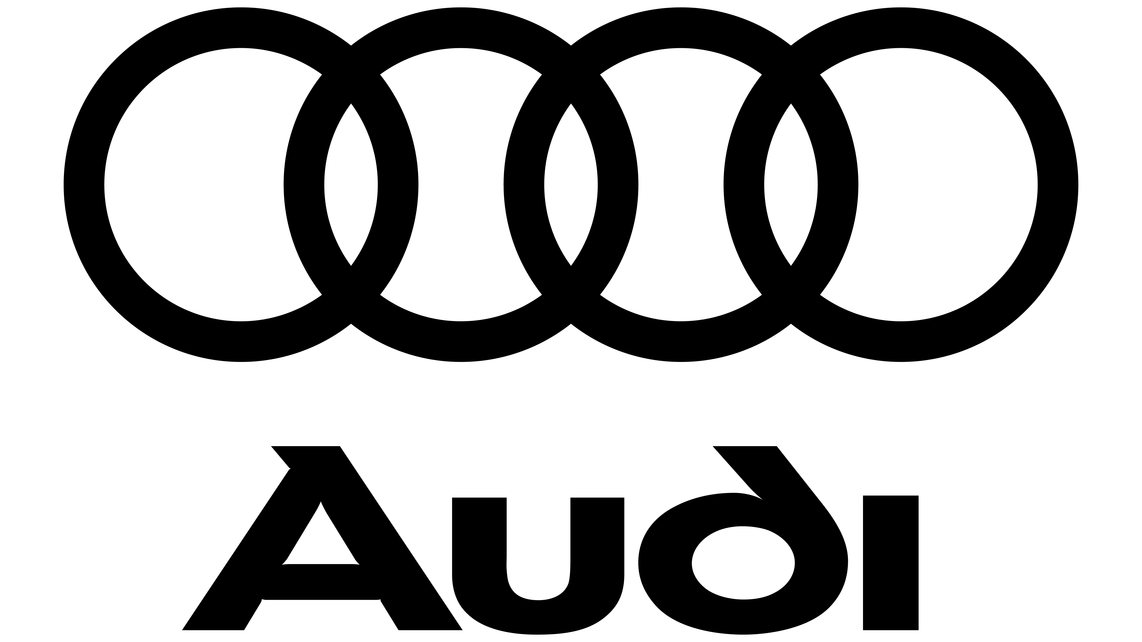
In 2016, designers drastically simplified the Audi logo. The 3D elements are gone. The connected legendary rings have changed color; they are no longer silver but black. There are no additional inscriptions. The car manufacturer’s original logo looks stylish and concise.
In 2017, the Internet revealed that the German concern had patented two new emblems. Experts speculate that this is due to the emergence of electric cars and Audi luxury models, which are known for their luxury, improved performance, and uniqueness. The first version of the logo consists of two pairs of connected black half-rings. The second option consists of rings with no weaves. In both cases, the emblems remain recognizable and associated with Audi.
Font and Colors
The logo of a major automotive concern has constantly changed. The font has always had unusual spelling options for A and D.
The color scheme also changed. At first, it was black, white, and blue, then red was added. In 1995, designers introduced a new idea, silver metal rings. Such solutions helped the developers demonstrate the company’s reliability and professionalism.
Today, the Audi logo is in black. The connected rings reflect the company’s rich history and are associated with high quality. This emblem on a car’s radiator grille is recognized worldwide!
FAQ
Does Audi have a new logo?
Yes, the company has updated its logo. The brand has introduced a new version of its iconic interlocking rings. Following modern graphic design trends, this new design moves away from the previously raised edges and takes on a flat, two-dimensional look.
The original interlocking ring logo has undergone several changes. The most noticeable change occurred when the rings took on a silvery, three-dimensional appearance. The latest update removes the raised edges, creating a cleaner, flatter screen. The move towards 2D design is part of a wider trend among many brands toward simplicity and minimalism.
Is a BMW or Audi better?
The choice depends on what you value in a car.
Audi is known for its luxurious and comfortable interiors. The brand uses quality materials and advanced technologies to make its cabins stylish and comfortable. Audi is a strong contender if you prefer a refined and cozy interior.
BMW focuses on performance. The brand offers engines designed to deliver an exhilarating driving experience. If you enjoy sporty, dynamic driving with precise handling, BMW’s focus on performance may be more appealing.
What does the Audi emblem represent?
The emblem with four intertwined rings symbolizes the merger of the four companies that formed Auto Union AG. Each ring represents one of the parent companies: Audi, DKW, Horch, and Wanderer. The rings symbolize their unity and strong connection.
The merger occurred during economic troubles, helping these companies survive in the auto industry. The four rings now symbolize cooperation, strength, and shared history. Although the brand has evolved, the logo remains a reminder of its origins and the unity of its founders.
Why is the Audi logo four rings?
The logo with four interlocking rings commemorates the formation of Auto Union AG. Each ring represents one of the founding companies: Wanderer, Horch, DKW, and Audi. These rings show their unity and cooperation.
The creation of Auto Union AG was a crucial step during difficult economic times. This allowed these companies to pool their strengths and resources. This emblem has remained a strong symbol throughout the brand’s history. It symbolizes the brand’s origins and the strong partnership of its founders.
What do the four rings in Audi’s logo represent?
The four rings in the logo symbolize the unity of the four founding companies: Audi, DKW, Horch, and Wanderer. Each ring represents one of these companies, which merged to form Auto Union AG.
This merger helped the companies pool their strengths and resources during difficult economic times, ensuring their survival and success. The rings symbolize their unity and commitment to excellence and innovation. The logo remains a powerful symbol of the brand’s origins and heritage.