The Royal Society for the Prevention of Cruelty to Animals (RSPCA), founded in 1824, recently unveiled a new brand identity. This redesign, developed by Jones Knowles Ritchie, refreshes the look of the world’s oldest and largest animal welfare organization as it gears up for future challenges in animal advocacy.
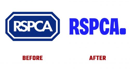
The new logo replaces the old one, which had cramped and uneven lettering, with a cleaner, more contemporary sans serif font. This font subtly flares at the ends, making the organization’s name more prominent and reflecting the RSPCA’s authoritative role in animal welfare.
A key feature of the new design is the updated octagon shape. Previously elongated, it now appears as a bold dot at the end of the wordmark. Although this might initially seem odd due to its size and shape, the octagon becomes more meaningful in larger uses. Here, it encircles illustrations of animals, symbolizing the RSPCA’s role in protection and care.
The new identity is versatile and designed to adapt across various media and settings to meet the diverse needs of the RSPCA’s branches and centers. The octagon is a frame for animal illustrations, including hedgehogs, chameleons, cats, and dogs. These illustrations are drawn with bold shadows and distinctive crescent-moon-like eyes, bringing character and vitality to the images.
The animal animations are smooth and playful, designed to be stylized rather than hyper-realistic. This approach helps make the RSPCA’s message more accessible and engaging, emphasizing their commitment to compassion.
Additionally, the rebrand includes a custom typeface and a vibrant blue color palette. This sturdy yet friendly typeface supports the RSPCA’s mission to be a reliable and caring authority in animal welfare.
This redesign modernizes the RSPCA’s visual representation and strengthens its communication strategy. The new elements highlight the organization’s dedication to protecting animals and aim to inspire and mobilize support with a coherent and appealing visual identity.


