This year marks the 78th anniversary of the release of the Italian motorcycle show EICMA (Esposizione Internazionale Ciclo Motorciclo e Accessori). By coinciding with the renewal of the visual identity for such a venerable event, the brand dooms itself to growing popularity and special attention from the audience.
This is not bad; on the contrary, it will raise the level of culture, make the audience talk about the traditions of automobile construction, and set a certain bar for competitors. Who else but Italians know a lot about the bright emotions that bring people three things – delicious food, noisy parties, and fast driving in a quality vehicle.
Within the show’s framework, a new visual identity will be consolidated; however, it has already been presented along with the changed name as part of the rebranding. A real extravaganza is being prepared on a grand scale; such a performance cannot be missed.
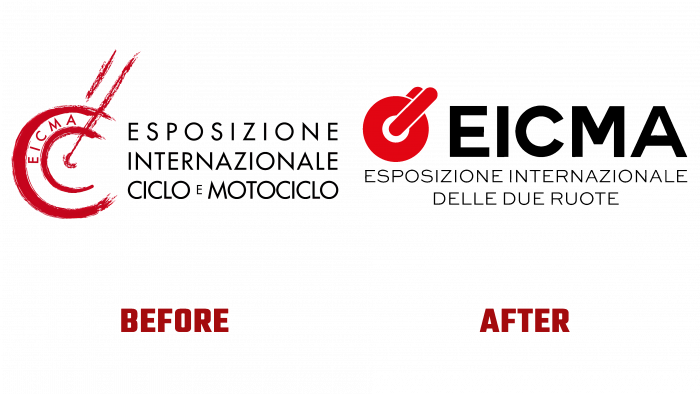
And for those who will not be able to attend the festival, it remains within the house’s walls to discuss the new logo and compare it with the old one. In the new logo, the creators wanted to convey the idea that the wheel is a symbol of peace, and red is the color of energy, love of life, passion, strength and potential, and aspiration. Someone will say that the creatives were not surprised; why should they invent a bicycle, or what (literally and figuratively)?
And not everything is so simple in this logo. It is one piece; it looks organic, there are no loose borders of the image, everything is aligned and drawn. Thanks to the Milan-based agency Yes Marini who took care of the whole rebranding process.
Looking at the old logo, one gets the impression that it was first made a sketch, then painted, and then decided not to finish it – “and so it will do!” There is a rectangle divided by a line into indistinct pieces. On the one hand, a sketch of a cyclist in a helmet on a blue background, and the other, a motorcyclist. Who, where, why are they going? There is no deep thought, there is only a riddle, and that is not so intriguing. What did the authors of the old logo want to convey – a competitive moment between a bicycle and a motorcycle?
Be that as it may, the previous image now looks like a fiasco. Maybe because you are the present time, the design tends towards simplifying forms and colors, so the laconicism and prosaicness of meanings are valued much higher. The fact that the brand also changed its slogan, placing a logical emphasis on “two wheels” (“International Exhibition of Two Wheels”), speaks of the foresight of creatives. They deliberately emphasize the number of wheels in the vehicle.
Indeed, in the future, the exhibition may expand, and more cars will be added. This will already be the “exhibition of four wheels.” And this will be a completely different story for the brand …


