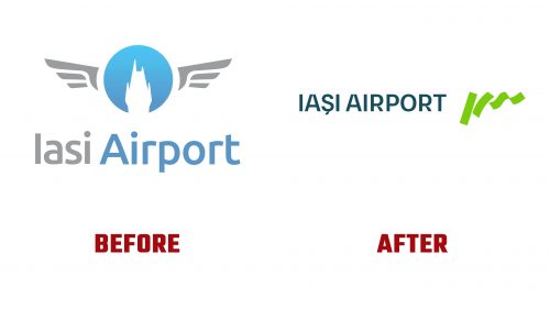
Established in 1926, Iași International Airport, one of the oldest airports in Romania, recently introduced a new visual identity. Located 8 km east of Iași city center, it is pivotal for the historical region of Moldavia and is the third busiest airport in Romania.
The rebranding, led by design firm Innerpride, aims to reflect the airport’s commitment to modernizing passenger experiences while honoring the region’s natural and cultural heritage. The redesign is part of the airport’s broader strategy to enhance its regional, national, and international role.
The new logo, a core element of the rebrand, symbolizes the dynamism of flight and the concept of ascension, aligning with the airport’s goal to serve as a gateway to new opportunities. The design features the name “IAȘI,” stylized in a unique way that combines elements of the characters to create a sense of upward and fluid movement. This logo is intended to be timeless, support various interpretations, and be adaptable to various uses.
The new identity’s color scheme steps away from traditional airport colors, integrating raw green and dark blue. These colors reflect the surrounding forest areas and convey calm, stability, and sophistication. The raw green signifies growth and renewal, while the dark blue adds a touch of elegance.
The new branding’s typography uses the BW Gradual typeface, which complements the logo. However, some aspects of the typeface, such as the curves in the letter “R,” might distract from the overall design coherence.
The rebranding extends to updating the airport’s signage and wayfinding systems. The new logo is used as a visual framing device for imagery, aiming to effectively integrate visual and textual elements within the brand’s identity. This approach tightens the logo’s necessary elements, potentially reducing the visual impact.
The signage system incorporates angled pylons and three-dimensional design elements that reflect the logo’s dynamic nature, enhancing the brand’s presence throughout the airport. A notable feature is the inclusion of a dot in all icons, a design choice whose purpose remains unclear, whether conceptual or visual.


