


At Microsoft Ignite in November 2025, Stack Overflow introduced a new identity, positioning the platform as a source of people-vetted technical knowledge. Koto developed the identity around the community’s role in the age of generative AI. On February 18, 2026, the company announced that it was replacing the logos across its public-facing platforms.
The project centered on “Always in Build,” an idea of continual creation, learning, and refinement. It reflects both programmers’ daily work and Stack Overflow’s history. Since its founding in 2008, the platform has accumulated over 83 million questions and answers. Commercial services and additional sites grew around the main website. As the identity expanded, the relationships among the products became harder to understand. Koto’s task was to bring them together and demonstrate the role of human expertise in the work of developers and AI systems.
The name Stack Overflow refers to a programming error that occurs when the call stack exceeds its available capacity. Pete Borlace designed the original symbol after winning an international competition in 2008. The tilted stack played on both the technical error and the wealth of knowledge the community contributes.
During development, the company discussed the future identity with users. In July 2025, it shared two directions. One built on the stack motif, while the other featured a face made from code characters whose expression could change. The final design adopted a reworked stack. Koto’s team included Creative Director Joe Ling and Cat Hill, who handled positioning. Senior Director of Design David Longworth represented Stack Overflow on the project.
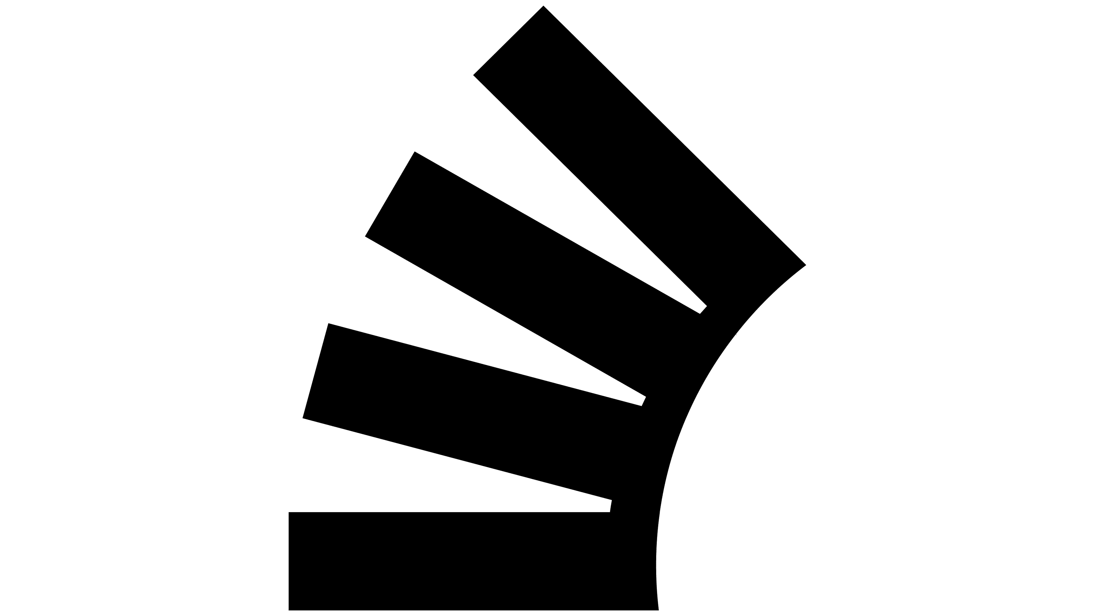
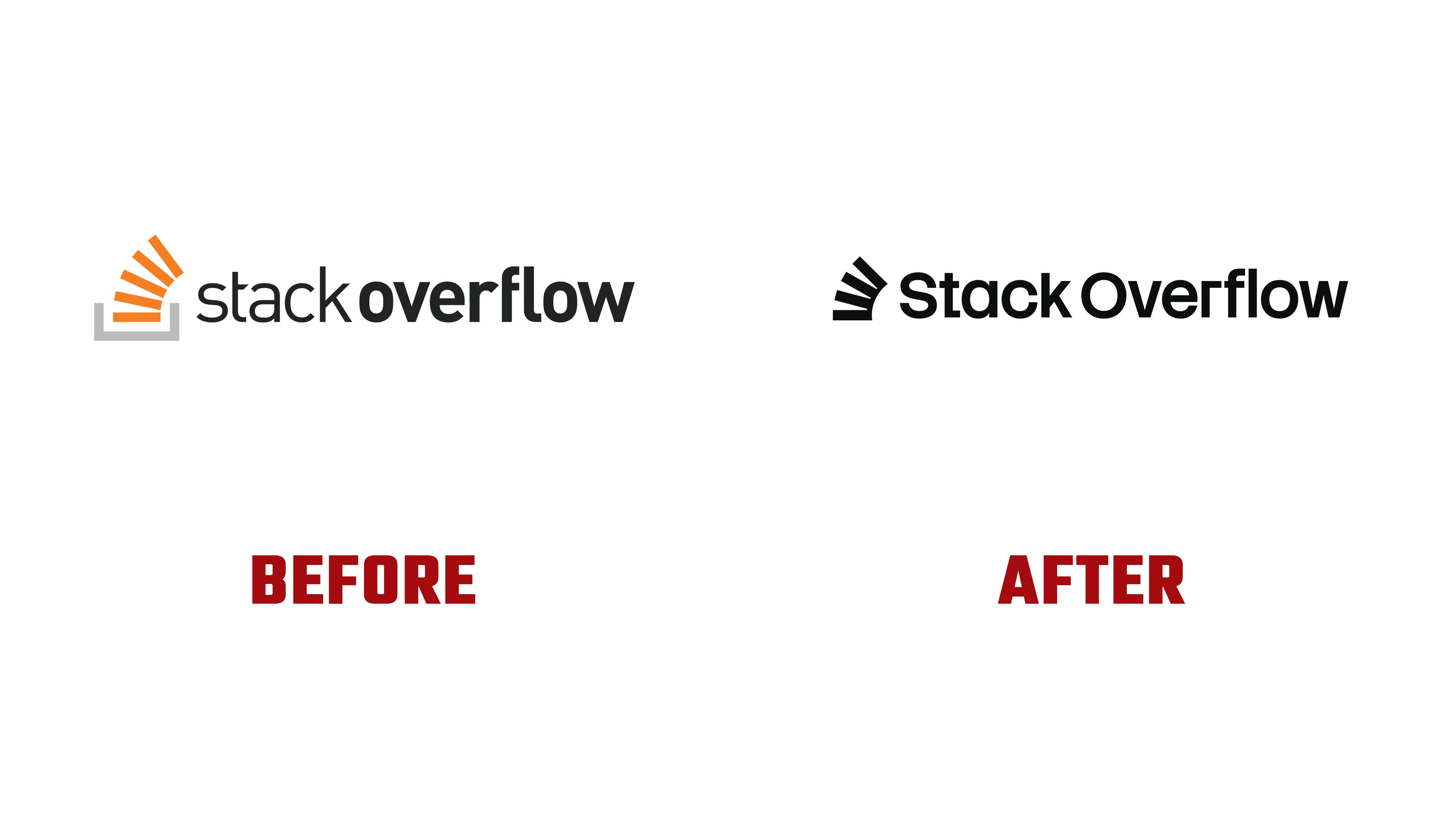
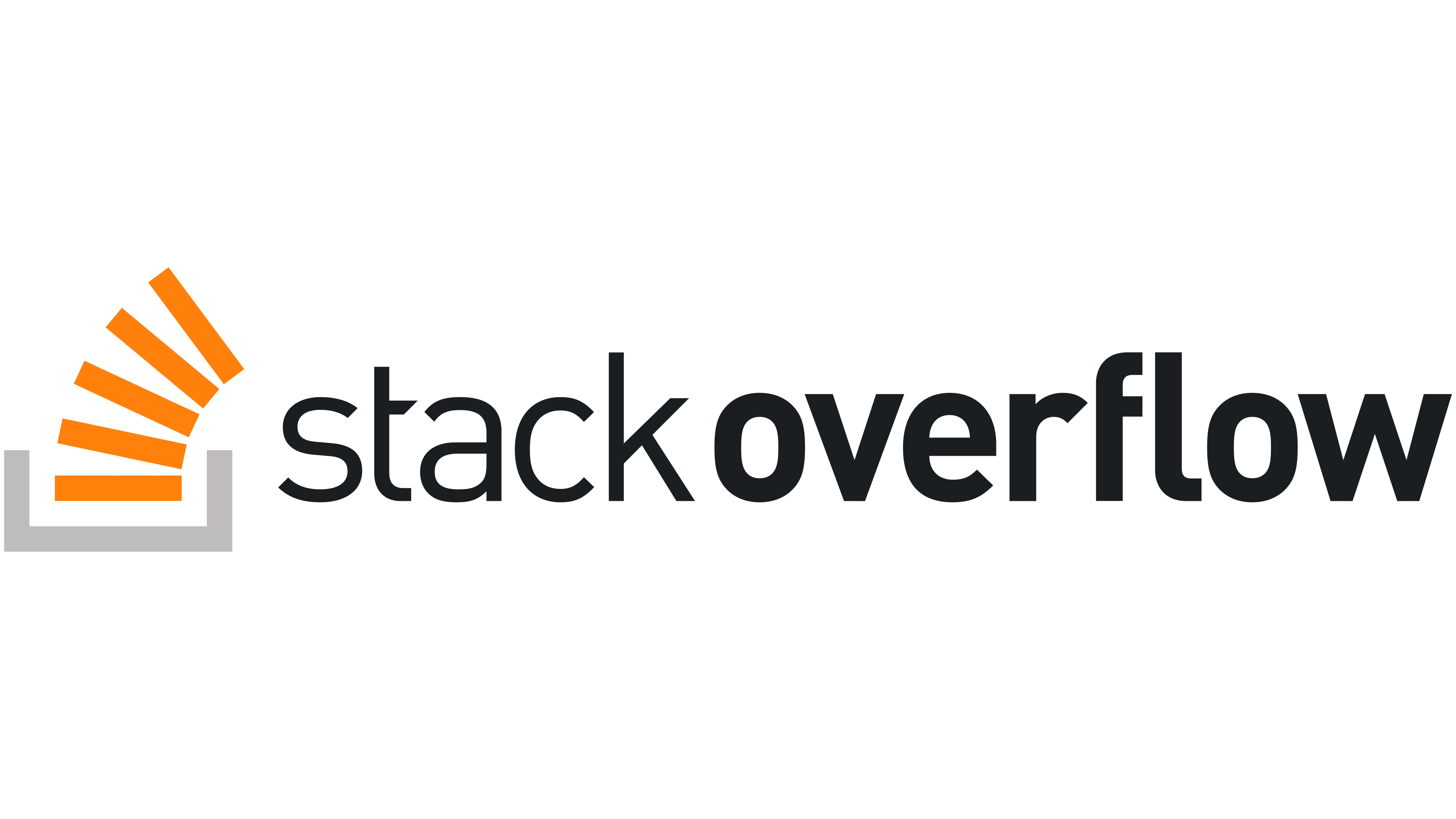
The previous symbol consisted of five orange bars above a gray, three-sided base. The lowest bar was horizontal, while the others fanned outward. The new version joins four bars along their right edges to form a single shape with angular gaps. Internal connections replace the base. The company compares them to a supporting structure, representing the platform’s role in building a body of technical knowledge. The tilt of the upper sections preserves the resemblance to a tower about to topple.
The name Stack Overflow sits to the right of the symbol, with a capital “S” and “O.” In the previous lowercase version, “overflow” stood out in bold. Both words now use the same weight. Tight spacing, large rounded counters, and flat stroke endings complement the heavy symbol. The name and symbol appear in a single color.
Koto developed the Stack Sans type family for body text and headlines. Rectangular notches in some letters resemble joints between building components. Offset or rotated dots extend the assembly theme. The family uses a neutral style for body text, with a decorative version for larger lettering. The family was first released on October 3, 2025. It is available through Google Fonts under the SIL Open Font License 1.1.
Orange remains part of the identity but has a new role. It often serves as a background for the dark logo, whereas it previously filled the symbol’s bars. The primary colors are Stack Orange #FF5E00, Off-Black #201C1D, and Off-White #F0EFEE. A light version of the logo is available for dark backgrounds. The symbol’s forms extend into flat and three-dimensional constructions for advertising, presentations, and digital publications.
The update extended across the corporate website, blog, social profiles, and public services. Stack Exchange’s topic-based communities retained their own symbols, with the Stack Overflow logo placed above them to identify their place within the network. In April 2026, following user criticism, the company withdrew the beta version of the main site’s new interface. The site returned to its previous interface while retaining the updated logo.