


Proximal introduced a ring-shaped logo with 8 rounded lobes for its public launch on June 23, 2026. U.S. agency Iverson developed the identity in 5 weeks. A black-and-white foundation unifies the company’s website, research publications, and materials for future products.
Founded in 2026, Proximal develops training data for AI, including agents for coding and complex engineering tasks. The team treats data preparation as a research discipline alongside developing training algorithms and model architectures. Its work relies on software, engineering systems, and experimentation, and it plans to make its research findings publicly available.
In Iverson’s assessment, Proximal’s previous identity did not match the caliber of its technical work. The agency was tasked with creating an identity that could support the company beyond its launch. The designers sought to communicate technical expertise through geometric forms and their construction. They called the guiding theme “The shape of intelligence.”
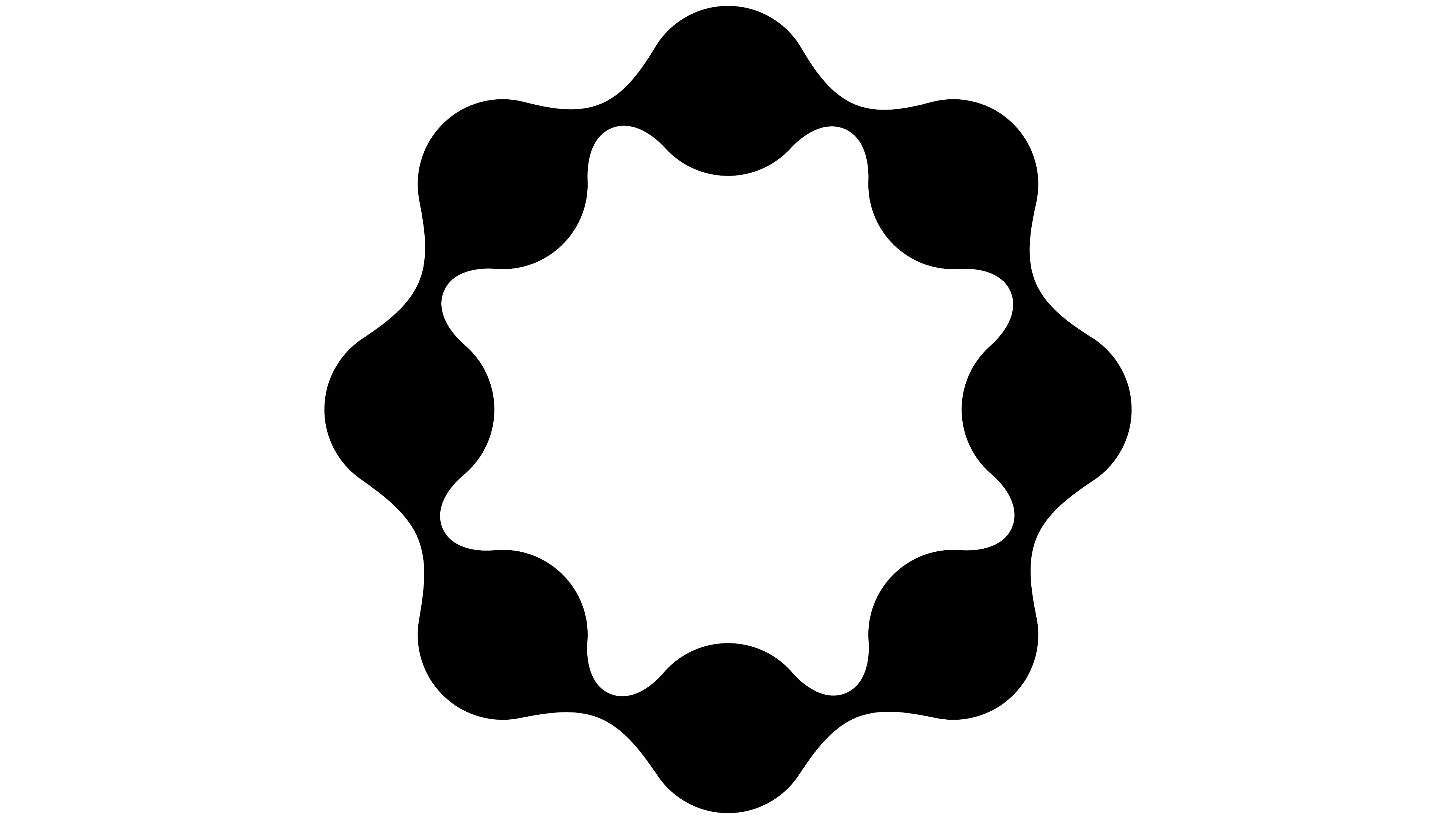
The emblem is built from 8 identical circles arranged around a central axis. Concave bridges connect them into a closed ring with an open center. Rounded lobes project outward, while convex sections alternate with indentations along the inner edge. The result resembles a flower with a continuous outline. Repeating circles define its structure, and smooth curves unite them into a single form.
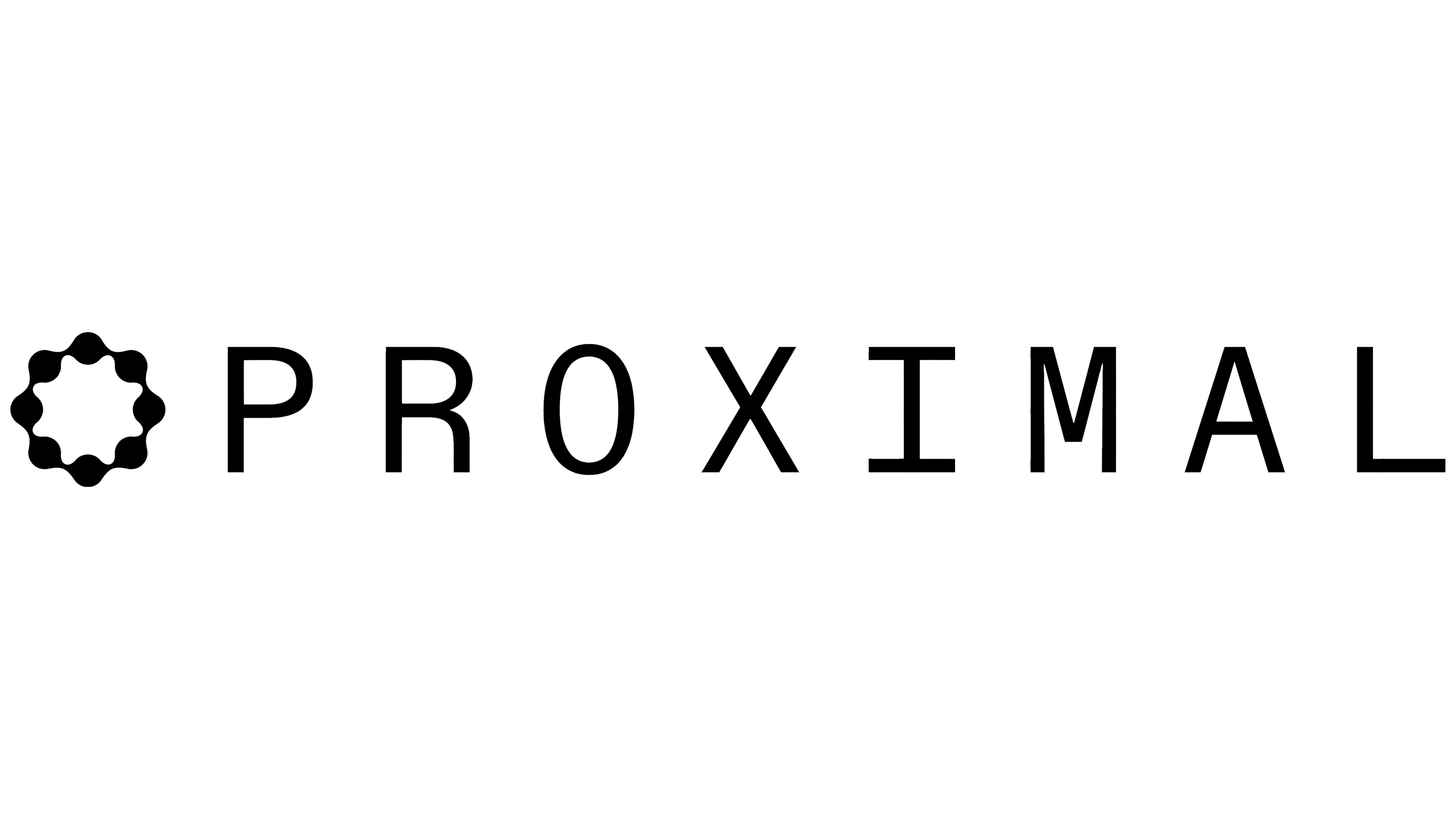
In the horizontal logo, the emblem sits to the left of PROXIMAL. The name appears in thin, widely spaced uppercase letters with nearly uniform stroke widths. The “I” has top and bottom crossbars, the “O” is vertically elongated, and the rounded upper portion of the “R” flows into a diagonal leg. The lettering’s straight lines contrast with the emblem’s flowing contours. In the primary version, the light-colored logo sits against a nearly black background.
A three-dimensional version of the floral ring was also developed. Its polished metallic surface follows the flat emblem’s wavy profile, turning it into a sculptural object. Black, white, and shades of gray unite the two versions.
Supporting materials extend the data theme through spheres made of numbers and symbols, coordinate grids, and research report layouts. These appear on the website and in social media posts. The flat emblem was also adapted for embroidery on caps.