Minecraft fans can already get acquainted with the new visual changes in the logo of the popular video game. Released in 2011, as a game with a processing element that allows the player to express a high degree of their creativity in interactions, and alternatives, without a specific goal, it immediately fell in love with many gamers. During its existence, it has become the best-selling. An attractive feature of the game was the many worlds that can be created with simple resource gathering and free building. This vast universe consists of multiple releases, major updates, and additional playable variations. The brand decided to rework its own identity to unite the entire franchise into a single visual space.
Over the ten years of its existence, Minecraft has become a global phenomenon that has outgrown the limitless gaming universe. A simple entertainment franchise has reached the same complexity as the world of everyone’s favorite Lego. In its growth and expansion, the brand began to lose its integrity, being perceived as fragmented and devoid of clear direction. To change the situation, designers have made every effort to form a new identity – design systems and philosophies that unite numerous parts of this universe, including games, services, TV shows, festivals, various events, toys, and communities. Despite some visualization complexity, the identity has acquired an attractive playfulness and ease of visual perception.
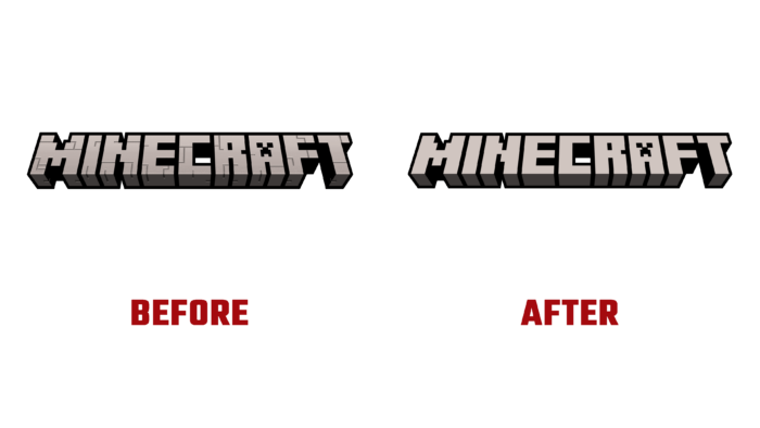
Among the main methods of influencing the consumer, amplifications and simplifications were applied in the graphics and color scheme of the logo composition. The new identity was focused on the brand’s future strategy, new architecture, and overall design philosophy. This contributed to the unification and direction of creative efforts, both the development team and partners. Visualization has gained sensuality, the ability to behave specially and look more attractive. The repetition and fragmentation across all identity elements have been reduced. The design and branding have been aligned across all digital and physical properties, making their new developments easy. The corporate identity has become common throughout the franchise, captivating the user, like the game itself. A simple pixel grid is the basis of the design system, applied in every asset, logo, typography, and digital design. With its help, a natural continuation of the game is ensured, based on the same resolution in its visual display. The whole structure is built on the use of blocks. The logo has retained recognizable perspectives and dimensions while better synchronizing with the pixel world. The smooth look of the logo became more raster-like, perspective changes were minimal, but they ensured the accuracy and smoothness of shifts in shadows and lighting. This also affected the shift of the gradient on the front plane, ensuring the natural reflection of shadows from the incident light.


