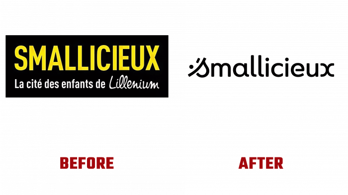
Smallicieux – a new entertainment and educational space for children has acquired a memorable and attractive external identity. The logo and corporate identity were developed with the help of 19-year-old branding agency Graphéine (Paris and Lyon, France). The creative team of the agency’s like-minded people, bright representatives of the design community with a high professional level and passion about the idea of forming an image in any field, are distinguished by the creation of unique projects, including the development of strategies, brands, visual identity and much more. They also started to develop the appearance of a new resource – Smallicieux created based on la Cité des Enfants (City of Children) – a permanent exhibition since 1992 in Paris, France. In 2010, already as Smallicieux, it was opened at the Lillenium shopping center in Lille, France.
The transformation began with creating a new name that reflected the brand’s focus, its direct relationship to children. Smallicieux is a combination of two words: “small” and “malicieux.” It has become an association of Anglo-French sound, the interpretation of words, which embodies the ambition and history of the brand and its cheerfulness and desire to be closer to children, not only in essence but also in its appearance, including its name. The name turned out to be quite clever in its sound. In terms of meaning, it describes its audience very well, gives an accurate description of it. Smallicieux is a fun and informative world that lends itself very well to visualization by creating emotional elements represented by emotional images, facial expressions, smiles, mischief while emphasizing the desire to make discoveries.
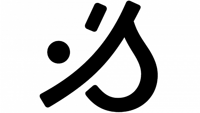
The accent element of the logo and the sign of which later became the main one in digital spaces and the designations of applications was the first letter of the brand name – “S.” The letter in italics, which connects it with school writing, has acquired a pleasant roundness in its loop and visual benevolence. The semicolon placed in front of the “S” upside down made the combination of these elements look very much like a naughty smiling face. All other letters of the name were worked out in such a way as to preserve the unity of the playful, mischievous style set by the first sign. The result was a successful integration of the word, the letter of the sign into a kind of emoji, and vice versa. If you look closely at the first sign, you can see how the letters and signs were transformed into outlines that very much resemble a smiling, winking emoticon. This graphic move brings the logo to life, makes it more informative while keeping it minimalistic.


