


![]() NASA Logo PNG
NASA Logo PNG
The emblem of the National Aeronautics and Space Administration reflects the organization’s primary focus and orientation. In all its variations, the NASA emblem is distinguished by its informativeness and recognizability. It represents the Universe and the satellite orbit.
NASA was established in July 1958, following President Dwight D. Eisenhower’s signing of the National Aeronautics and Space Act. The trigger was the launch of Sputnik 1 in October 1957, which exposed a gap in the space race. NASA absorbed NACA, inheriting its infrastructure and staff.
In the early 1960s, the Soviet Union achieved key milestones, including Yuri Gagarin’s April 1961 flight. The US response came through Project Mercury. In May 1961, Alan Shepard completed a suborbital flight, followed by John Glenn orbiting Earth in February 1962.
That same year, John F. Kennedy set a goal to land a man on the Moon. Gemini missions from 1961 to 1966 tested docking and spacewalks while the Saturn V was being developed. On July 20, 1969, Neil Armstrong and Buzz Aldrin landed on the Moon during Apollo 11.
In April 1970, Apollo 13 suffered an explosion of an oxygen tank, but the crew returned safely. NASA shifted focus in the 1970s to Skylab and the 1975 Apollo-Soyuz mission, marking cooperation with the USSR.
In 1981, the shuttle Columbia began a reusable spacecraft program. Disasters followed with Challenger in 1986 and Columbia in 2003, both causing program pauses.
In 1990, the Hubble Space Telescope was launched and later repaired in 1993. From 1998, NASA joined the ISS project with Roscosmos and others.
After the shuttle’s retirement in 2011, NASA relied on Soyuz until 2020, when SpaceX launched Crew Dragon. In 2021, Perseverance reached Mars with Ingenuity. In 2022, the James Webb Space Telescope launched alongside the Artemis program, which aimed to return to the Moon.
Meaning and History
![]()
One of the most respected organizations in the world has had only a few logos. Over the years, the Organization for Aeronautics and the study of outer space have used only three versions. Two of them have a complex structure and are based on the Rondel principle, and one is simple and consists only of the name. James Modarelli, an illustrator at the Lewis Research Center, along with Richard Danne and Bruce Blackburn, designed the wordmark for the round version. The logo also had a limited number of redesigns; essentially, they were swapped or used in parallel for different tasks.
What is NASA?
NASA is an abbreviation for the National Aeronautics and Space Administration, an agency associated with the U.S. aerospace industry. The organization reports directly to the President and is part of the federal government.
1915 – 1958
![]()
The space administration’s debut logo is a stylized heraldic shield with two large, spread wings. In the center of the yellow badge is the word “NASA.” It is written in a regular black, narrow, sans-serif font. A dark line runs along the symbol’s contour, which is twice as thin as the letters. This version accurately reflected the aerospace center’s tasks.
1959-1975; 1992 – today
![]()
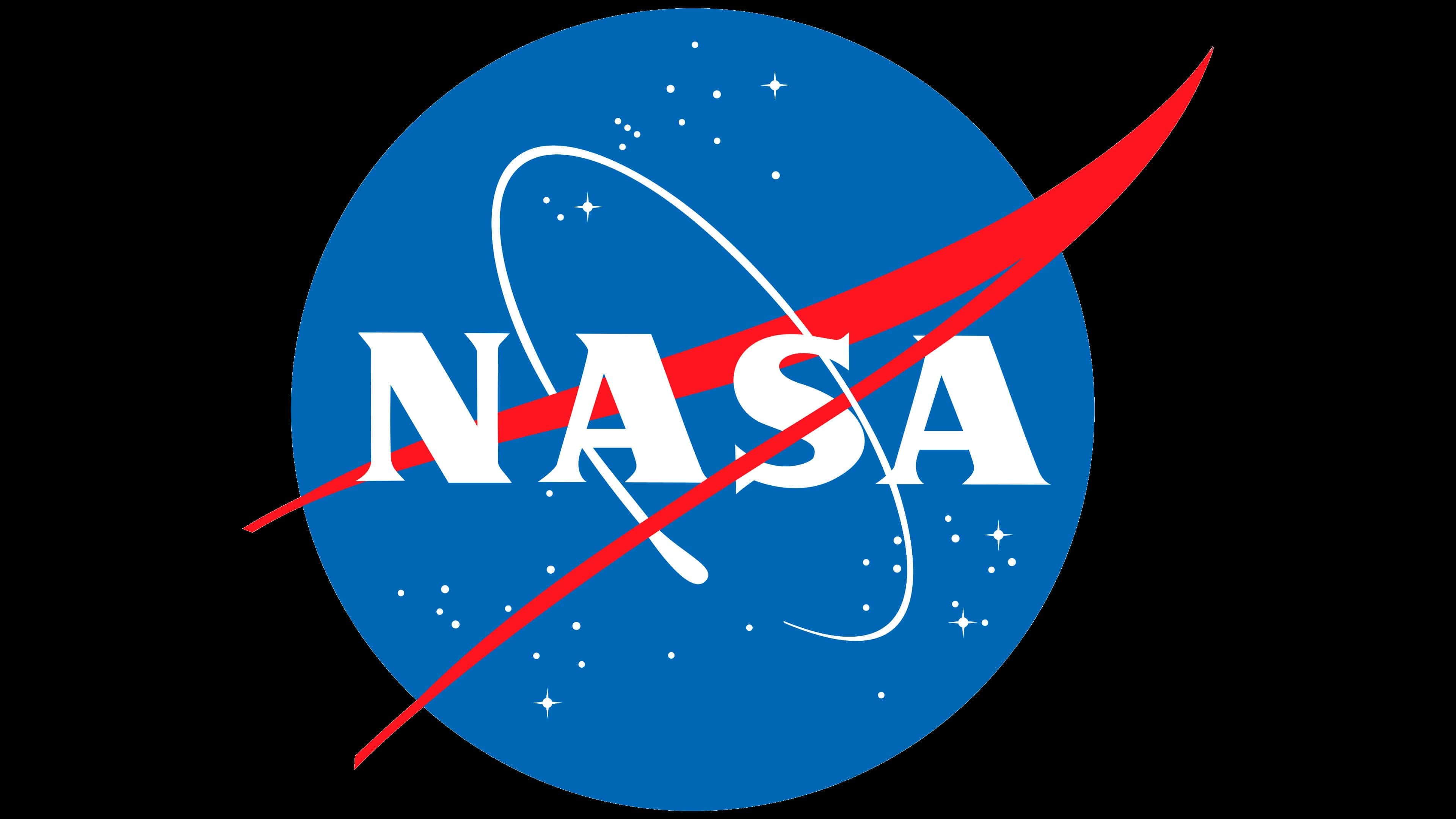
A year after the space research organization’s opening, it received its emblem, which would represent it at the national level. James Modarelli gave the amusing name Meatball. This logo was used until 1975, and then, after a long hiatus, it was reverted to. Therefore, it has been in use since 1992.
The round logo, symbolizing the Universe, depicts a dark blue disk with white dots (presumably stars) intersected by a V-shaped red ribbon. In the center of the rondel is the abbreviated name of the National Aeronautics and Space Administration, “NASA.” A thin, improvised orbit with a thickening at one end is located off to the side of the world, like a rocket’s trail.
This logo also exists in another incarnation, mainly used for printing and special programs. A wide white frame with a yellow line along the contour surrounds the round blue badge. Around the perimeter is the agency’s full name. The red V-shaped strip, like the white orbit, is arranged around the planet.
1975 – 1992
![]()
Richard Danne and Bruce Blackburn created this version. It features the word “NASA” in a streamlined red font. Because of the letters’ visual resemblance to worms, the emblem was nicknamed “Worm.” It served as the main logo for over 15 years before being replaced by the traditional one. This version coexists alongside the official one and is used in some projects.
Font and Colors
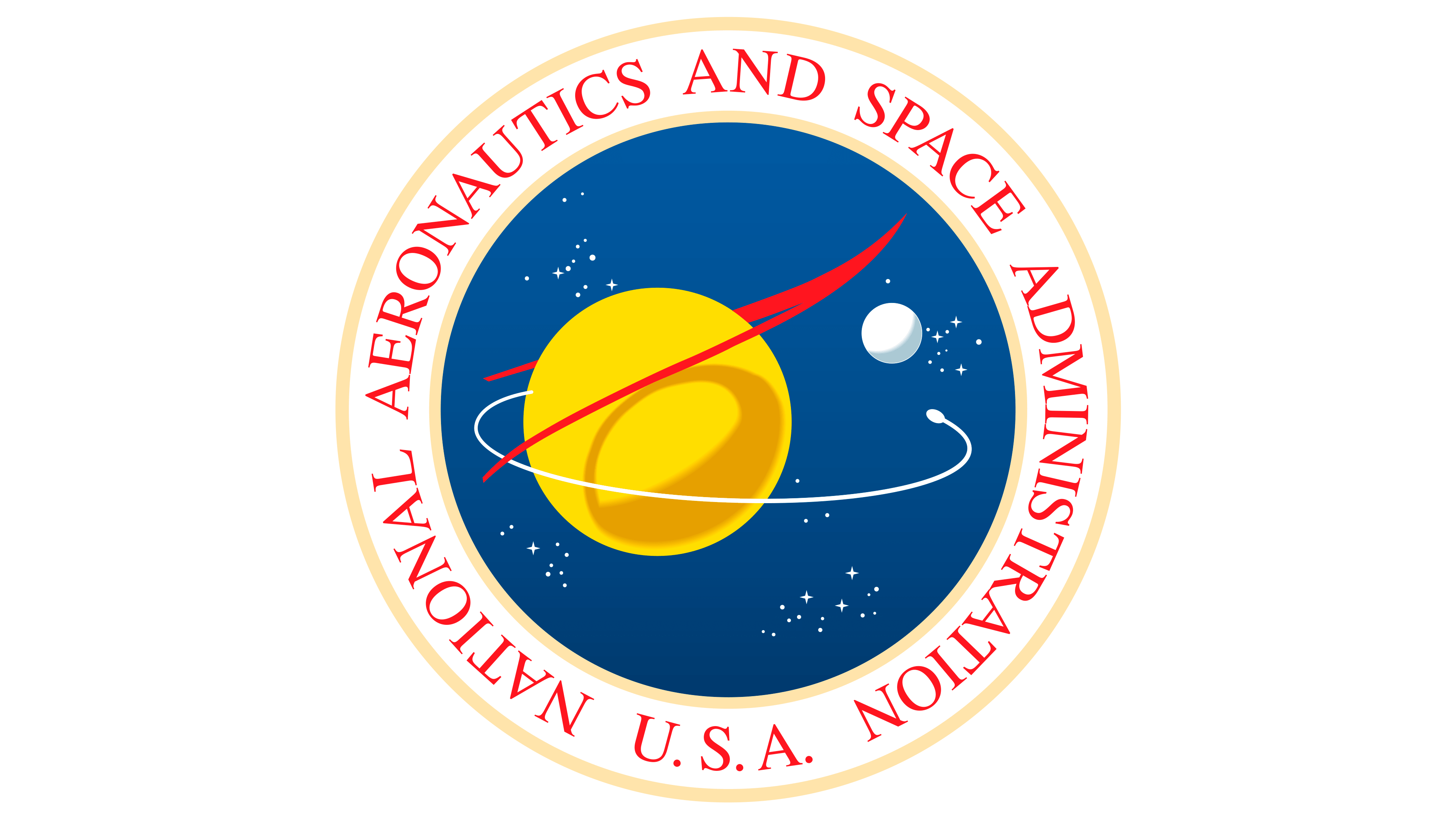
NASA uses a special logo resembling a seal for awards, official documents, and special occasions. It is almost a complete copy of the main one, with an additional design. A red line surrounds the blue circle, depicting the Universe on a white background. The full name of the organization, the National Aeronautics and Space Administration of the USA, is written on a wide strip with a beige-pink edge. The central part is represented by a yellow sphere, symbolizing the planet. Next to it is the Moon. The satellite’s orbit and the figurative element resembling the letter V surround the Earth.
In 1975, the Space Administration introduced another version of the logo, created as part of the Federal Graphics Improvement Program. As a result, the word “NASA” received an “alien” spelling: the crossbar disappeared from the letter “A,” and the letters became streamlined, resembling spaghetti or a worm, hence the informal nickname. This variant was used for 17 years.
The “Worm” emblem has an inscription made in a simple, smooth sans-serif font with clear cuts and rounded corners. Neither letter “A” has a horizontal crossbar. Moreover, the right leg of the central “A” is connected to the beginning of “S.” The Meatball logo uses an uppercase font and thin, serifed letters. The palette is tricolor, consisting of white, Pantone 286 blue, and Pantone 185 red.