The YMCA logo is massive and strong. The emblem traces a solid foundation consisting of spiritual values. The organization deals with educational programs and the mental health of its members. It helps them to take their rightful place in society.
YMCA: Brand overview
| Founded: | 6 June 1844 |
| Founder: | George Williams |
| Headquarters: | Geneva, Switzerland |
| Website: | ymca.int |
Meaning and History
The founders of the YMCA are not just one person but a group of eleven members. They were headed by George Williams, a fabric merchant from London. He and those close to him were concerned about the unhealthy lifestyle of young people in the urban environment and industrial development. They were worried about the abundance of taverns and the lack of conditions for physical strengthening.
As a result, the specific concept emerged during the meetings Williams and his associates held for Bible reading and prayer. And since the members of the community were also businessmen, it was not difficult for them to transfer the idea to practice. The meeting that laid the foundation for the Young Men’s Christian Association took place on June 6, 1844. From craft training and physical strengthening, the organization gradually shifted to lecturing and then publishing. However, she founded companies related to healthcare, as she has been working in medical science for many years. She also laid the foundation for a considerable number of colleges and universities in the United States.
This service is currently involved in implementing projects and providing services related to youth development. So, she offers a large list of activities: charity work, the promotion of Christian canons, lessons on mastering a wide range of skills, sports. At the same time, the approaches to teaching the younger generation are being improved and the symbols of the organization so that it accurately meets the assigned tasks. In total, the YMCA has seven worldwide emblems and two UK logo designs.
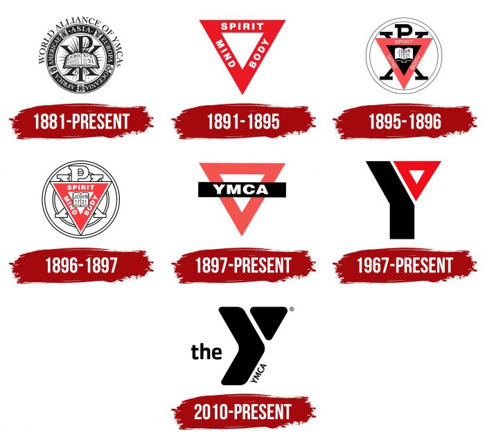
1881 – today
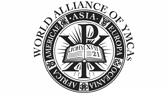
The original logo, adopted 26 years after the association was founded, contains key marks. Outwardly, it resembles a rondel. Most companies and institutions use this form; therefore, it is considered classic. The round stamp consists of five segments located on a wide strip. They represent the same number of continents, whose names are written down right there: “America,” “Asia,” “Europa,” “Oceania,” and “Africa.” Between them on a white background are miniature YMCA monograms made in different languages.
In the middle, there are two letters superimposed on each other. These are “X” (Chi) and “P” (Rho) – variants of the name Jesus Christ used in early Christianity. They serve as the backdrop for an open book – the Bible with verse 21 from John XVII, still the organization’s motto. This structure means that Christ is at the center of the movement, the source of unity, hope, and strength. “World Alliance Of YMCA” is written above the seal, as this emblem is used as part of the personal identity of the eponymous worldwide alliance.
1891 – 1895
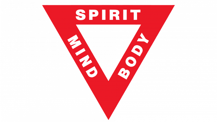
Luther H. Gulick, physician and head of physical education, proposed a simplified logo. It consists of an inverted red isosceles triangle. Each side symbolizes a certain aspect of a harmoniously developed person; therefore, it says “BODY,” “MIND,” and “SPIRIT.” All letters are white, straight, chopped, and in uppercase.
1895 – 1896
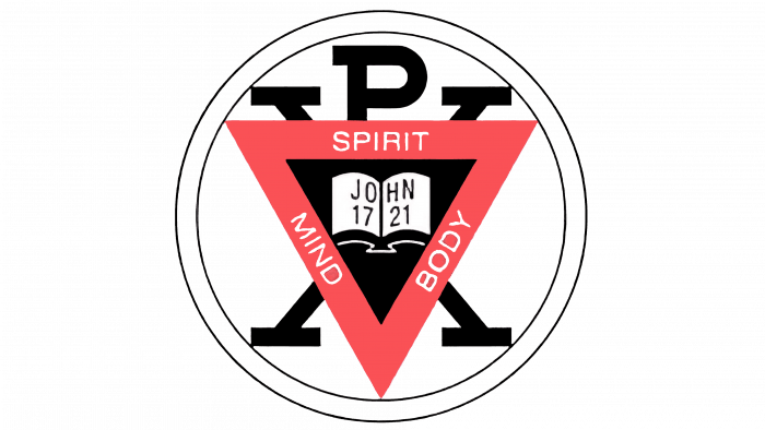
During this period, the organization tried to combine the previous logo with the debut one. Therefore, the red triangle is inscribed in a white ring consisting of two thin lines. In the center of the geometric shape is a black background with an open book. Its pages bear the name “John” and the Arabic numerals “17” and “21”. The wide edges of the triangle still contain the words BODY, MIND, and SPIRIT. All central elements are superimposed on large X and P letters.
1896 – 1897
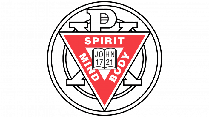
The designers have simplified the logo by removing the black color and adding thinner outlines. In addition, another ring appeared on it – a small one connecting the corners of the triangle and all four ends of the legs “X.” This circular strip symbolizes the love between people and endless friendship. The red triangle now has a thin border.
1897 – today
All religious symbols and inscriptions have disappeared from the logo. Only the triangle-shaped frame remains. On top of it, the developers placed a long black rectangle with an abbreviation for the organization’s full name.
1967 – today
The National Board approved the logo proposed by the Chicago Illinois designer. He created it on instructions from John Root, head of the local YMCA. The form, structure, and content of the logo have been completely changed. It is an innovative sign that reflects the modern principles of the association, which has come to be called “Y.” This letter was taken as the basis for the logo. Its structure is traced in the outlines of geometric figures, despite the red element on the right side. This is a legendary triangle that has been used since the organization’s inception. This is how the developer connected the past and the present.
2010 – today
Another current version contains a small triangle and a large arrow pointing to the right. This is the “Y” styling. The definite article “the” is located in front of the letter. It is grotesque and is in lower case. Nearby is the name of the YMCA, written in thin, chopped letters.
YMCA: Interesting Facts
The YMCA (Young Men’s Christian Association) is a global organization that began in London in 1844 and was founded by Sir George Williams to help people cope with the challenges of the Industrial Revolution. Its goals have grown to encourage the development of the whole person through healthy living, social responsibility, and supporting young people.
- Worldwide Presence: The YMCA operates in over 120 countries, reaching about 64 million people annually and serving people of all ages, genders, and backgrounds.
- Sports Origins: It’s where basketball and volleyball were invented. James Naismith created basketball in 1891, and William G. Morgan invented volleyball in 1895, both as ways to stay active indoors.
- Father’s Day Origins: The first Father’s Day was celebrated in a YMCA in Spokane, Washington, in 1910, thanks to Sonora Smart Dodd, who wanted to honor dads like hers.
- War Support: The YMCA has provided vital support to soldiers and prisoners in war, offering recreational facilities, spiritual support, and care packages.
- Healthy Living Advocacy: It was among the first to promote physical health as essential for overall well-being, introducing many to activities like swimming and providing community access to gyms and pools.
- Social Programs: Beyond sports, the YMCA runs various programs for child care, job training, environmental education, and housing, addressing social issues and aiding those in need.
- COVID-19 Response: During the pandemic, the YMCA adapted by offering services like childcare for essential workers, food distribution, and virtual fitness classes.
- Global Coordination: The World Alliance of YMCAs in Geneva helps coordinate efforts among national branches and spearheads international initiatives.
- Symbol and Motto: Its red triangle symbolizes the development of “a healthy spirit, mind, and body,” and its motto, “Empowering young people,” shows its dedication to youth development.
- Cultural Impact: The YMCA has also left its mark on culture, notably with the Village People’s hit song “Y.M.C.A.,” which celebrates empowerment and inclusion.
With nearly two centuries of history, the YMCA’s legacy of adaptability, service, and community impact is remarkable, showing its dedication to helping individuals and communities thrive.
Font and Colors
After the expansion of the organization’s influence promoting the principles of Christianity, its logos have changed several times. Moreover, many of them exist in parallel and remain relevant. They are united by a triangle, on which the fundamental tasks of the YMCA for the upbringing of the younger generation and the development of a perfect person were previously written.
Two fonts are mainly used in the Young Men’s Christian Association identity – Cachet and Verdana. The first is a sans-serif typeface created in 1997 by Dave Farey. Matthew Carter developed the second one.
Previously, the signature palette was very sparse and consisted of red, black, and white. Now it is diverse and allows several color combinations of the triangle and arrow. According to corporate guidelines, they can be colored blue, green (emerald), red, yellow, or purple. Black and white monochrome is also allowed.
YMCA color codes
| Black | Hex color: | #000000 |
|---|---|---|
| RGB: | 0 0 0 | |
| CMYK: | 0 0 0 100 | |
| Pantone: | PMS Process Black C |
