


 Air Force Logo PNG
The emblem’s main message is the reward for victories in the sky. The Air Force logo reflects courage, purpose, and bravery. It promises recognition of service to the Motherland. The symbols hint at airspace and a sky-blue color.
Meaning and History
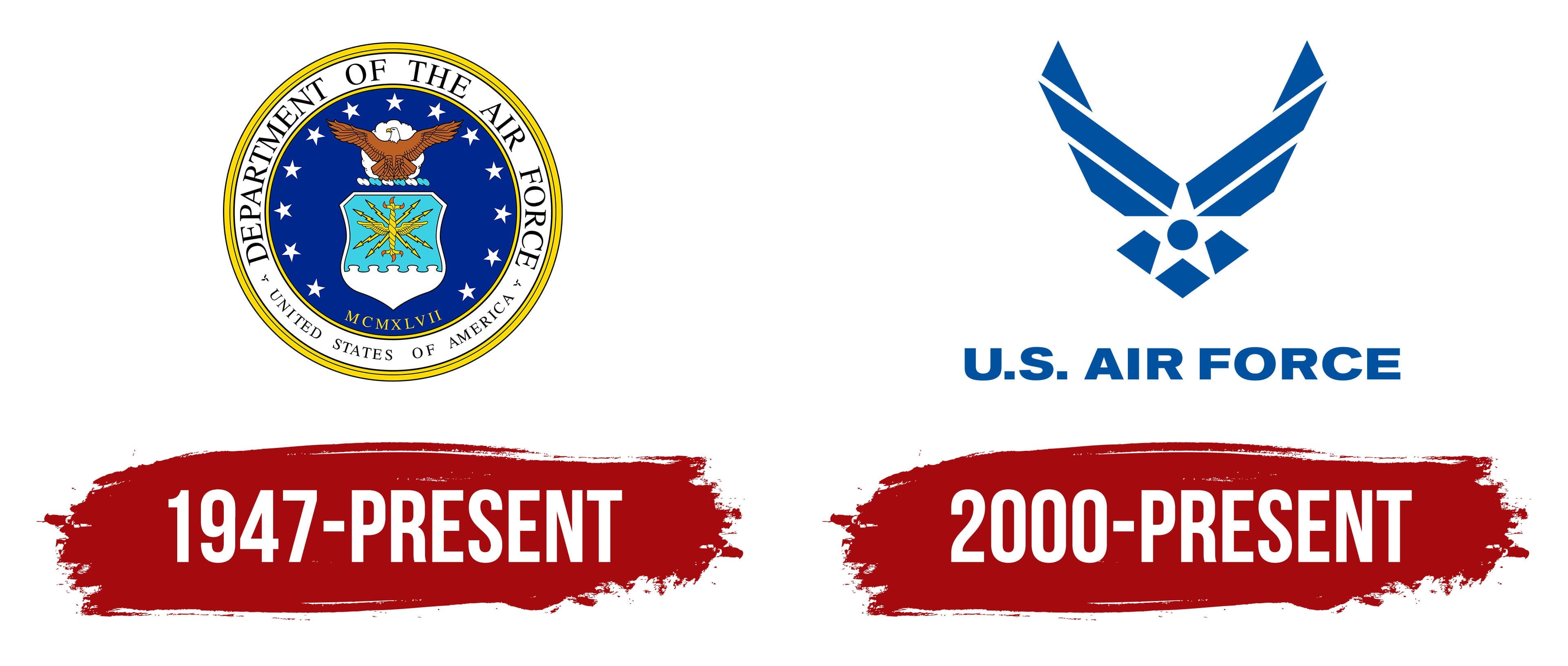
The Air Force’s emblems reflect its priorities, tasks, and goals. It has two: one as an identification mark on chevrons, a flag, and other paraphernalia; the second is the official logo, approved in January 2000.
The story of its appearance began in the late 90s, when the United States Air Force’s main headquarters commissioned a commercial company to research and create unique symbols. The corporate branding firm dispatched representatives to major cities and military sites to gather information about employee values, conduct analysis, and better understand the situation. The studio staff traveled to military air bases for an extended period to study the military’s environment, culture, and heritage.
The detailed work resulted in a truly original sign. The updated logo is based on traditional military values and reflects historical traditions. The proposed design emphasizes the service’s current and future capabilities to protect US airspace and the country’s interests.
The work took place in several stages. In 1998, the team conducted initial surveys and a focus group. A year later, they introduced a graphic symbol. This was the prototype for the Air Force emblem in black and white. In late spring 2000, the authors applied for trademark registration, and in 2001, they tested it with all military personnel.
After a 2002 survey, the target audience reported that most representatives (90%) identified the symbol as an official USAF mark. In the first half of autumn 2003, he received registration and serial numbers; in May 2004, the chief of staff officially approved him.
What is the Air Force?
The Air Force is a branch of the military. In the United States, it is one of the youngest branches of the armed forces, formed in 1947 as a separate unit. It provides air support for naval and ground forces.
1947 – today
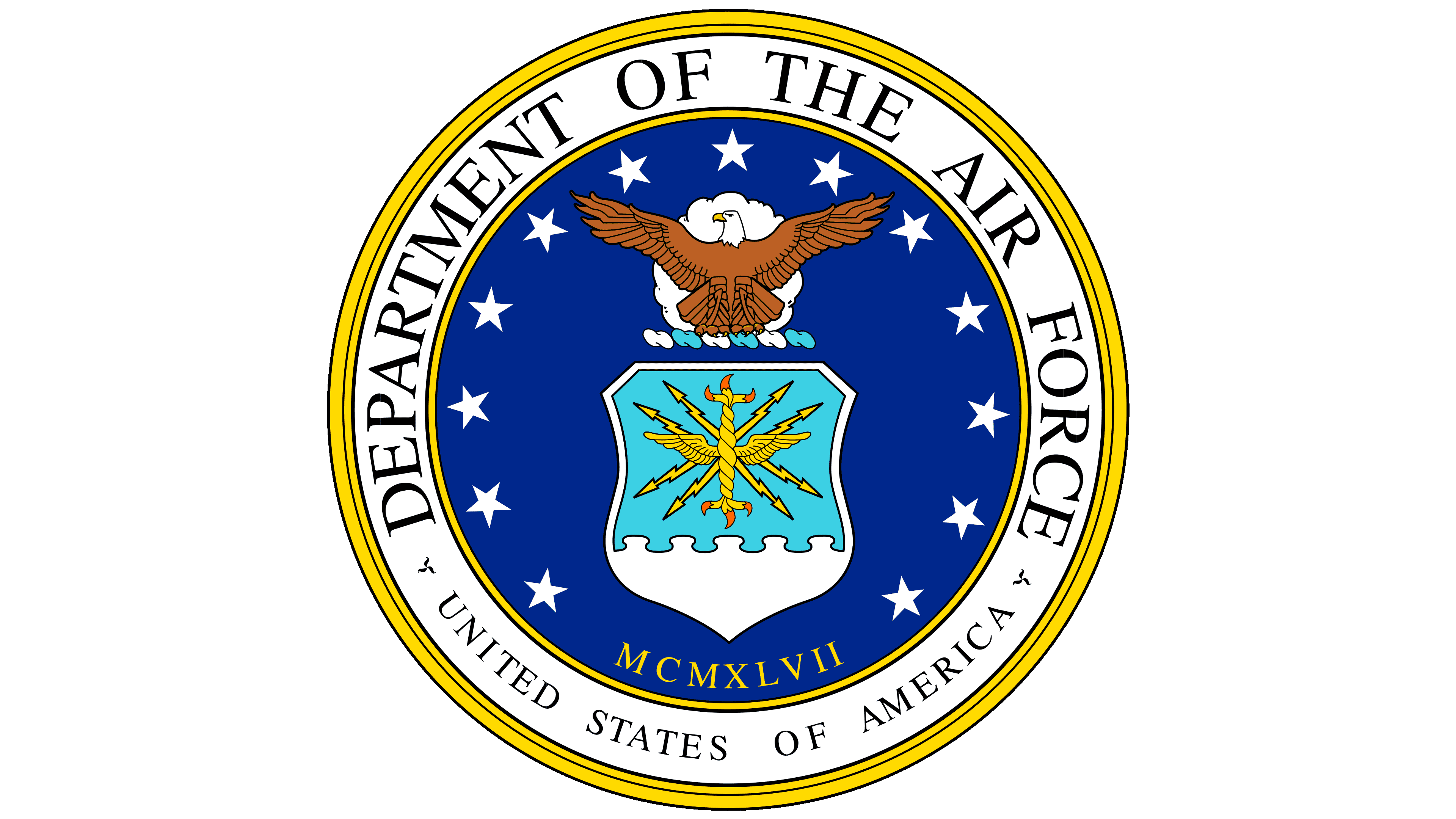
The general logo resembles a circular stamp. The rondel consists of a central circle with a wide border, on which the full name of the military service is written. In the center is the bald eagle, the symbol of the United States. It is also depicted in a Cubist style on a new symbol. The old emblem was used in the early days when the Air Force was part of the Army.
2000 – today
The modern, legendary soaring-bird symbol, the prototype associated with Air Force General Henry Harley Arnold, is a legacy dating back to World War II. The logo is composed of various geometric shapes, including trapezoids, triangles, rhombuses, circles, and parallelograms with one side cut off. Arranged in a certain way, they form the figure of a bald eagle flapping powerful wings.
A five-pointed star sits at the emblem’s center. It appears as negative space, contrasting with the color and straight lines. A blue circle is visible in the middle, from which white rays diverge in different directions. Below is the inscription “U. S. Air Force. ”
Font and Colors

This military service has two logos: a general and an individual one. Although they are made in different styles, they are united by the United States’ main symbol, the bald eagle. The first version is classic and close to realism; the second is improvised and resembles Cubism.
The logo’s lettering is almost identical to the Craft Gothic Heavy Extended typeface created by FontSite Inc. It is bold, wide, large, stocky, and sans serif. The military unit associated with flights has a naturally heavenly color scheme, so blue, paired with a white background, dominates the corporate palette.
USAF logo

USAF academy logo

United States Air Force logo
US Air Force logo

old Air Force logo