The Nationwide logo is a prototype of a bank card and symbolizes working with money. The emblem demonstrates the turnover of investments and savings, improving customers’ quality of life. Symbols hint – that the company will help build a practical and comfortable home.
Nationwide: Brand overview
Meaning and History
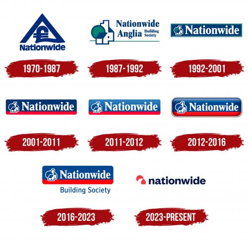
The largest building cooperative, with more than 15 million members, arose out of the Cooperative Permanent Building Society, which, in turn, was created in 1884. The financial institution received its current name in 1970 and, with it – a new logo. Since then, the company has been renamed several times but eventually reverted to the “Nationwide Building Society” variant. The symbolism also changed frequently, although the designers tried to adhere to the general concept and color palette.
What is Nationwide?
Nationwide is the short name for the Nationwide Building Society from the UK. It acts both as a construction organization and as a cooperative bank. The company was formed in 1846 and consists of many acquired specialized enterprises.
1970 – 1987
Before merging with the Anglia Building Society, the organization used a stylized pound sign emblem. It was placed in a triangular frame that protruded from its bottom. Under the symbol, “Nationwide” consisted of bold letters placed close together. The main color was dark blue.
1987 – 1992
In 1987, the company became Nationwide Anglia. This happened after she teamed up with the Anglia Building Society. The merger resulted in a logo update. As a result of the rebranding, a multi-component symbol appeared, which contained a pictogram depicting a white and blue house and a green circle (crown of a tree). A long strip was drawn at the bottom to indicate the earth’s surface. On the right was the inscription: “Nationwide” in the top line and “Anglia Building Society” in the second, with the last two words written in a column.
1992 – 2001
The cooperative returned to its former name in 1992. Despite this, it decided not to restore the old symbol but to experiment with the existing design. Thus, the stylized house was reduced and, together with the word “Nationwide,” placed in a blue double-framed rectangle. The horizon line has disappeared. The lettering has turned white to stand out against the dark background. The pictogram now has a light outline.
2001 – 2011
The company entered the new millennium with a new logo. The developers made the font bolder and repainted the crown of the tree blue. They rounded the rectangle’s edges, removed the outer outline, and added a long red stripe at the bottom, which was supposed to replace the missing green line.
2011 – 2012
In 2011, the colors became lighter. The blue part of the rectangle now has a linear gradient. It was, in fact, a 3D version of the 2001 Nationwide symbol.
2012 – 2016
The designers made the image even more voluminous, using a more pronounced color transition and darkening around the edges. For the same purpose, they added a silver outline, which was also decorated with a gradient. The redesign coincided with a major purchase: in 2012, the company acquired the building companies Dunfermline, Derbyshire, and Cheshire.
2016 – 2023
In 2012, the 2D logo returned because the 3D effect went out of style. It is very similar to the 2001 version but differs from it in a light palette, an enlarged icon, and an expanded rectangle. The design has become cleaner, and the proportions more harmonious.
The Nationwide Building Society icon contains a sketch of a house, alluding to the scope of the company that issues mortgages. The pictogram comprises the simplest geometric shapes: two-dimensional polygons and lines. The blue parallelogram and triangle represent roofs, and the section of the circle represents wood. The emblem is always used with the word mark and is positioned against a large two-color rectangle’s background.
The financial institution has not changed the font of the logo since 2001. This bold typeface is vaguely similar to the Times New Roman family typefaces. The letters have rectangular serifs at the ends and consist of strokes of different widths. This contrast makes the lettering dynamic.
The color scheme, on the contrary, experienced a constant metamorphosis. It is now much lighter than in 2001. Instead of navy blue (# 0C326C), it uses a medium-dark shade (# 144390), and a reddish-pink color (# C41624) is replaced by bright red (# D41A09). Even the white color changed, which became darker (#FCFEFC), but then the impurities were removed and became clear (#FFFFFF).
2023 – today
The multi-component symbol to the left of the inscription has become so simple that it contains only an approximate outline. Previously, this space was occupied by several houses and one tree with a round canopy. Now, the designers have left only one structure: the red roof of the building is visible, but the white wall on the side is not. That is, it exists in negative space. Behind the house is a segmented red circle. In earlier versions, it represented a tree, but now it symbolizes the sun. On the right side, in lowercase, is the company’s name, “Nationwide.” The bold letters are devoid of serifs but have rounded edges, missing only the letter “w.”
Nationwide: Interesting Facts
Nationwide Building Society in the UK is a standout financial institution known for sticking to its roots while adapting to modern needs.
- Historical Beginnings: Nationwide started from the cooperative movement in the 19th century, merging over a hundred societies since 1846.
- Member-focused: In the 1990s, while other building societies became banks for financial reasons, Nationwide’s members voted in 1997 to keep their mutual status, favoring member benefits over profits.
- World’s Largest: It’s the biggest building society globally, offering various services and focusing on what’s best for its members.
- Tech-Savvy: Nationwide was the first in the UK to offer internet banking in 1997, showing its commitment to staying current and innovative.
- Wide Product Range: They compete with traditional banks by offering everything from savings and mortgages to insurance and investments.
- Eco-Friendly Goals: Nationwide aims to be carbon neutral by 2050 and works on making homes energy-efficient, highlighting its environmental commitment.
- Owned by Members: Being mutual means Nationwide is owned by its members, ensuring profits benefit them or improve services.
- Supports Communities: It actively supports housing and homelessness causes, providing grants through the Nationwide Foundation.
- Top-notch Customer Service: Nationwide is often awarded for its exceptional service, emphasizing customer satisfaction.
- Promotes Financial Literacy: The society invests in programs to help people understand finances better, proving its dedication to member and community welfare.
Nationwide Building Society demonstrates how a financial institution can be innovative and modern without losing sight of its mutual values, focusing on member benefits and community well-being.
Font and Colors
Nationwide’s emblems have used serif fonts similar in style to the Times New Roman family for many years. There is a custom-designed sans-serif version with a stylized “a” whose tail is slightly curved upward and a “t” with a notch where the vertical stroke joins the crossbar. The letters are in bold type.
Thelogo’s palette includes several shades of red and blue, ranging from light to dark throughout history. White and green colors periodically complement them.
FAQ
What is the Nationwide symbol?
The symbol, known as the “village icon,” depicts a circle with a rising sun. This design is part of the brand’s corporate identity. Initially, there was confusion about whether the circle represented a tree or the sun. Historical records indicate that older versions were green, suggesting they could be seen as trees. Over time, the design evolved into the rising sun.
This icon symbolizes renewal, hope, and a positive outlook, reflecting the brand’s dedication to its community and customers. Subtle changes to the symbol while maintaining its core elements show the brand’s ability to stay relevant while respecting its history.
Why has Nationwide changed its logo?
The brand updated its logo with the help of New Commercial Arts to give it a modern look. This is the largest rebranding since 1987. The goal is to emphasize the value of being “member-owned” rather than shareholder-owned. The change aligns with the building society’s new promise to be a “good way to bank.”
The new logo showcases the brand’s uniqueness to its members and highlights its unique position in the banking industry. The brand differentiates itself from other shareholder-focused financial institutions by focusing on member ownership. This rebrand demonstrates the brand’s commitment to providing a positive, community-focused banking experience. The design update is part of a plan to remain relevant and attractive in a competitive market.
Is Nationwide a bank or a building society?
Nationwide is a building society, not a bank. A building society is a financial institution owned by its members, who are its clients. Unlike shareholder-owned banks, a building society serves its members rather than making a profit for investors.
Nationwide is the seventh largest financial institution and building society. It offers savings accounts, mortgages, personal loans, and insurance products. It focuses on helping individuals and communities, especially in the housing sector. As a cooperative, the company reinvests profits for the benefit of its members, including offering competitive interest rates on savings and loans.
How old is the Nationwide Building Society?
Nationwide first appeared in 1846, making it 175 years old. This marks the beginning of its journey as a financial institution dedicated to serving its members.
The Permanent Building Society, which became an important part of the brand’s history, was formed later. In 2021, it celebrated its 137th anniversary. This society became a key part of what we now know as Nationwide. These milestones demonstrate the brand’s rich history and long presence in the financial sector.
Which bank owns the Nationwide Building Society?
Nationwide Building Society does not belong to any bank. It is an independent mutual organization structured as a cooperative. This means it is owned by its members and customers, not outside shareholders. It operates as a cooperative with over 13 million members.
A building society includes many financial services, forming a large cooperative network. This member-owned model allows Nationwide to focus on serving the interests of its members and reinvesting profits to provide them with competitive rates and services.

