


![]() Girl Scout Logo PNG
Girl Scout Logo PNG
Nurturing the younger generation is not an easy task. The Girl Scout logo shows that the organization unites girls with different looks and characters and teaches them friendship, mutual support, and determination for the good of their country.
The Girl Scouts of the USA began in 1912, after Juliette Gordon Low returned from Europe, inspired by the scouting movement founded by Robert Baden-Powell. After meeting Baden-Powell and learning about the Girl Guides led by his sister Agnes, Low organized troops in Scotland before bringing the idea to Savannah, Georgia. On March 12, 1912, the first meeting of the Girl Guides of America was attended by 18 girls. By the next meeting, membership had already passed 100.
Low taught practical skills, including map reading, first aid, camping, cooking, and signaling. In 1913, the organization changed its name to Girl Scouts, while its first national headquarters opened in Washington. Competition quickly emerged from Camp Fire Girls, supported by figures associated with the Boy Scouts of America, but the Girl Scouts continued to expand across the country.
By 1915, the organization counted around 5,000 members. During World War I, scouts supported Red Cross campaigns and military families. In 1917, a troop in Oklahoma sold homemade cookies to raise money for soldiers, creating the foundation for the future cookie program. Commercial bakeries entered the market in the 1930s, and by 1937, more than 125 regional councils were running cookie sales. During World War II, shortages forced scouts to sell calendars instead, but cookie sales returned by 1948.
In the 1950s, the lineup stabilized with products that later evolved into Thin Mints. Membership and cookie sales expanded during the baby boom years, while designer Saul Bass created a new logo in 1979. Juliette Gordon Low died in 1927, and in 2012, Barack Obama posthumously awarded her the Presidential Medal of Freedom.
Meaning and History
![]()
But cookies aren’t the only thing Girl Scouts are famous for. This organization differs from other social projects through its unique identity system, recognizable by the trefoil symbol and its characteristic green color. But identity does not stand still; it is constantly changing. Updating the logos is part of a deliberate strategy that attracts modern girls to the scouting movement.
What is Girl Scout?
Girl Scouts is a GSUSA youth union formed in the spring of 1912 by Juliette Gordon Low. The idea of founding the organization came to her after meeting Robert Baden-Powell, the founder of the Scout movement.
1912 – the 1920s
![]()
The original Girl Scout emblem dates back to the last century. It looks like a hybrid of a three-leaf clover and a fleur-de-lis. The vegetable symbol is colored white with a bold black outline. An eagle’s dark silhouette holds objects like arrows and an olive branch in its paws. The designers simply copied the centerpiece from the Great Seal. The letters “G” and “S” are depicted to the right and left of the head of the US national bird. Juliette Gordon Low, the founder of the social movement, invented this logo.
1920s – 1940s
![]()
In the 1920s, the brand name was redesigned. Inside the large shamrock, a second, slightly smaller, appeared. They differed not only in size but also in shape because the designers did not observe strict symmetry. The font of the letters “G” and “S” has also changed. The central element has been detailed: it is now obvious that an eagle is depicted in the middle, the personification of victory and strength. He carries a triangular shield with four white stripes and three black stars on his chest. It is a reflection of confidence and national pride. Four arrows are clamped in the bird’s left paw, a symbol of greatness, and on the right, there is an olive branch, which denotes peace. Altogether, it says that the Girl Scout organization educates the country’s patriots.
1940s – 1960s
![]()
In the middle of the 20th century, the logo moved away from political aspects. The artists focused on the shamrock by removing any mention of the Great Seal and enlarging the letters “GS” to occupy the vacant space. The main element is surrounded by a rectangular frame of 16 small white clover leaves.
1960s – 1978
![]()
Over time, there were even more shamrocks. They formed five concentric rings extending outward from the black circle. Inside this circle is a central sheet with a white outline and the letters “GS,” which is an acronym for the full name of Girl Scouts.
1978 – 2003
![]()
The most famous version of the logo was designed in 1978 by graphic designer Saul Bass. This man approached the task professionally: he drew an exquisite, stylish symbol by hand, unlike the previous ones. The emblem retained the traditional shamrock shape, but three female faces appeared within it. The artist achieved this by alternating filled and empty areas. He encoded a deep meaning in his drawing. Three united silhouettes represent unity and mutual assistance, the core values of Girl Scouts.
A full-fledged inscription appears on the logo for the first time, positioned beneath a stylized shamrock. Saul Bass chose the unusual ITC Korinna Bold typeface, with asymmetrical letters and short, pointed serifs. In addition, the designer assigned the organization a new corporate color – a rich shade of green.
2003 – 2009
![]()
In 2003, the legendary Girl Scout symbol was redesigned. The graphic was shrunk and moved to the left. The case of the inscription has changed: only “G” and “S” remain in capital letters. The font has also been updated: the elegant serif has been replaced by a minimalist sans serif. At the same time, both the emblem and the organization’s name took on a blue-green hue.
2009 – today
![]()
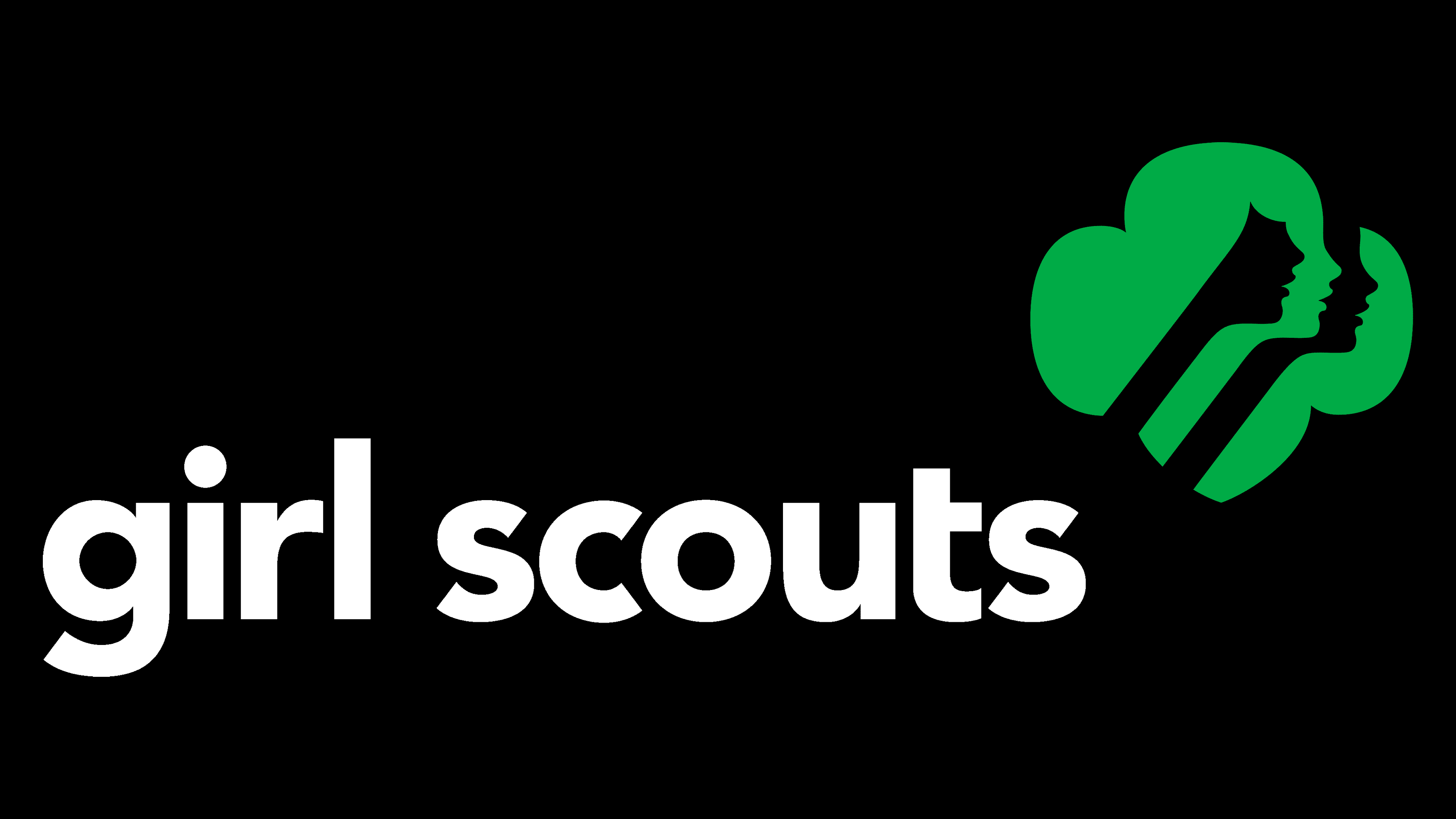
The current logo was introduced in 2009 as part of a new development strategy. This modernization occurred shortly before Girl Scouts’ centenary and was intended to bring the brand closer to modern standards. Identity modernization is aimed at the younger generation. Its goal is to attract girls’ attention to relevant events and to interest them enough to join the organization’s ranks.
The marketing department entrusted the redesign to the Original Champions of Design agency. Bobby Martin and Jennifer Kinon led the process, working with two illustrators: Jasper Goodall and Joe Finocchiaro. They decided not to deviate from the original Saul Bass concept but only to slightly update the outdated elements.
The artists changed the shape of the stylized shamrock, making it symmetrical and adding a semicircular bang to one of the girls. On all three faces, the noses and chins have become larger to match the scouts’ actual appearance. The necks are straightened, and the lips are enlarged. The underside of the leaf has a slight sharpening and now resembles a heraldic shield.
The shamrock is located in the upper right corner of the inscription, which has also noticeably changed. The designers chose a new sans-serif font (Avenir Black) for the organization’s name, repainted the phrase in black, and converted all letters to lowercase.
2021 – today
![]()
The Girl Scout organization received a logo with a badge reminiscent of the 1920s variant. This is a cloverleaf with three petals, from which the images of women’s faces in profile have disappeared. Moreover, the designers rounded the lower part like another sheet fragment. The inscription is enlarged, so the clover looks small.
Font and Colors

The main element of Girl Scouts’ identity has always been the shamrock. The creator of the scout movement, Robert Baden-Powell, claimed that this symbol is associated with the Pole Star: in ancient times, it was used to represent a compass needle pointing north. It can be interpreted as a guiding sign that leads in the right direction. In the modern context, each leaf of the shamrock embodies the scout’s oaths: to abide by the organization’s laws, to rescue in times of difficulty, and to serve their country.
![]()
The designers have slightly modified the Avenir Black font to better match the current logo. They removed the left side of the horizontal stroke from the “t,” so there is approximately the same distance between all the letters. Using lowercase letters helps make Girl Scouts’ name both friendly and trustworthy.
The organization’s main colors and symbols are green, white, and black. Green must be a bright shade (#00AE58), which became a brand after the 2009 redesign.
FAQ
What is the official Girl Scout symbol?
The trefoil is the official symbol of the Girl Scouts. It consists of three leaves and symbolizes the Girl Scout promises: to serve God and country, to help people at all times, and to live by the Girl Scout Law.
The trefoil has been important to the organization since its founding over 100 years ago. It unites former and current members through its history. The design is simple but meaningful, reflecting the core principles that guide Girl Scouts.
What does the Trefoil stand for?
The trefoil symbolizes the Girl Scout promises: to serve God and country, to help people at all times, and to live by the Girl Scout Law. The logo has been updated to give the brand a new and modern look, making it more appealing to young girls from diverse backgrounds. The new design reflects a more inclusive approach and better suits the interests of today’s young women.
What does the Girl Scout logo mean?
The logo includes a stylized trefoil, symbolizing the brand’s three key principles. These principles are adherence to Scout rules, which determine members’ behavior and activities; always helping others, which is central to the organization’s focus on community service and altruism; and service to God and country, which shows the organization’s commitment to patriotism and spiritual development.
Who designed the Girl Scouts logo?
The logo was first changed in 1978 by Saul Bass, a renowned graphic artist. This update gave the brand a more modern and impressive look.
In 2010, the logo was revised again to meet modern design trends. The update was completed by Original Champions of Design, a firm known for its branding expertise. They built on Bass’s original work, adapting the design better to suit the brand’s evolving image and goals.
Can you use the Girl Scout logo?
To use the Girl Scout logo, you must obtain permission from the organization. Send a detailed request to trades@girlscouts.org describing how and where you plan to use the logo. You can contact your nearest organization office for assistance in this process. Following these steps is crucial to ensure your logo complies with brand guidelines and legal requirements.
Is there a Girl Scout organization?
Yes, the Girl Scouts was founded in 1912 in Savannah, Georgia, and received official recognition from the US Congress in 1950. It has more than 2.5 million members, including girls and adult volunteers. The organization empowers young women by teaching important life skills and promoting community, leadership, and service. Its large membership demonstrates its significant and lasting influence in the United States and worldwide.