The UNICEF logo demonstrates the care and protection of all children and mothers around the globe. “All babies on the planet should be surrounded by love and live in a safe world,” the emblem states. The organization promises to do everything possible for this.
UNICEF: Brand overview
| Founded: | 11 December 1946 |
| Headquarters: | New York, U.S. |
| Website: | unicef.org |
Meaning and History
The individual logo of an international organization was officially approved in 1985. It reflects the noble cause of the company. Therefore it consists of two thematic parts: a graphic sign and a text.
Mother and baby are a symbol of motherhood and an inextricable unity between them. A woman holds a child in her arms, lifting it high above her head. The olive wreath has two meanings. The first is the distinctive sign that was awarded in ancient Greece as a prize for a victory. The second is the symbol of peace that has come down to us from the Bible.
What is UNICEF?
It is the successor to ICEF. This organization assists children and adolescents, including migrants, refugees, and people with disabilities. She fights for gender equality, ecology, affordable health care, and education.
1946 – 1953
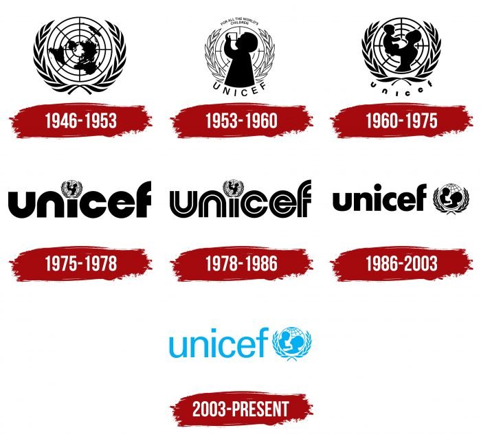
The first emblem represents the Earth in the form of a cartographic designation – a top view from the side of the North Pole. The continents are located on a circular grid of parallels and meridians. Moreover, the transverse and longitudinal stripes form a kind of target, as for shooting ranges. The continents are presented in the form of black blurred silhouettes with indistinct outlines. Around the circle is a wreath of two branches of a laurel tree – the leaves are elongated, narrow. There are six pairs in total on each side and two unpaired at the top and bottom.
1953 – 1960
After updating the logo, it became more specific. Against the background of intertwined parallels and meridians, a child drinking water from a glass is depicted. The leaves from the wreath became contoured rather than completely colored as before. Above (above the circle), the phrase “FOR ALL THE WORLD’S CHILDREN” appeared. At the bottom is the name of the world organization. Capital letters, grotesque.
1960 – 1975
After the organization shifted its key focus, it changed its logo. The image now shows a mother holding the baby in her outstretched arms. She lifted him above her head and looked into his face. The silhouettes are painted black like the rest of the logo. The lines are smooth, rounded, without sharp transitions and corners. The designers removed the inscription at the top but left the bottom one, changing the font style.
The letters are now bold, with a wide inter-character space. They look lowercase, but this is just an illusion – the characters remain uppercase, except for the “e.” Moreover, “u” and “n” are made identical – they are as similar as possible in shape; they are arranged in a mirror image as if inverted relative to each other. The “c” and “e” also emphasize the similarity, for which the developers have made the crossbar “e” invisible. “F” has a shortened right half, so it is perceived as narrow.
1975 – 1978
The designers kept all the existing logo elements but rearranged them. They shrunk the circular icon with the silhouettes of the earth, mother and child, and enlarged the text portion. To add originality to the emblem, experts used the icon as a dot above the letter “i.”
1978 – 1986
In 1978, the main change was in the letters. The authors made them double: two wide stripes appeared in each symbol, which duplicated each other. The only exceptions are “e” and “f”: they have a different structure. The first is formed from a single branched line, and the second is composed of three separate segments.
1986 – 2003
The debut emblem shows the name of the organization, executed in wide bold lowercase letters. They are rounded and streamlined, so the “u” has no stem, the edges of the “c” are clipped, and the “f” lacks some of the horizontal strokes. The dot above the “i” is as large as possible, so it looks disproportionate.
The graphic part consists of a globe with meridians and parallels, against which the mother holds the child and looks into his face. Due to the dark color, the images appear silhouette, as if they are shadows. A wreath of two olive branches frames the image. To the right of the picture is the word “UNICEF.”
2003 – today
The modern version has changed color: from black to blue. The arrangement of the elements has been preserved, as is the form of the graphic symbols. But the inscription has been updated. The designers used a thin classic font, so all the letters got the correct spelling – with missing legs and a complete piece of the crossbar.
UNICEF: Interesting Facts
UNICEF is a key part of the United Nations that helps kids worldwide by providing aid and support to improve their lives.
- History: It started on December 11, 1946, to help children affected by World War II by offering them food and healthcare.
- Nobel Peace Prize: UNICEF won this prestigious award in 1965 for promoting peace and improving conditions for kids globally.
- Became Permanent: Initially set up for temporary relief, its success made it a lasting part of the UN in 1953.
- Immunization Effort: In the 1980s, UNICEF aimed to vaccinate all kids. By 1990, 80% of children worldwide were getting vaccinated.
- Children’s Rights: UNICEF played a big role in creating the Convention on the Rights of the Child in 1989, the most agreed-upon human rights treaty ever.
- Fundraising Cards: UNICEF started selling greeting cards to raise money. The first card was by a girl helped by UNICEF after the war.
- Famous Ambassadors: Celebrities have been used to raise awareness, starting with Danny Kaye in 1954 and later stars like Audrey Hepburn and David Beckham.
- Supply Division: Located in Copenhagen, the world’s biggest humanitarian warehouse provides vaccines, medicine, and emergency supplies.
- Education Innovation: Partnering with Microsoft, they created the Learning Passport so kids can keep studying, even in hard times.
- Global Presence: In over 190 places, UNICEF focuses on helping needy kids, especially those facing the toughest challenges.
UNICEF’s dedication to children’s well-being has led to significant progress in health, education, and safety for kids everywhere. Its ongoing work is crucial for defending children’s rights and meeting their needs worldwide.
Font and Colors
The logo contains an image of the planet, which underlines the global nature of UNICEF’s mission: it helps children and women around the world. The globe also conveys the magnitude of her work, reaching every corner because there are no boundaries for an international charity.
The name has always been written in lowercase letters. The current typeface is reminiscent of Univers Light, developed in 1954 by Adrian Frutiger. They are sleek and simple sans serif marks. On the debut version, the inscription was bold, with wide, rounded letters.
The color palette of the emblem consists of blue and white. They serve a double function: they symbolize the sky with clouds and denote the founding organization because the United Nations’ official colors are light blue and white.
FAQ
What is the symbol for UNICEF?
The first brand logo shows a child drinking a cup of milk, symbolizing the organization’s main activity at the time: delivering milk to children. The logo features elements from the UN logo, such as olive branches and a globe.
The olive branches stand for peace, while the globe represents UNICEF’s commitment to helping children worldwide. The child drinking milk highlights the focus on improving children’s health and nutrition.
What font is the Unicef logo?
The font Unicef used for the logo is likely Univers Light, designed by Adrian Frutiger. Univers is a realist sans-serif typeface known for its clarity and legibility. Using Univers Light gives the logo a clean, modern, and professional look, which aligns with the organization’s mission to help children globally.
What is the color of the Unicef flag?
The flag is cyan blue, with the UNICEF logo in white at the center. The cyan blue base symbolizes peace and calm, reflecting UNICEF’s mission to support and protect children worldwide. The white logo stands against the blue background, making the organization’s name and emblem easily recognizable. This design represents peace, clarity, and the organization’s global mission to help children.
What does the UNICEF logo mean?
The logo carries deep meaning through its elements. The image of a mother with a child symbolizes care and protection, reflecting the organization’s mission to support and nurture children worldwide. The globe signifies UNICEF’s international reach and commitment to helping children everywhere. The two olive branches represent peace and highlight the organization’s relationship with the United Nations, which uses olive branches in its emblem.
What is the UNICEF slogan?
The company slogan, “For every child,” captures the organization’s core mission. This slogan reflects UNICEF’s commitment to helping all children, regardless of their background or circumstances. It emphasizes the organization’s dedication to ensuring every child can access care, support, and opportunities to thrive.
The slogan aligns with the brand’s mission to provide essential services like education, healthcare, and protection. It highlights the belief that every child deserves a fair chance in life. This simple yet powerful phrase guides the company’s efforts, showing its resolve to advocate for children’s rights and address challenges that prevent them from reaching their potential.
Who started UNICEF?
Representatives of the United Nations General Assembly started UNICEF to help children affected by the war. The organization was led by bacteriologist Ludwik Rajchman, who is called the “father” of UNICEF.
Rajchman played a crucial role in shaping UNICEF’s mission and structure. His leadership established the organization as a key agency dedicated to improving children’s lives worldwide. Under his guidance, the organization began providing children with food, clothing, and healthcare in post-war Europe.
When was UNICEF founded?
UNICEF was founded on December 11, 1946, during the difficult times following World War II. Representatives of the United Nations General Assembly recognized the need to help vulnerable children. The organization initially focused on providing children with food, clothing, and healthcare in post-war Europe. Over time, the organization expanded its mission to support children’s rights and welfare globally.
