


![]() UN Logo PNG
UN Logo PNG
The UN logo is a sign of victory. The organization’s focus is on the oceans and continents; it surrounds the entire globe with care and attention. The emblem conveys the association’s main goal: maintaining peace, health, and prosperity on the planet.
The United Nations grew out of wartime diplomacy, not only the 1945 founding date. The League of Nations’ failure shaped the plan. Created in 1919, the League failed to stop aggression in Ethiopia and China, and in Germany, while the United States never joined. The Allies wanted a new body with real authority and the participation of major powers.
On January 1, 1942, 26 countries fighting the Axis signed the Declaration by the United Nations in Washington, using a phrase coined by Franklin Roosevelt. In 1943, the USSR, the United States, and Britain agreed on basic principles in Moscow. In 1944, delegations from the United States, USSR, Britain, and China drafted the charter at Dumbarton Oaks. The veto issue was settled at Yalta in February 1945.
The San Francisco conference opened on April 25, 1945, before Germany’s surrender. Delegates from 50 states worked for two months. Smaller countries secured equal voting rights in the General Assembly. The charter was adopted on June 26, 1945, and the UN officially came into force on October 24, after ratification by the permanent members of the Security Council and most signatories.
Cold War rivalry shaped the early UN, with the United States and the USSR often wielding veto power. In 1948, Eleanor Roosevelt led efforts on the Universal Declaration of Human Rights, and the Genocide Convention was adopted that year. UN peacekeeping began during the Suez Crisis in 1956. Decolonization expanded membership in the 1960s; China’s Security Council seat was passed to the People’s Republic of China in 1971; and after 1991, peacekeeping grew sharply. By the mid-2020s, the UN had 193 member states.
Meaning and History
![]()
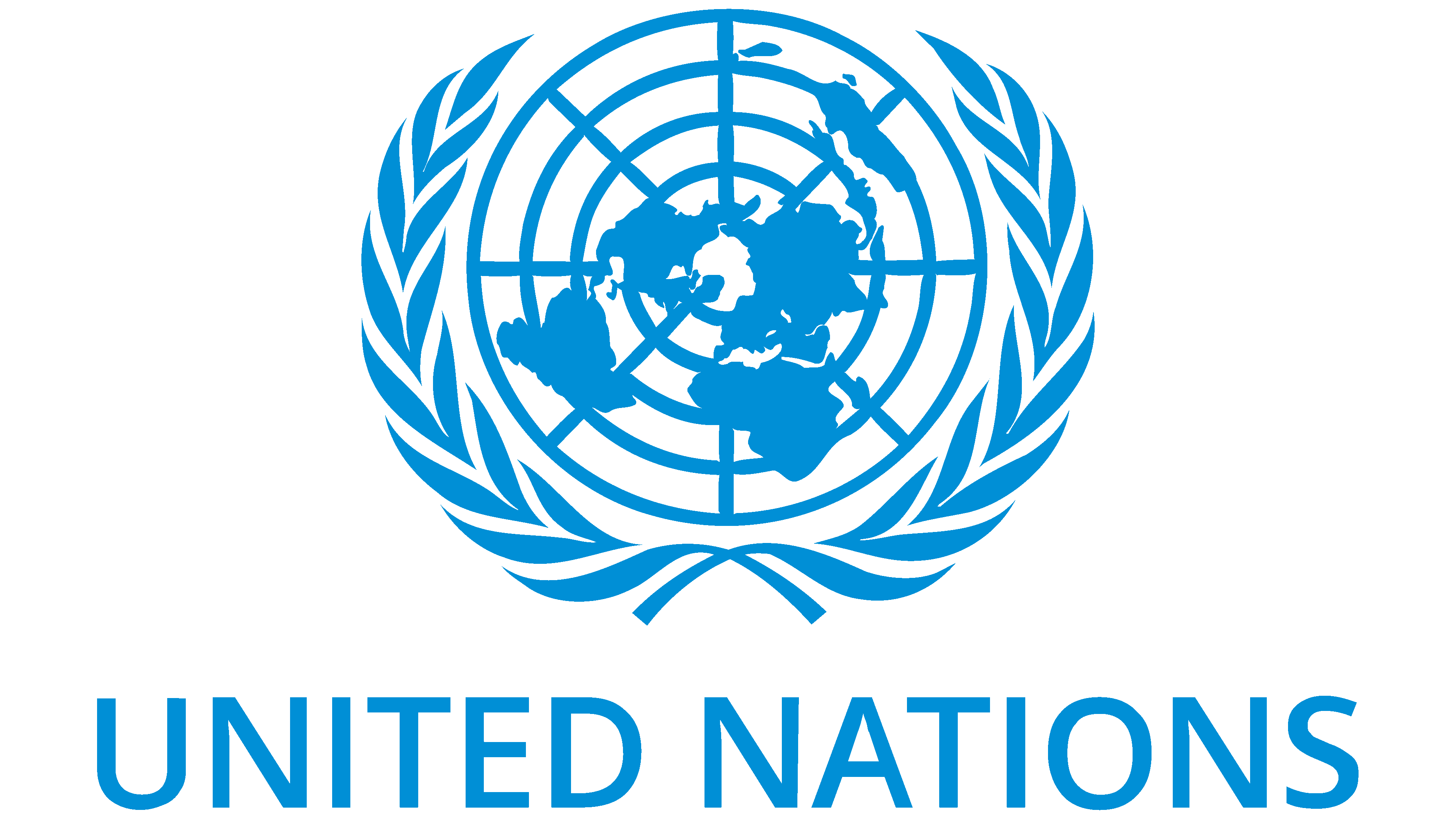
The United Nations has had 51 members since 2011; another state has joined the list: South Sudan. In total, the council comprises 193 people representing most sovereign countries. According to the rules, they are engaged in protecting people’s rights, providing humanitarian assistance, maintaining peace, and monitoring the observance of international rights.
To better manage processes and track progress, the organization has created six key bodies, several committees, funds, and programs. The official languages of the UN are Arabic, Chinese, English, Russian, French, and Spanish. The emblem of the intergovernmental organization was adopted along with the charter. A team of professionals led by Oliver Lincoln Lundquist, an architect and industrial designer, tried to reflect the core missions of the global service. There are two United Nations logos in total.
1945 – 1946
![]()
The debut version is a flat projection of the globe. The view is directed from above, from the side of the North Pole. The continents that are closely located radiate from it in all directions. This view of the planet is associated with the desire to show that all countries are interconnected and close to one another, sharing common interests. In the original version, the map extends to the 40th parallel south.
The outlines of states are schematic, without a gradient overlay; they are white inside with a black outer outline. The background is a ball with three concentric circles inside and eight meridians, which diverge from the center in different directions. The indents between the parallels are wide. Generally speaking, the first logo is very similar to a target for shooting or playing darts, both in structure and color. The symbolic globe is surrounded by two branches of a laurel tree, collected in a classic wreath. It consists of six paired leaves on each side and one single leaf at the top.
1946 – today
![]()
After only one year, the debut emblem underwent some adjustments, as its shortcomings became apparent. So, the designers changed the viewing angle, depicting the planet not up to the fortieth but up to the sixtieth parallel. This made it possible to slightly increase the viewing area, allowing the continents to be seen much more clearly. Such a measure led to the appearance of another concentric circle, so now the whole world is visible on a flat map.
According to cartography, the authors made the meridians (there are eight) and parallels (now there are five) wider. They also painted them black, like the rest of the land, leaving only the body of water white. The laurel wreath also turned black. The developers have corrected it, making the edges of the leaves smooth and even. They expanded the centers of the concentric circles to make them look like full circles rather than big dots.
Font and Colors
Elements of the UN logo are used in the identity of all its organizations and committees. This emphasizes their connection and reflects the main mission: cohesion, cooperation, unity.
The basic emblem has no inscriptions; it has only a graphic element. The term refers to the six governing bodies that make up the United Nations’ structure. But sometimes, the mark is supplemented by the name created by the Roboto typeface.
![]()
In the modern version, in addition to white and black, the blue color of our planet’s natural shade, visible from space, also appears. The authors advise choosing blue under code #009edb or Pantone 2925.