The sign of the fund contains a lot of care and love for wild nature. The WWF logo is like an invisible question that makes you wonder if we are doing enough for the safety and preservation of the planet’s biodiversity. Can we look into the eyes of our lesser brethren without shame?
WWF: Brand overview
| Founded: | 29 April 1961 |
| Headquarters: | Gland, Vaud, Switzerland |
| Website: | wwf.panda.org |
Meaning and History
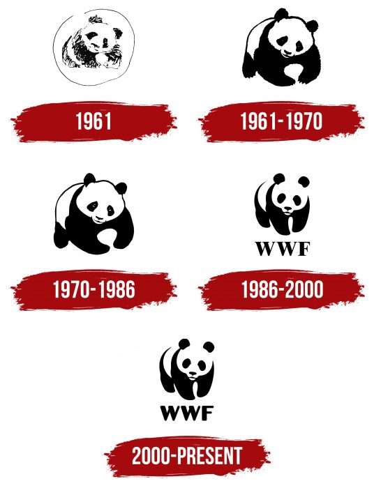
Immediately after the foundation of the fund, the management chose a symbol. A rare animal was proposed for the role of a mascot. It perfectly reflects the main goal of the organization – the protection of wild animals that are in danger of life and extinction. The prototype of the sign was a real animal – a panda named Chi-Chi, who arrived at the London Zoo in 1961. Its silhouette is the only logo of the charity. Over the years, the emblem has undergone several changes.
What is WWF?
WWF is the old abbreviation of the international environmental organization World Wildlife Fund, which everywhere (except the USA and Canada) is called the World Wide Fund for Nature. It was founded in 1961 to address issues of minimizing human impact on nature. The organization’s headquarters are located in Switzerland.
1961
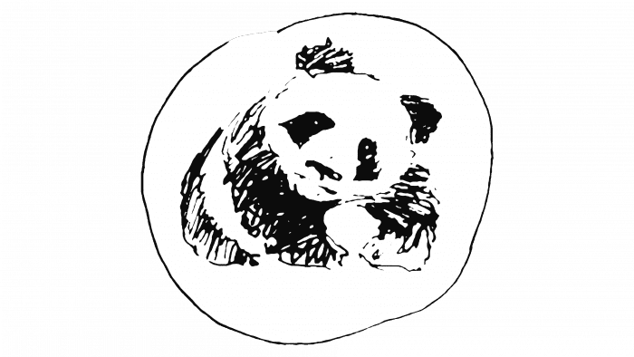
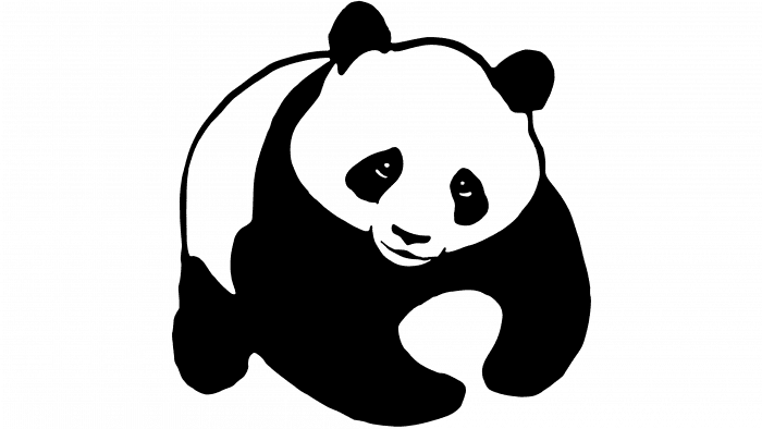
In the initial version, a panda is drawn. The style is schematic; the contour, like the animal, is already in the process of extinction, so it was hastily sketched on paper while it was still visible. The cute panda is taken in a circle as if surrounded by care.
1961 – 1970
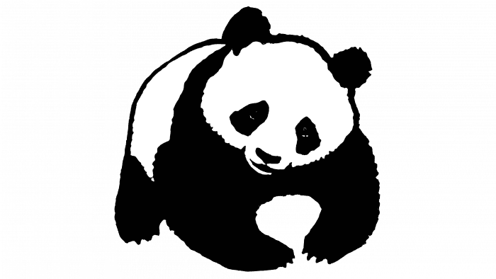
In the same year, designers presented the second version of the logo. They enlarged the image, gave it detail, and removed the circle.
1970 – 1986
In 1970, the name of the organization was changed: “for nature” was added to the “World Wildlife Fund.” In connection with this, the logo was revised. The panda has sad eyes, looking directly at the surroundings. The animal’s claws were removed to emphasize helplessness and defenselessness.
1986 – 2000
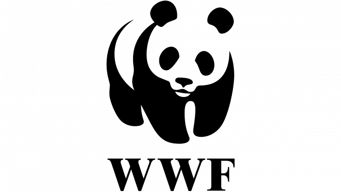
The animal is depicted standing on all fours, and the abbreviation of the charitable fund – “WWF” – is placed under the drawing. The eyes are not visible: the artists left only the characteristic black spots.
2000 – today
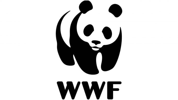
The abbreviated name of the organization was added to the existing image in a different font.
WWF: Interesting Facts
The World Wildlife Fund (WWF), also called the World Wide Fund for Nature in some places, is a big group that works hard to protect nature and animals worldwide.
- How It Started: In 1961, some people who cared about nature, including a scientist named Sir Julian Huxley and a conservationist named Sir Peter Scott, started WWF. In Canada and the U.S., it’s still called the World Wildlife Fund.
- Panda Symbol: The WWF logo shows a giant panda inspired by a panda named Chi-Chi that came to the London Zoo in 1961. They chose a panda because it’s easy for people everywhere to recognize, and it shows the importance of saving animals.
- Working Worldwide: WWF works in over 100 countries and has more than 5 million people supporting it. They have many offices working on many projects to help nature and animals.
- Important Projects: WWF has undertaken many big projects to save different animals and places since its start. They’ve helped protect special areas, save endangered animals, and bring some back to where they used to live.
- Earth Hour: WWF started Earth Hour in 2007. It’s a time when people turn off lights they don’t need for one hour on the last Saturday in March to show they care about our planet.
- Living Planet Report: WWF produces a major report on the health of the world’s animals and nature, showing how human actions affect them.
- Supporting Big Goals: WWF supports the United Nations Sustainable Development Goals, which are about protecting the environment and ensuring we use nature in a way that we can continue to do in the future.
- Using Technology: WWF uses new tools like satellites to watch over nature, tags to follow animals, and apps to help people learn about and save nature.
- Working Together: WWF works with governments, businesses, other groups, and people to reach their goals. Working together helps them do more for nature.
- Helping Indigenous Peoples: WWF knows that Indigenous peoples play a big role in protecting nature. They work to ensure that these communities are respected and can help care for their lands.
WWF is known and respected worldwide for its work to save nature. By using science, new ideas, and help from people everywhere, they’re making a big difference in protecting our planet for the future.
Font and Colors
Since the launch of the project, the panda is the only image on the logo. It was proposed by Peter Scott. He admitted that he chose this animal because of the black and white spots to reduce printing costs.
The first text appeared on the WWF emblem in 1986. It was a classic font with clear capital letters and serifs. The current version uses a smooth font resembling Zar Brush Gothic Regular. The palette has always remained unchanged: it represents the natural black-and-white color of the panda.
WWF color codes
| Black | Hex color: | #000000 |
|---|---|---|
| RGB: | 0 0 0 | |
| CMYK: | 0 0 0 100 | |
| Pantone: | PMS Process Black C |
