


![]() GSK Logo PNG
GSK Logo PNG
The GSK logo is associated with medicines, but it contains nothing that hints at healthcare. It has a neutral design with no obvious symbols. The emblem became recognizable only thanks to the pharmaceutical company that owns it, and now a strong bond has been established between them.
GSK’s history goes back to 1715, when Silvanus Bevan opened a small pharmacy in Plough Court, London. That business later became Allen & Hanburys. In the United States, John K. Smith opened a drugstore in Philadelphia in 1830. His brother George later joined, and in 1865, accountant Mahlon Kline entered the business that became Smith, Kline & French.
Another branch began in 1842, when Thomas Beecham started selling laxative pills in Lancashire. By 1859, Beecham had opened a factory in St Helens. In 1880, Henry Wellcome and Silas Burroughs founded Burroughs Wellcome & Co. in London, where they developed pressed tablets under the Tabloid trademark and opened a research laboratory in 1894.
Glaxo came from a different origin. In 1904, Joseph Nathan & Co. began selling infant milk powder under the Glaxo name in New Zealand. The company later moved into vitamins and pharmaceuticals, was listed on the London Stock Exchange in 1947, and acquired Allen & Hanburys in 1958. In 1969, Glaxo launched Ventolin, followed by Zantac after a 1978 US patent for ranitidine. By 1988, Zantac had become the world’s top-selling prescription drug.
The modern group was formed through major mergers. SmithKline Beckman and Beecham Group merged in 1989 as SmithKline Beecham. Glaxo bought Wellcome plc in 1995 for about £9 billion, creating Glaxo Wellcome. In December 2000, Glaxo Wellcome and SmithKline Beecham completed a $70 billion merger, forming GlaxoSmithKline. Later moves included ViiV Healthcare’s acquisition by Pfizer in 2009, the acquisition of Human Genome Sciences in 2013, and the 2022 separation of Haleon from GSK’s consumer health business.
Meaning and History
![]()
The concern’s logo, if it changed, strove for ever more minimalism each time. This is due to the growing worldwide fame. As a result, only three letters were enough to recognize the company.
What is GSK?
One of the ten largest pharmaceutical companies in the world, founded in 2000 in the UK, develops, produces, and sells medicines and healthcare products.
2000 – 2014
![]()
The first logo consisted of a large, bright visual sign with an abbreviation inside and an additional inscription on the right.
The main element of the emblem is triangular with streamlined, rounded corners. It symbolizes:
- Tablets are the corporation’s main product.
- The heart is the source of life and health. As long as the heart beats, a person is alive. GSK, like the heart, is a source of healing. The company’s products prolong life and improve health.
- A plectrum helps to create a clear, beautiful sound of a stringed instrument. Health is a sensitive and subtle instrument. The company is fixing it. And when everything works correctly and harmoniously, then waves of joy and happiness come from a person.
- An egg is a symbol of life.
- An amulet is a hint of protection and memory. GSK is always there and ready to help at any moment. The yellow dot near the letter K resembles a hole for a thread or chain, further enhancing the similarity.
Inside the heart is the abbreviation GSK in lowercase; outside the visual image, its decoding is added: GlaxoSmithKline, in a very small, thin font. The name in the logo conveys to customers information about the company’s impressive past and, therefore, its extensive knowledge and experience.
- Smith is the surname of an apothecary who registered a company in his name in 1830.
- Kline is the name of a pharmacist who became CEO of Smith in 1875, which led to the formation of Smith, Kline & Company.
- Glaxo is a trademark for the production of powdered milk, registered in 1906, and in 1947, it acquired a medical focus.
More than a century of heritage in the study of the logo is designed to inspire confidence in customers, but not to focus too much on themselves. This is indicated by the use of a very small font and the placement of the title at the bottom of the image.
The lowercase letters of the abbreviation convey the energy of service and care. The company does not put itself first. Her main goal is to make happy patients.
The open loop of the letter q, extending beyond the image, looks like a cardiogram line. GSK always keeps abreast. The company is open to innovation and actively engaged in research. 13,000 of its employees are working to create new drugs.
2014 – 2022
![]()
In 2013, the company licensed its HIV products and, in 2014, acquired Novartis’ vaccine business, moving away from cancer drugs. This changed the corporation’s main direction and led to a rebranding.
Futurebrand designed the updated logo. The designers did not make global changes but only slightly corrected the visual sign.
The inscription was removed from the emblem, leaving only the abbreviation. The corporation has reached a high level and brought many drugs to market, so the founders’ names, as indicators of experience, are a thing of the past. The letters GSK are recognizable on their own.
The monogram fits completely inside the heart, and “g” has a regular ponytail. The closed space shows that the company’s capabilities cover all stages of drug production, so there is no need to involve anyone from outside. The corporation also decided on a list of areas in which it will work in the future, leaving only the most interesting and profitable for itself.
The emblem has a gradient. The coloring makes it look as if the sun is shining on the logo in the top right. This shows that the company is approaching the luminary, and no competitors obscure it. GSK has reached such heights that it orbits the celestial sphere.
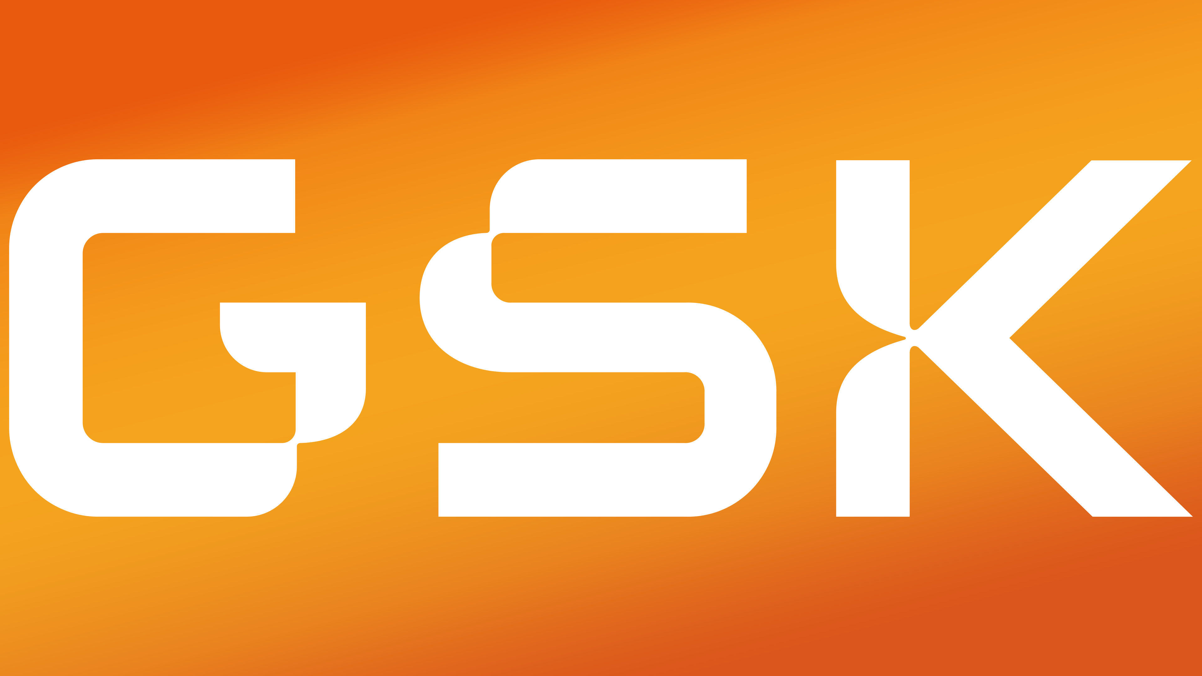
2022 – today
![]()
GSK split, creating Haleon as a subsidiary and bringing oral, pain, and antipyretic products under its wing. This helped further crystallize the conglomerate’s main areas of work. After the split, the corporate name was officially shortened to GSK, and the visual identity was updated.
The design studio Wolff Olins developed the new emblem. The heart background image has disappeared. Only three letters remained in the logo, which became uppercase.
Their font resembles an image on a scoreboard or monitor. The corporation keeps pace with the times. It is becoming more modern, its production processes are computerized, and the latest equipment is used. GSK is the company of the future.
Curls of letters look like DNA ribbons. The company penetrates the very essence of the disease and creates drugs that act at the molecular level. In its laboratories, GSK has unraveled the code of life.
Font and Colors
The main one for all logos is orange with a red-yellow gradient, and this is the color:
- Warmth, care, happiness.
- The flame that makes the corporation’s owners move forward, creating effective medicines.
- Health.
Red is a symbol of blood, and yellow is a symbol of joy and well-being. They are also closely related to health.
Using a gradient adds life’s energy to the logo and embodies bodily processes, such as chemical reactions and blood flow. The white color in the letters hints at medical gowns, sterility, and pills.
The logo font is unique and designed specifically for GSK Corporation.