


![]() Novartis Logo PNG
Novartis Logo PNG
The Novartis logo embodies lofty ideas. It demonstrates the corporation’s creativity and passion for its business. Operating with chemical formulas as notes, creating compositions that amaze with their harmony and possibilities.
Novartis was formed from three Swiss lines rooted in Basel. In 1758, Johann Rudolf Geigy-Gemuseus began trading dyes, chemicals, and medicines. In 1859, Alexander Clavel opened a dye works, which was later reorganized in 1884 as the Gesellschaft für Chemische Industrie Basel, with CIBA becoming the official name in 1945. Sandoz began in 1886 as Kern & Sandoz, and in 1917, Arthur Stoll created its pharmaceutical division.
During the 20th century, the companies expanded into medicine. Sandoz launched Melleril in 1958 and registered Sandimmun, a cyclosporine-based product, in 1982 for transplant medicine. Ciba-Geigy developed drugs in neurology and pediatrics, including Ritalin. Ciba and Geigy merged in 1970, while CIBA Vision was created in 1987 for ophthalmology. Roche grew nearby as a major Swiss competitor.
On March 7, 1996, Ciba-Geigy and Sandoz announced a merger, then the largest corporate deal of its time. Novartis, from the Latin “novae artes,” began operating on December 20, 1996, led by Alex Krauer and Daniel Vasella. Non-core assets were sold or spun off, including Ciba Specialty Chemicals.
In 2000, Novartis merged its agrochemical business with AstraZeneca’s to form Syngenta and listed shares on the New York Stock Exchange. In 2002, it created the Novartis Institutes for BioMedical Research in Cambridge, Massachusetts. The FDA approved Gleevec on May 10, 2001, after ten weeks of review. Novartis revived Sandoz for generics in 2003, acquired control of Alcon in 2010, sold its consumer business to GlaxoSmithKline in 2018, bought back its stake in Roche in 2021, and spun off Sandoz on October 4, 2023.
Meaning and History
![]()
After the merger, the new concern developed its own visual identity. It was changed only once and then only slightly.
What is Novartis?
The largest Swiss medical concern, with a turnover of 53 billion dollars, is part of the pharmaceutical federations of Europe and America. More than 104,000 employees work at the company’s facilities across 17 countries. The headquarters is located in Basel.
1996 – 2017
![]()
The company logo consists of a visual sign and an inscription.
The name Novartis is a union of two Latin terms: novae (new) and artes (art). It implies a creative approach to developing medicines, drawing on new developments and research results. The creation of tandems and combinations reveals the potential and possibilities of substances.
The name underscores that the company has several research institutes. An important area of research is genetic engineering. This makes it possible to create state-of-the-art drugs that act very selectively.
The large letters show the company’s scale, with 67 plants across different countries. It is considered one of the largest by market capitalization (it ranks 51st).
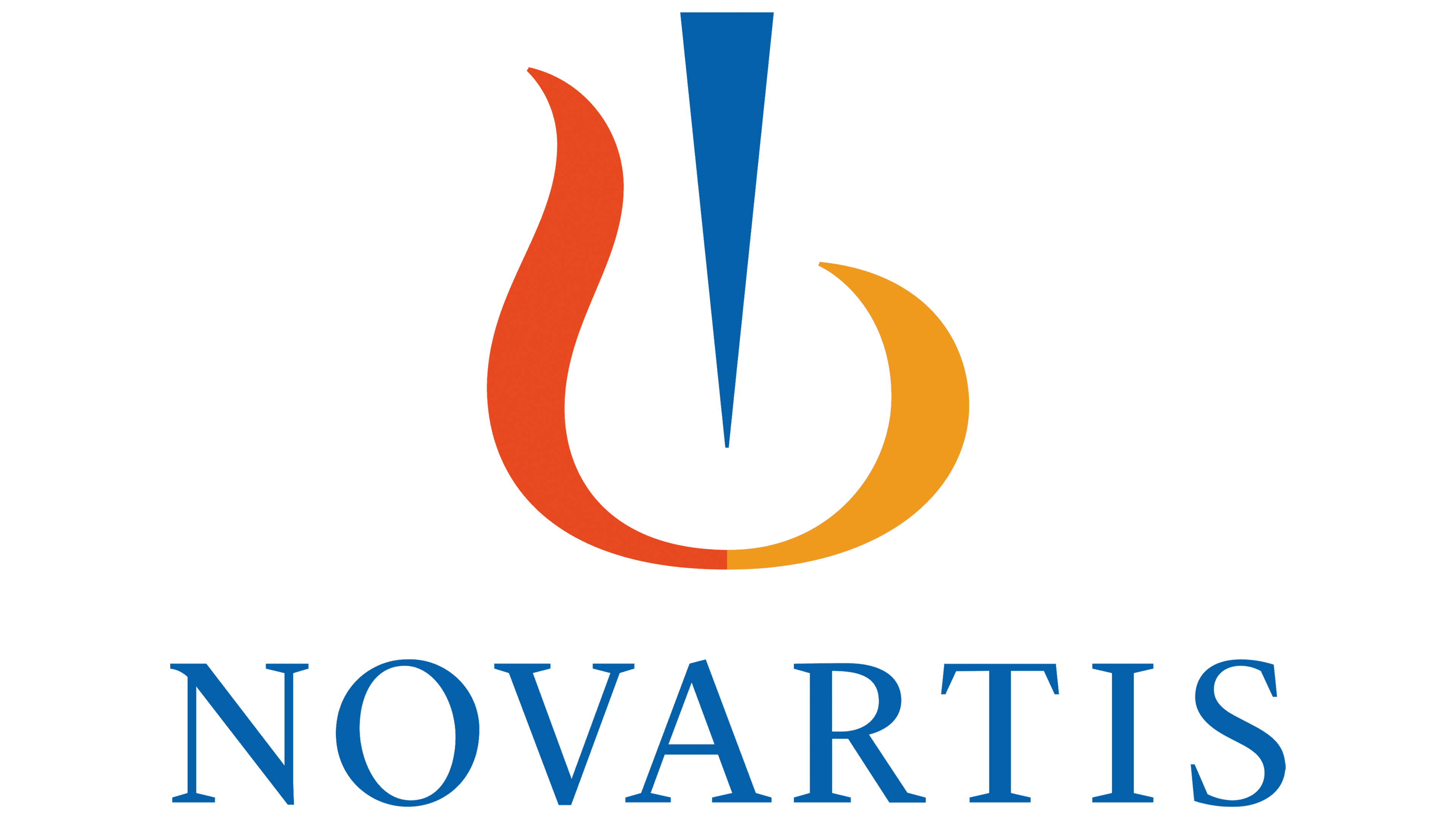
The sign in front of the inscription is schematic and has several meanings.
- Violin key. The key is a logical addition, given the connection between the corporation’s name and art. The red and yellow coloring of the image speaks of research and innovation.
- Flask. The chemical toolkit is a reference to the laboratories where new medicines are developed.
- Flame. Symbolizes the burning heart and the desire for development and creation. Fire supports life, just as Novartis works to preserve life on Earth.
- Harp. A musical instrument is also consonant with the corporation’s name. It allows you to create a melody with multiple strings, just as the company creates medicines from various substances.
The widely spaced letters indicate coverage across many areas of work.
2017 – today
![]()
The only change in 2017 was to the color scheme, which became lighter. The shades show the corporation’s commitment to new developments and research activities that make people’s lives easier. It allocates about 9 billion dollars a year.
The predominance of blue symbolizes concern for the environment and the implementation of environmental programs.
The letters of the name have increased in size and are closer together. The composition suggests a reduction in the number of lines of work. The company sold its Gerber and Nutrition baby food assets and said goodbye to its veterinary and vaccine divisions. It separated the production of over-the-counter drugs into a separate company. It shut down antiviral and antibacterial research. And concentrated on just three areas.
Font and Colors
The main colors of the logo are blue, red, and yellow. These are the three indispensable colors from which, by mixing, the other colors can be obtained. This choice underscores once again the company’s research direction.
- Red means burning, constant search, and love for what you do.
- Blue is deepening its presence in the world of innovation and modern developments.
- Yellow is the implementation of discoveries to improve people’s health.

The font is elegant, with Trajan Bold serifs.