Processes and technologies are at the mercy of the company. The Pfizer logo conveys the idea of progress through rotating elements. The emblem alludes to DNA strands and works with biomaterial, leading to the pharmaceutical industry’s improvement and development.
Pfizer: Brand overview
| Founded: | 1849 |
| Founder: | Charles Pfizer, Charles F. Erhart |
| Headquarters: | New York City, U.S. |
| Website: | pfizer.com |
Meaning and History
The logo of this company marks the boxes of many popular medicines because it independently derived their formulas, tested them, and put them into production. She has a list of permanent medicines in huge demand and consistently brings in multi-billion dollar revenues. Before such success, it went on a thorny path, starting in 1849, when it was opened by two cousins who arrived in the United States from the German city of Ludwigsburg.
In its early years, the business focused on producing chemicals and was headquartered on Bartlett Street in Williamsburgh. There, Pfizer and Erhart produced santonin, an antiparasitic agent. But it was not he who led the company to popularity, but citric acid, manufactured in the 1880s. Business people used all their profits to expand laboratories, offices, and industrial sites, having firmly established themselves in Brooklyn and neighboring areas. However, in 2009, the factory there closed, and the company moved to Clinton Hill.
In 1906, when Charles Pfizer died, the corporation’s income exceeded $3 million. She went through hard years during World War I when the channels for supplying raw materials from Italy to produce main products were blocked. Then the experts set about their developments and began to look for an alternative in chemical formulas.
Further, the company’s activities progressed by leaps and bounds: it conducted research, made discoveries, and provided the world with ever more advanced medicines. To reduce the cost of production, the company launched its branches worldwide. The list of areas in which she worked has also expanded. So, experts became interested in fungal and heart diseases, offering innovative drugs. During the coronavirus pandemic, Pfizer was one of the first to create and release a vaccine against COVID-19.
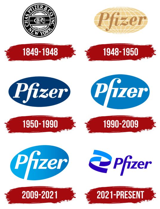
The company has changed logos throughout its history to remain visible among many competitors. Because visual recognition comes first, and only after that is an interest in products, she carried out the last identity update in 2021, introducing the newest cure for coronavirus infection.
1849 – 1948
Initially, the company was called Charles Pfizer & Co., Inc. That is what was reflected in the emblem. A rectangle occupied the central part with a monogram formed from the first letters of each word in the name. A wideband surrounded the monogram with an expanded version of the name. Below was an indication of the company’s location – “New York.” The letters were in capitals. The color of the ornate logo is black and white.
1948 – 1950
After renaming Pfizer Corp., the pharmaceutical company has changed the emblem to match modern times. To do this, the designers simplified the visual identity sign by using an oblate globe with meridians and parallels as a background. It symbolizes the global demand for medicines as the company expanded to its centenary, opening offices in many countries worldwide.
The inscription was in the middle. It was large, lowercase, italic, but incoherent (each letter stood separately). The “f” and “r” had large dots instead of serifs. Moreover, the first of them had a point in common with “i.” The lines of latitude and longitude were painted in white, the planet in light beige, close to gold, the corporation’s name in dark beige. That is, it was the first color logo.
1950 – 1990
Two years after the approval of the new identity style, Pfizer again decided to redesign the logo. It was all about the color because beige was unsuitable for a medical products company. Then the management chose blue. Since then, it has become the official color of the corporation. The developers completely flooded the background with them, turning the flattened globe into an ordinary oval. The name was given a white color to better stand out against a dark blue background.
1990 – 2009
The updates made before the beginning of the millennium concerned the letter part. In the new version, the lowercase “f” was elongated so that its leg connected with the edge of the oval and interrupted at the bottom. In addition, designers from Enterprise IG used a different font – strict, geometric, with clear lines and angles. The only thing that was left from the previous inscription is the large dots at the top of the “f” and “r.” The developers lightened the dark blue color and expanded the oval.
2009 – 2021
The logo was redesigned by the well-known studio Siegel+Gale. She added a dark blue to whitish-blue gradient, rotated the ellipse diagonally, and modernized the lettering. As a result, the letters are thinner than in the previous version, the “e” has a rounded style, and the “P” and “r” have lost their short serifs.
2021 – today
At the beginning of 2021, a radical transformation of the Pfizer graphic sign took place: it abandoned the oval for the first time since 1948. The letters have acquired a dark blue color with a bias towards the neon spectrum. Moreover, the designers aligned the “z” and completely redid the “e,” using a variant similar to the one that was in the 1990th year. They placed the inscription on a white background.
In addition, a graphic element in the form of a spiral appeared in the logo. It resembles a DNA chain, emphasizing the corporation’s focus on innovative pharmaceutical and medical research. Curved ribbons are painted in two shades of blue: dark (like the current letters) and light (like the oval in the past logo).
Pfizer: Interesting Facts
Pfizer Inc. is one of the biggest pharmaceutical companies in the world, with over 170 years of history. It’s known for making a wide variety of medicines and vaccines.
- Start in 1849: Pfizer was created by Charles Pfizer and Charles F. Erhart, cousins from Germany, in Brooklyn, New York. They began with a $2,500 loan, making chemical compounds.
- Penicillin in WWII: Pfizer was key in making penicillin during World War II. They developed a new method that increased production, making it available for soldiers and saving many lives.
- Biotech Innovations: In the 1980s, Pfizer was ahead in biotechnology, using genetic engineering to make insulin and other medicines.
- Worldwide Operations: Operating in over 180 countries, Pfizer provides medicines for infections, cancer, heart diseases, and more, making it a well-known name in healthcare.
- Top-Selling Drugs: Pfizer has created drugs like Lipitor for cholesterol, which became the best-selling drug ever.
- Growing Through Acquisitions: Pfizer has grown by buying companies like Warner-Lambert, Pharmacia, Wyeth, and Hospira, adding many products to its lineup.
- COVID-19 Vaccine: Working with BioNTech, Pfizer developed one of the first COVID-19 vaccines approved for emergency use, playing a big part in fighting the pandemic.
- Sustainability Efforts: Pfizer is focused on sustainability and global health challenges, like fighting antimicrobial resistance and making vaccines more accessible in poorer countries.
- Research and Development: Pfizer spends billions on research and development to create new medicines and vaccines, staying at the forefront of pharmaceutical science.
- Helping Globally: The Pfizer Foundation supports global health initiatives, helping with disease prevention, education, and healthcare access for those in need.
Pfizer’s dedication to innovation, producing life-saving drugs, and tackling health challenges worldwide highlights its leadership in the pharmaceutical field.
Font and Colors
The ellipse version was created by Gene Grossman, who has overseen the branding of many international firms. He proposed to place the letters obliquely, occupying the entire space of the oval. The designer is also the author of the original “fi” connection in the form of a ladder: the flat crossbar “f” is extended forward so that it captures the point above the “i” and passes into the rest. In general, it looks like a syringe with a needle, which is very important for a drug manufacturer, so the unique combination is preserved on all corporate logos.
The typeface is individual: it was created from scratch based on a humanistic typeface with smooth lines. For a while, the strokes became sharp, but then they returned to a soft style. The color is also personal and is called Pfizer blue. Pantone Corporation specially designed it.
Pfizer color codes
| Medium Blue | Hex color: | #2b01bd |
|---|---|---|
| RGB: | 43 1 189 | |
| CMYK: | 77 100 0 26 | |
| Pantone: | PMS Violet C |
| Dodger Blue | Hex color: | #0090ff |
|---|---|---|
| RGB: | 0 144 255 | |
| CMYK: | 100 44 0 0 | |
| Pantone: | PMS 285 C |


