The emblem is based on love for patients and concern for their health. The CVS Pharmacy logo should show pharmacy customers that there are always life-saving drugs in the network. Symbols indicate the continuity of supply and attention to customers’ needs.
CVS Pharmacy: Brand overview
Meaning and History
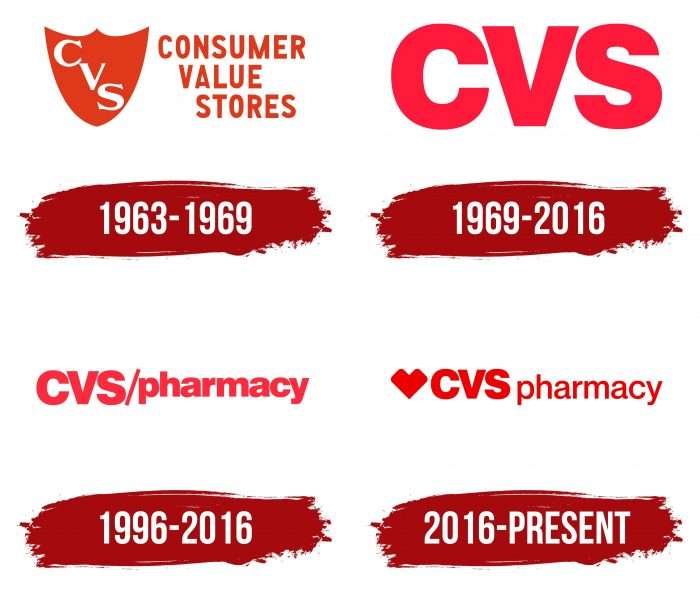
The original name of the pharmaceutical service was the Consumer Value Store. An abbreviated version was used a year after its appearance, in 1964. At that time in its network, there were already 17 outlets, and by the beginning of the 70s – 100. The company opened its first stores, combined with pharmacies, in Cumberland and Warwick, Rhode Island. This was in 1967. In 1969, it was bought by the now-defunct Melville Corporation, which invested a lot in developing CVS.
Currently, she sells not only generic and prescription drugs but other goods. Its range includes food, face and body care, color cosmetics, seasonal products, and more. Moreover, they are implemented in real life and online since the organization owns its online store. In addition, she provides healthcare services in her clinics and diabetes care centers. They all operate under one logo, the abbreviation CVS, and the red heart. The pharmacy chain has four emblems, two of which have been used in parallel.
What is CVS Pharmacy?
It is an American healthcare and retail corporation with its stores and clinics. The company was founded in 1963 and was originally called the Consumer Value Store.
1963 – 1969
The debut logo contains the full name of the company in two lines. The first row on the sign is occupied by “Consumer,” the second – “Value Store.” Nearby, on the right side, there is a graphic sign – a figure shield with a wide top and a pointed bottom, which already visually resembled a heart at that time. It contains three white serif letters – the abbreviation “CVS.” The inscription is located diagonally.
1969 – 2016
The company chose a different logo after changing the chain’s name to CVS Pharmacy. She preferred simplicity and minimalism so that nothing interfered with the visual perception of the sign. Therefore, the logo contains three red symbols—the abbreviated name of the trademark. Large letters do not have serifs—they are wide, smooth, and even.
1996 – 2016
Many years later, the management approved the logo, which echoes the new name and the network’s basic specialization. It consists of the original “CVS / pharmacy” in crimson. A thin slash separates the two parts. The first half of the logo is written in uppercase, and the second half is in lowercase.
2016 – today
The commercial and pharmaceutical network CVS Health received a new identity following the parent company’s name. The design now includes a miniature heart before the ‘CVSpharmacy’ keynote, where the developers removed the oblique line but returned the red color. The heart has a geometric shape and is distinguished by angular protrusions. This version was provided by the New York brand agency Siegel + Gale.
CVS Pharmacy: Interesting Facts
CVS Pharmacy, part of CVS Health, is among the largest pharmacy chains in the U.S. Founded in 1963 in Lowell, Massachusetts, CVS has transformed from a small store into a major health solutions provider.
- Name Meaning: CVS stands for “Consumer Value Stores,” reflecting its goal to offer value and convenience to customers.
- Growth Over Time: With its first store in 1964 in Rhode Island, CVS Pharmacy has grown to over 9,900 locations across the U.S., including Puerto Rico.
- No Tobacco Sales: In 2014, CVS became the first major pharmacy to stop selling tobacco products, a move celebrated for promoting health.
- MinuteClinic Services: CVS runs MinuteClinic, offering walk-in medical services like vaccinations and health screenings, making healthcare more accessible.
- CVS Health Merger: In 2007, CVS merged with Caremark Rx, enhancing its healthcare services and creating CVS Health.
- Eco-Friendly Efforts: CVS is committed to the environment and works on energy efficiency, waste reduction, and recycling.
- Digital Health Leadership: With tools like the CVS Pharmacy app, CVS leads in digital health, offering online prescription management and clinic services.
- COVID-19 Efforts: CVS played a crucial role during the COVID-19 pandemic by providing testing, vaccinations, and support for public health.
- Aetna Acquisition: In 2018, CVS Health acquired Aetna, aiming to offer integrated, affordable healthcare services.
- Store Innovations: CVS has tested various store formats, including CVS Pharmacy y más, to better serve the Hispanic community with specialized services and bilingual staff.
CVS Pharmacy’s transition from a small pharmacy to a healthcare giant shows its dedication to innovation, customer health, and adapting to healthcare needs. By focusing on wellness, embracing technology, and broadening its services, CVS Pharmacy has become a key player in American healthcare.
Font and Colors
Since the sign is the most important part of the sales service, emphasis was placed on it. For this, the owners chose simple lettering with minimal decoration. At first, it was a small shield, a diagonal oblique line, and now a heart.
Until 2016, a typeface from the Helvetica Black category was used, created by the studio Eduard Hoffmann & Max Miedinger and first published by Linotype. Then, each part of the name got its style: another one was added to the already-known font – Lubalin Graph, which is thin and has serifs.
The corporate palette throughout the history of modifications remained unchanged – it was red in several shades. Its background, as before, is a neutral white color.
FAQ
What does the CVS Pharmacy logo mean?
The logo features the iconic CVS Health Heart, reflecting the brand’s mission to shape the future of healthcare. The heart symbol is central in the logo, representing caring, compassion, and dedication to improving health. Its simple design makes it recognizable and understandable to people of all ages and locations. This aligns with the company’s goal of creating personalized healthcare. The logo design makes it easily recognizable and emotionally resonant in the healthcare industry.
Why is the CVS logo a heart?
The logo’s heart is a universally recognized symbol, reflecting the brand’s core values and mission. It symbolizes care and compassion. It embodies the brand values of honesty, caring, collaboration, and responsibility. This symbol represents the company’s commitment to improving healthcare and promoting a healthier future.
Did CVS change its logo?
Yes, CVS changed its logo as part of a broader effort to modernize its brand image and mission to improve healthcare. The most significant change was transitioning from a text logo to a graphic one with a new heart symbol.
This new heart logo is unique. It was created by combining two teardrop-shaped elements into a geometric, stylized heart. The heart symbol reflects the brand values of honesty, caring, cooperation, and responsibility. It evokes care and compassion, which are key elements of the company. The new logo is designed to be understood by everyone, bridging gaps between different age groups, geographies, and experiences.
Who created the CVS logo?
Siegel + Gale designed the logo as part of a rebranding effort to modernize the company’s image. The new logo features a minimalistic heart symbol that combines two elements in a teardrop shape. This bold and sophisticated heart design departs from the traditional heart shape. It conveys care and compassion, reflecting the brand’s commitment to improving health and well-being.
What is the CVS slogan?
The slogan “Health is everything” was introduced when CVS Caremark Corp. was renamed CVS Health. This slogan reflects the brand’s mission and focus on healthcare, demonstrating the company’s commitment to improving the health and well-being of its customers. It emphasizes that health is essential to a good quality of life. The rebranding positioned the company as a provider of comprehensive healthcare services rather than a pharmacy chain. The slogan reflects the brand’s commitment to being a trusted partner in the healthcare industry.


