A company, which combines the production of paints and pharmaceutical products, should have a universal emblem, not attached to a certain kind of activity. The AkzoNobel logo contains an abstract image – fresh, open, and friendly. It looks friendly and elevated and symbolizes the desire for continuous development.
Akzonobel: Brand overview
| Founded: | 1994 |
| Headquarters: | Amsterdam, Netherlands |
| Website: | akzonobel.com |
Meaning and History
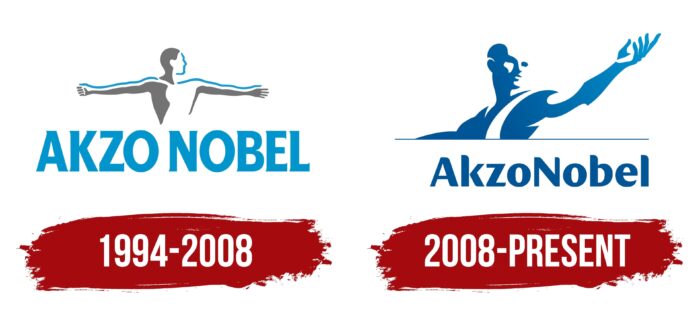
During the company’s entire existence, only two versions of the logo were presented. The basis on them is the same, namely, the figure of a man made in the style of sculpture, under which is the corporation’s name. Changes took place only in the figure’s appearance, its location in relation to the buyer, and the color palette. Interestingly, the AkzoNobel logo has a prototype. It is a Greek bas-relief sculpture. Today, it is in Oxford, in the Ashmolean Museum.
What is AkzoNobel?
First and foremost, it is one of the world’s leading paint manufacturers. Sales in 2020 were more than 8 billion euros. Also, the company has subsidiaries in many countries around the world.
1994 – 2008
The first version of the logo was presented immediately after the company’s foundation. Its author was the famous designer Wally Ollins, who worked for Wolf Ollins. The latter was not related to him, and the identical last names are nothing more than a coincidence. That said, his success in creating visual brand identities led him to become chairman of Saffron Brand Consultants, a popular consulting firm.
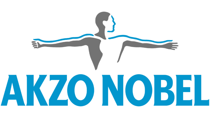
In creating the Akzonobel logo, he was assisted by Amsterdam-based illustrator Martin Rijven. A male figure, turned to face the viewer, was chosen as the basis. His face is turned to the left, and his arms are raised at shoulder level. The image is partially painted in gray, contrasting with the blue outlines that do not cover the entire figure. The face has no elements, but one can easily determine that it is a man. Both hands have five fingers each.
The brand’s name is made in a classic bold font without serifs using blue capital letters with a slight rounding. There is a small space between the parts “Akzo” and “Nobel,” which separate the parts. Together with the logo, the logo looks modern and progressive.
2008 – today
The redesign of the logo in 2008 is directly linked to the fact that AkzoNobel Corporation acquired the rights of a well-known chemical company ICI (Imperial Chemicals Industries). The decision to change was because the acquired organization had a fairly modern logo. Therefore AkzoNobel did not want to get lost in the visual identity against the background of a subsidiary company.
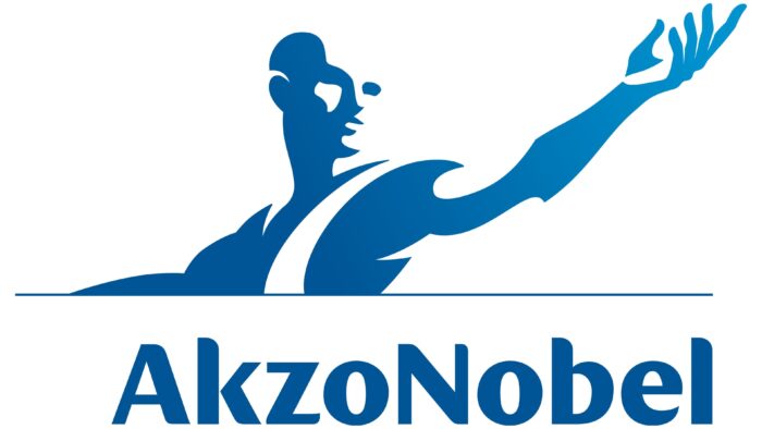
At this stage, the emblem takes on the more pronounced characteristics of a sculpture. The left hand is raised, while the right hand is partially closed at the bottom. This creates an association with scales. The man’s face is also turned to the left, and the use of a gradient of blue, and the presence of white, creates a sense of three-dimensionality. The corporation’s customers immediately see a reference to Greek sculptures. This choice aimed to show the company’s current achievements and aspirations for development in the future.
Changes were also made to the verbal lettering. There was no distance between the parts of the name at this stage. At the same time, the capital letters “A” and “N” clearly indicate the two parts. The typeface was significantly redesigned. It is a bold and modern sans serif style with rounded corners. All of the letters look playful and friendly. Like the entire logo, the overall wordmark was in navy blue instead of blue as in the original version.
Saffron handled the redesign. The slogan “Tomorrow’s Answers Today” is the basis for this version of the logo. Interestingly, the day of the release of the new logo in April 2008 led to a significant increase in the stock (by more than 3%).
Font and Colors
A classic sans serif font with rounded corners was chosen for the lettering. The name is not lost on the emblem’s background but complements it.
The corporation did not choose the white and blue color palette by accident. It perfectly matched the style of the “sculpture” and clearly showed Akzonobel’s customers the company’s prospects and growth and its prospects.
Akzonobels color codes
| Medium Electric Blue | Hex color: | #005596 |
|---|---|---|
| RGB: | 0 85 150 | |
| CMYK: | 100 43 0 41 | |
| Pantone: | PMS 301 C |

