


![]() Bayer Logo PNG
Bayer Logo PNG
The German concern, which produces a wide variety of products, is forced to use a universal emblem so that it fits all products. This explains why the Bayer logo is so neutral. On the other hand, it has hidden medical symbols that indicate the brand’s connection with pharmaceuticals.
Bayer began with coal tar chemistry and two kitchen stoves. On August 1, 1863, dye trader Friedrich Bayer and master dyer Johann Friedrich Weskott founded Friedr. Bayer et comp. in Barmen, now part of Wuppertal. Bayer handled sales and foreign contacts, while Weskott managed production and tested synthetic aniline dyes. The company started with three employees.
By 1881, after both founders had died, Bayer had grown to 300 workers and became Farbenfabriken vorm. Friedr. Bayer & Co. Chemist Carl Duisberg then built a research laboratory in Elberfeld, moving the company from dyes toward pharmaceuticals. In 1897, Felix Hoffmann synthesized acetylsalicylic acid, and in 1899, Bayer launched it as Aspirin. In 1912, the headquarters moved to Leverkusen.
Bayer also sold diacetylmorphine under the name Heroin from 1898, marketing it as a cough remedy before bans followed, including in the US in 1924. During World War I, Bayer worked on chemical weapons and later joined BASF, Hoechst, Agfa, and others in IG Farben in 1925. After World War II and the forced breakup of IG Farben, Bayer re-emerged in 1951 and became Bayer AG in 1972.
In later decades, Bayer built a global pharmaceutical and agricultural business. It held control of Agfa-Gevaert from 1981 to 1999, bought Schering AG in 2006 for about 17 billion euros, and developed CropScience. In 2018, Bayer acquired Monsanto for $63 billion, gaining Roundup but facing thousands of cancer-related lawsuits tied to glyphosate. By 2026, it had paid about $10 billion in settled claims.
Meaning and History
![]()
The company has changed its logo many times. However, after the emergence of the cross-shaped idea at the end of the 19th century and the beginning of the 20th century, it has remained on the emblem and has become a real trademark of the brand.
What is Bayer?
A large holding was founded in Germany in 1863. It produces fertilizers, medicines, paints, cosmetics, and dietary supplements.
1881 – 1886
![]()
The production opened in 1863 and consisted of 3 people. It was not until 1881, when the company became a joint-stock company, attracted third-party capital, opened branches in America and Russia, and grew to 100 employees, that the first logo was created. Its regal features predicted a great future for the enterprise.
The emblem is shaped as a heraldic shield. Its image is inextricably linked with the coat of arms of Elberfeld, the city where the company was formed. On the shield in the center is a rising two-tailed lion. He holds the bars with his paws. On it, according to legend, a saint who later became the city’s patron was martyred. The lion symbolizes the spirit’s victory over death and torment. It indicates the company’s firmness and reliability.
At the very top of the logo is a heraldic ribbon. On it is a part of the enterprise’s name, indicating the occupation: Farbenfabriken (paint factory). And below the lion, the continuation of the name simultaneously indicates the company’s founder: Friedr. Bayer (Frederick Bayer).
1886 – 1895
![]()
It was decided to incorporate pharmaceutical preparations into the dye production process and to reflect this in the logo. However, the desire to put as much information as possible on the emblem made it very busy and unclear.
At the base of the image is a plant branch that indicates the presence of pharmaceuticals. Its leaves and berries are twisted into a wreath.
Inside, surrounded and partly covered with leaves, is the coat of arms of the city of Elberfeld. Its location at the heart of the composition is a prototype of the origin and the central place from which the company’s products are distributed worldwide.
A gentleman’s hat is worn atop the coat of arms, a sign of honest, decent founders who know how to conduct business.
In the background, above the entire composition, is the torso of another barred lion. Now he patronizes both the company and the city.
1895 – 1904
![]()
In 1992, Bayer released the first insecticide, entering the agricultural market. In this logo, the lion symbolizes the company and is depicted with wings. He holds a scepter of medicine in one paw, and the other rests on the globe. He is the prototype of strength, power, and development. Bayer conquers the world.
1904 – 1929
![]()
In the late 19th century, the company made significant breakthroughs with the registration of Aspirin (1899) and the development of a cough medicine (later heroin, 1898). The drugs made her famous all over the world. After these discoveries, a new logo appeared.
The idea belongs to the scientist G. Schneider, who depicted the cross in 1900. Such a representation simplified the perception of a complex, long name abroad and made the company more recognizable.
The logo’s round shape symbolizes a pill. The double spelling of the word Bayer, vertically and horizontally, shows the company’s growth and expansion. It grows upwards, improving product quality, outperforming competitors, and enhancing its offer. And it spreads in breadth, capturing new areas of activity and opening new offices and markets everywhere.
The logo was a painted prototype of Aspirin, as each tablet was marked with a cross-shaped name.
1929 – 1989
![]()
In 1925, Bayer’s dye companies merged with Farbenindustrie to form the Farben concern. The headquarters is in Leverkusen, and the Bayer logo is well-known. The original cumbersome company name disappears, and the black background changes to white, making the image more welcoming. The circle becomes a symbol of unification.
1989 – 2002
![]()
Rebranding issues were in the background for a long time, as the Nuremberg Tribunal sentenced the Bayer leadership after the war to prison terms for using the labor of concentration camp prisoners and conducting experiments on people. Restoring the business and the name took time. By the end of the 80s, all unprofitable enterprises had to be sold, and staff was reduced. The new logo has become a symbol of a new beginning.
The main feature is the addition of color. The blue (water, cleansing) and green (new life) stripes separated the company’s past from its future. Now everything will be built on a clean foundation for life. The triple use of the name spoke of three areas of work: agricultural, pharmaceutical, and industrial.
2002 – 2010
![]()
In 2001, the conglomerate’s restructuring began. All areas of Bayer became independent and linked within the holding. As a result, the logo was rebranded.
The emblem gets volume. A hoop surrounds the cross, painted blue and green with white spaces in between. Each color symbolized one of three areas: blue – industry, white medicine, and green agricultural business. The white gaps also showed the giant’s separation.
The visual element, with a circle and a cross, is placed in front of the inscription, indicating that the company is changing and leaving the previous device behind.
2010 – 2017
![]()
In the 2010s, the company has been actively developing initiatives to reduce the environmental burden.
Like Bayer’s emissions into the atmosphere, the logo is becoming minimalistic: a circle with a cross. The name was given more color, highlighting the corporation’s significant global role.
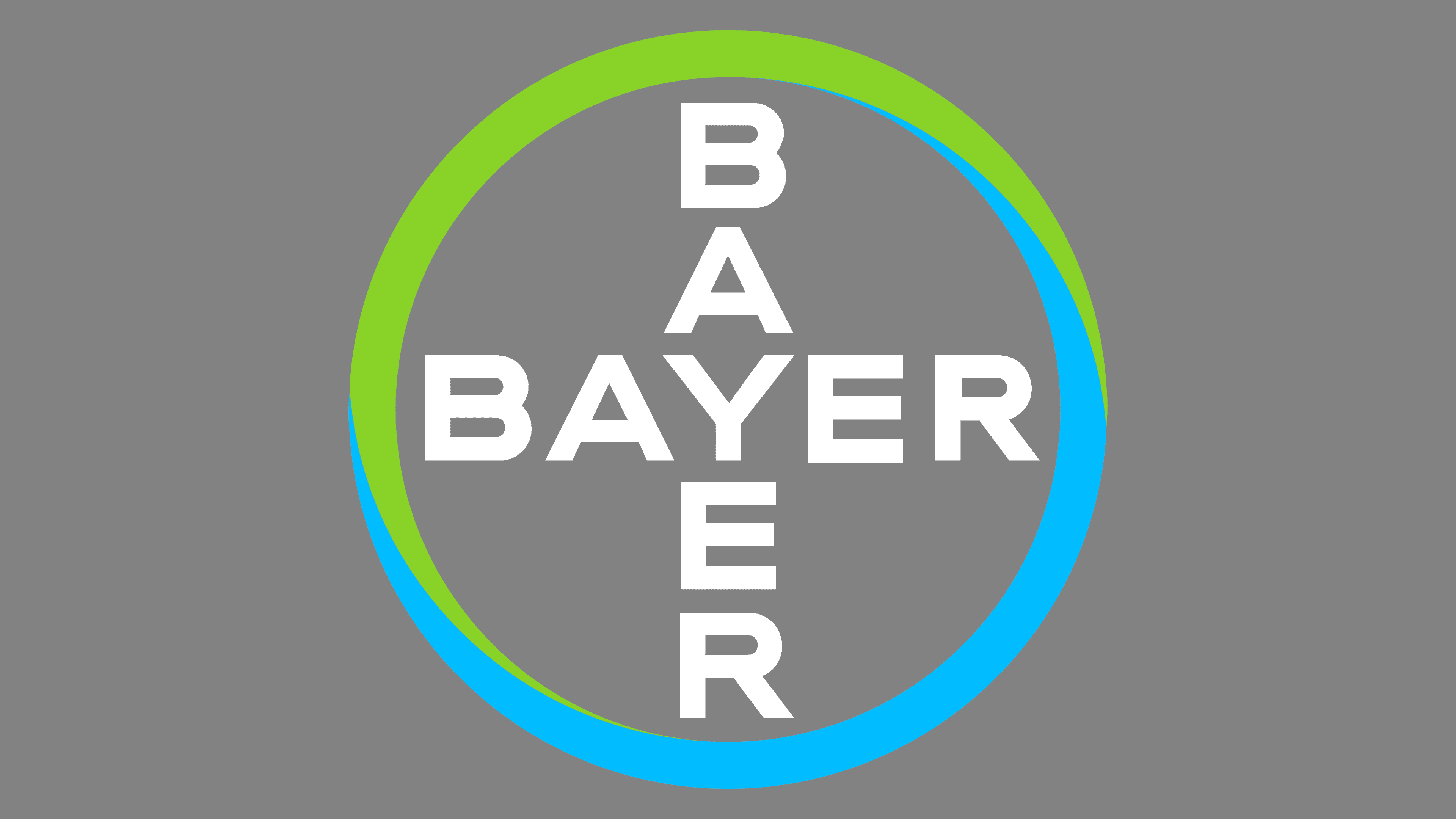
2017 – today
![]()
Bayer is preparing to merge with the largest biotech company in the agricultural sector, Monsanto, a move that was completed in 2018. A change in the logo marked a similar breakthrough.
The dense combination of blue and green in the circle’s edging and the removal of the stroke borders show close cooperation and association with other giants for the well-being of all.
Font and Colors
Primary colors:
- Blue is pursuing dreams, good goals, and intentions, and scientific research.
- Light green: life, development, growth, health.
- Black: power, solidity, global scale.
The font of the inscription inside the emblem is Tapas Sans.