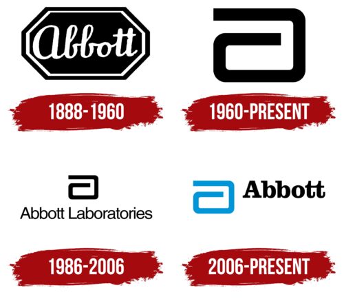
The Abbott logo reflects both the company’s historical heritage and its confident outlook for the future. It harmonizes two trends that have now come together to show the world the true face of a leading provider of medical devices. The organization, founded by a physician, has taken a professional approach to creating its identity, making its emblem a code for the concept of medical products.
Abbott: Brand overview
Since its inception, the Abbott brand name has been associated with the healthcare sector. It is an American company engaged in the production of medical devices as well as health maintenance products. Today, it is the largest center with foreign branches around the world. The company was founded in 1888 by physician Wallace Calvin Abbott. It is headquartered in North Chicago, Illinois, USA.
Meaning and History
After its founding in 1888, the company was named Abbott Alkaloidal Company in honor of the physician-pharmacist who founded it. Wallace Calvin Abbott decided to get into the business of producing pharmaceuticals that were superior to existing alternatives. As a result, a specialized company began to work in the city of Ravenswood (Illinois), which later moved to the production of medical equipment, diagnostic tests, and generics.
The emblems of this brand are serious. They allegorically reflect the direction of the company’s activity and have a simple structure characterized by minimalism. The geometric shape has become predominant. However, it is not the basic element – it is balanced by a classic inscription printed in lowercase letters. Only the first letter of the name is capitalized; the rest are lowercase. The color palette is also simple – monochrome.
What is Abbott?
Abbott is an international company headquartered in Illinois, specializing in medical devices, nutritional supplements, generics, and diagnostics. It was founded in 1888 by physician Wallace Calvin Abbott to develop promising pharmaceuticals.
1888 – 1960
The logo is a complex polyhedron. It resembles a geometric figure consisting of two trapezoids. A double frame formed of black and white stripes of equal thickness runs along the edge. In the center on a dark background is the word “Abbott” in rounded letters, imitating handwritten text. The inscription is smooth, coherent, and calligraphic, with connected letters “t” in the upper part. Its specialty is the large lowercase letter “a.” Although written in lowercase, the glyph is very visible.
1960 – today
After using the old logo for a long time, the medical-pharmaceutical company decided to modernize its visual identity and turned to the studio of George Nelson & Co., Inc. for help. Designer Don Erwin overhauled the emblem by combining several key elements of the original mark.
First, he depicted a glyph based on the first letter of the company’s name and gave it a geometric shape. Second, the developer used the similarity of the letter “a” with a curved band with open ends. The result was a wide band bent inward. Thirdly, the author gave the emblem a resemblance to the snake from the cult staff of Asclepius. Thus, the symbol became directly associated with the company and its founder and medicine.
1986 – 2006
In this version, the logo, graphics, and text are clearly separated. The designers moved the lettering from the center of the geometric figure and placed it separately, making it an independent element. The phrase “Abbott Laboratories” is located at the bottom. It is typed in lowercase sans-serif font. The letters are thin and rounded, with a minimum distance between the symbols. The composition also includes a stylized lowercase letter “a” in the form of a curved black stripe.
2006 – today
The logo is used simultaneously with a blue symbol and black text. The lettering is bold, smooth, and large. The letters are decorated with expressive serifs, which give elegance and attract the viewer’s attention. The right side of both “t” letters is longer than usual: it is elongated upwards, which makes the glyph look like a hook.
Font and Colors
For the Abbott logo, highly readable fonts were chosen, reminiscent of Sequel Sans Body Book by OGJ Type Design and Clarendon FS ExtraBold by FontSite Inc. A handwritten variant with imitation calligraphic lettering was also used.
The corporate palette of the emblem is strict, businesslike, and practical, reflecting the seriousness of the company and the high importance of its work because nothing should distract from the main thing – the name. Basically, all the symbols are monochrome, but to create a connection with medicine, the designers suggested diluting the black-and-white range of light blue color.
Abbott Logo Color Codes:
- Blue: Hex Code: #0095DA; RGB Code: (0, 149, 218); CMYK Code: (1, 0.316, 0, 0.145); Pantone Code: PMS 2192 C
- Black: Hex Code: #000000; RGB Code: (0, 0, 0); CMYK Code: (0, 0, 0, 100); Pantone Code: Process Black
FAQ
What is the significance of the Abbott logo?
The original logo, created the year Abbott was founded in 1888, featured the company name written in white letters on a black background. This monochrome design served as Abbott’s trademark for more than seven decades.
What is Abbott known for?
Abbott has earned its reputation for manufacturing a wide range of medical products, from cardiovascular devices to nutritional supplements. Famous brands include Similac, Ensure, FreeStyle, and more.
What is Abbott’s company motto?
The company’s mission is summed up in the phrase: “Living your best life, now and in the future.” It refers to Abbott’s commitment to developing technologies that improve health and quality of life.
Is Abbott owned by Johnson and Johnson?
No, Johnson & Johnson completed the acquisition of Abbott Medical Optics, but it does not own Abbott Laboratories.
Is Abbott a Fortune 500 company?
Despite a slight 1.3% increase in revenue and a 2% decrease in profit, Abbott is still a Fortune 500 company as of 2022.


