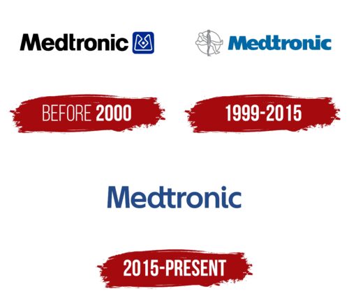
The Medtronic logo contains a wordmark in dark blue. It used to be inseparable from the emblem in the form of a man rising to his feet, symbolizing the fullness of life. But after a series of rebrandings, these identity elements began to be used separately.
Medtronic: Brand overview
| Founded: | 1949 |
| Founder: | Earl Bakken and Palmer Hermundslie |
| Headquarters: | Dublin, Ireland |
| Website: | medtronic.com |
Meaning and History
Now Medtronic actively uses the word mark with its name. But the real fame of the brand was brought not by this inscription but by the symbol with the image of a human figure. Its history began in the 1960s when Earl Bakken, one of the company’s co-founders, ordered a picture with philosophical content. The painting depicted a man lying on a table, slowly rising to his feet in a standing position. And the picture showed the whole trajectory of the movement, from the starting point to the endpoint. This was the inspiration for the iconic Medtronic emblem.
The logo was initially accompanied by the slogan “When life depends on medical technology,” which implied the ability of medical equipment to lift people to their feet, both literally and figuratively. Over time, the company’s identity has evolved. A particularly notable leap in its development came in 2015 when Interbrand employees took on the job.
What is Medtronic?
Medtronic manufactures various medical and diagnostic equipment, including electro cardiac monitors, portable ventilators, insulin pumps, X-ray systems, spinal cord neurostimulators, and more. The company is legally registered in Ireland but is headquartered in the United States, in Minneapolis.
Before 2000
Medtronic was once represented by a logo with black lettering that used a bold, sans-serif font. To the right of the brand name was a graphic sign, a stylized “M.” It was enclosed in a blue square with rounded corners and consisted of thin white lines. The central part of the pattern formed a rhombus with a dot in the middle. There was also a black-and-white version of the emblem without the blue elements.
1999 – 2015
For a long time, the medical device manufacturer had a logo with the word “Medtronic” in an unusual design. The designers made it blue and used a bold font with lengthened end elements in some of the glyphs. The letter spacing was reduced to the extent that narrow gaps were only between the “t” and “r,” “o” and “n,” “i,” and “c.” All other glyphs were merged. The stylized “M” on the right had disappeared, but a symbol of three human silhouettes in a white circle appeared on the left. The closest figure (standing straight) was gray, and the two farther ones (at different angles) had gray outlines but were themselves white. Overall, this icon resembled a dial with people instead of hands.
2015 – today
Medtronic’s next transformation came courtesy of the Interbrand Health office. Designers completely changed the company’s visual identity to present it not just as a seller of medical devices but as a universal health care provider. The rebranding followed the acquisition of Covidien, which led to a change in business strategy. As a result, the main Medtronic logo was shortened to a dark blue lettering that was more legible than the previous version. Now there are sufficient width intervals between all letters except “d” and “t.” In addition, the glyphs no longer look flattened.
Font and colors
The most famous emblem of the company is the image of a man standing up. In the original version, the figure rose from the table, but after the finalization of the symbol, has changed. The 2021 redesign left a single silhouette in a ring made up of blue, blue, and purple bands with a gradient. This graphic sign expresses the promise of helping people find life’s fullness.
The medical technology manufacturer originally used a bold sans-serif font in its logos. Despite multiple changes, it remains balanced in shape. In the current version, the glyphs have both smooth roundings and straight lines with corners, which makes the lettering dynamic. The Medtronic wordmark is completely painted in its signature navy blue color.
Medtronic color codes
| Safety Blue | Hex color: | #234a87 |
|---|---|---|
| RGB: | 35 74 135 | |
| CMYK: | 74 46 0 47 | |
| Pantone: | PMS 7686 C |


