Symmetry and harmony are what the Merck & Co logo reflects. The manufacturer of medical products needs to show a responsible attitude to work. In this case, the visually balanced emblem symbolizes the balance that specialists observe in the research and production of drugs.
Merck & Co: Brand overview
| Founded: | 1891 |
| Founder: | Theodore Weicker, George Merck |
| Headquarters: | Rahway, New Jersey, U.S. |
| Website: | merck.com |
Meaning and History
First, the apothecary Friedrich Jacob Merck set up a company in Germany. Then his descendant Georg Merck began to expand his business to foreign countries, where he launched production sites, laboratories, and research centers. As a result of business negotiations, it was decided to open a branch of the Merck Group’s chemical and pharmaceutical plant in the United States. However, in 1917 the state confiscated the firm. Two years later, the owner bought back the shares and privatized them again, but then it again became independent of the parent company. This time is considered the second founding date of Merck & Co.
Nationalization after the First World War had negative legal consequences. The parent organization, which previously included the American division, initiated litigation regarding the name. It was decided that Merck of Darmstadt (the original company) would own the rights to it in all countries except the territory of the United States and Canada. There it is known as EMD (abbreviation for Emanuel Merck, Darmstadt). But this did not satisfy the requirements of the founder, and litigation still flares up.
Naturally, problems with ownership of the name Merck were reflected in the visual identity of the American successor, which became an independent structure. Her own logo did not come into existence until 1953, signaling a complete break between the two companies. However, this fact did not prevent the newly created enterprise from using the name of a German pharmacist in the emblem. In general, a pharmaceutical company from the United States has two trademarks.
What is Merck & Co?
Merck & Co is an American pharmaceutical and biochemical company engaged in producing medicines, vaccines, biologicals, and animal health products. The year of its foundation was 1891 when it was opened as a foreign division by the German organization Merck Group. Its founders are Georg Merck and Theodore Weicker. The headquarters is located in Kenilworth, New Jersey.
1953 – 1965
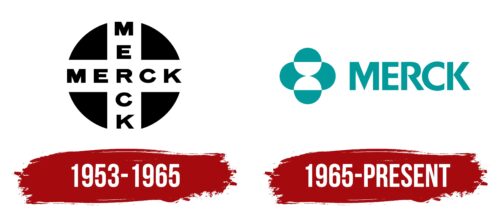
By that time, a simple circle-shaped logo is divided inside by two intersecting stripes of a contrasting color: the disk itself is black, and the lines on it are white. This combination made it possible to effectively highlight the negative space and create additional elements. For example, four triangles at the corners, between which two words “Merck” are harmoniously located. Both texts intersect and, in the central zone, are united by a common letter, “R.” Thus came the cross. All characters are capital, bold, and chopped.
1965 – today
After the redesign, Merck & Co switched to a modernized and themed logo. The basic emphasis in it is focused on biochemical and pharmacological topics, so a geometric construction appeared next to the name, reminiscent of chemical and biological processes. For example, cell division under a microscope. For this, circles and hemispheres are used, located in a strictly defined order, one on each side. They are located at the top, bottom, right and left, which resemble the symbolic cross. Designers replaced the black color with emerald green. The style of the inscription has also changed: now, the signs are elongated, with sharp intra-letter corners, which are visible in the “M,” “R,” and “K.”
Font and Colors
The evolution of the Merck & Co logo has always been associated with disputes over the copyright of the authentic name passed to it from the parent company. But at each stage of development, one can note the presence of large chopped letters combined with simple geometric shapes: circles and triangles. The current version is the development of the studio Chermayeff & Geismar.
The designers chose grotesque to make the company’s name clear and easy to read. He made the text in both the first and second logos. The main emphasis is on the sharpness of the internal details: on the connection of the right and left sides of the “R,” “K,” as well as on the central element “M.” The palette of emblems is monosyllabic and consists of a combination of black and white (in the first case) and emerald and white (in the second logo).
Merck & Co color codes
| Dark Cyan | Hex color: | #019999 |
|---|---|---|
| RGB: | 1 153 153 | |
| CMYK: | 99 0 0 40 | |
| Pantone: | PMS 7467 C |
