


![]() EMS Logo PNG
EMS Logo PNG
Familiar to almost all Brazilians, the EMS logo is a successful design. Despite its abstract style, the logo embodies everything the company strives for: innovation, development, and progress. It is a symbol of going beyond the usual limits, as drug development involves seeking innovative solutions.
EMS began in the early 1950s with a small pharmacy in Santo André, in the ABC industrial region of Greater São Paulo. Pharmacist Emiliano Sanchez built a local reputation by serving ordinary patients, then moved toward industrial drug production. Em 9 de janeiro de 1964, ele registrou Indústria Farmacêutica EMS. He opened its first factory in São Bernardo do Campo, where it produced antibiotics, painkillers, and basic medicines.
At the time, Brazil’s pharmaceutical market was dominated by foreign companies such as Pfizer and Novartis. At the same time, local producers focused mainly on lower-priced segments. In 1981, EMS bought Laboratório Dória in Hortolândia, a deal that later shaped the company’s manufacturing base and headquarters. After Emiliano Sanchez died in 1988, his 26-year-old son Carlos inherited a debt-burdened business. He restructured it by selling non-core assets and restoring financial balance.
EMS expanded in January 1991 by acquiring Legrand Pharma. In 1999, it opened a major industrial complex in Hortolândia, the same year Brazil introduced its generics law. That reform gave local manufacturers access to public health tenders, and EMS became the first Brazilian company to produce a generic version of Cyclosporine Microemulsion, a complex transplant drug.
By 2002, EMS ranked third among Brazil’s largest pharmaceutical companies and created Germed Pharma. Legrand Pharma became autonomous in 2009, and Germed followed suit. EMS later joined Bionovis in 2012 with Aché, Hypermarcas, and União Química, and founded Brace Pharma in Maryland in 2013. Today, EMS belongs to Grupo NC, leads Brazil’s generics market, and competes mainly with Hypera Pharma and Aché Laboratórios Farmacêuticos.
Meaning and History

The Brazilian pharmaceutical company was created to support the domestic drug market. At first, it was a small organization with a limited number of production sites. But over time, it has grown into the largest specialized center. Now it has both local and foreign enterprises at its disposal. It owns several production facilities under the same identity: in São Bernardo do Campo, Hortolândia, Jaguariúna, Manaus, and Belgrade, Serbia. The most important are the first two. They bear the brunt of the burden.
This is the first Brazilian laboratory to export medicines to Europe. The company also owns five divisions, united by the common abbreviation EMS. It distributes products through them. Among them are Similars (which offers various medications in the domestic market), Generics (which trades in generics), Sigma Pharma (which sells branded drugs), Hospital (which provides hospitals with medicines), and Consumer (which sells over-the-counter drugs).
What is EMS?
EMS is a Brazilian pharmaceutical company founded in 1964. It has six factories and five brands under which it sells its medicines. Its founder is Emiliano Sanchez. The head office is located in Hortolandia in the state of São Paulo.
The Brazilian company has had a personal sign of visual identity since its inception. This conceptual element of the identity emphasizes its uniqueness and shows the main direction of work on liquid substances, diffusion, powder mixtures, and other aspects of medicine production. Moreover, it has only one logo and has never changed since its inception.
The logo has two basic components: the name and the background, which are designed as key elements. In particular, it consists of two superimposed “spread” spots. They almost exactly repeat a single shape, so they look like laboratory substances under a microscope. They have streamlined edges, meaning it’s safe to say they represent liquid. There are no corners, only rounding. The outer edge has a more complex configuration and is painted in light blue. The part placed inside it looks like two circles of different sizes that flow into one another. This image resembles the process of cell division.
In the center of spots of indefinite structure is the name of a pharmaceutical company. The abbreviation is typed in a smooth font, with no points. The letters are streamlined, symmetrical, and sans-serif, with little inter-character space. To be visible against the blue background, the designers left it white, as if it were formed from negative space.
Font and Colors
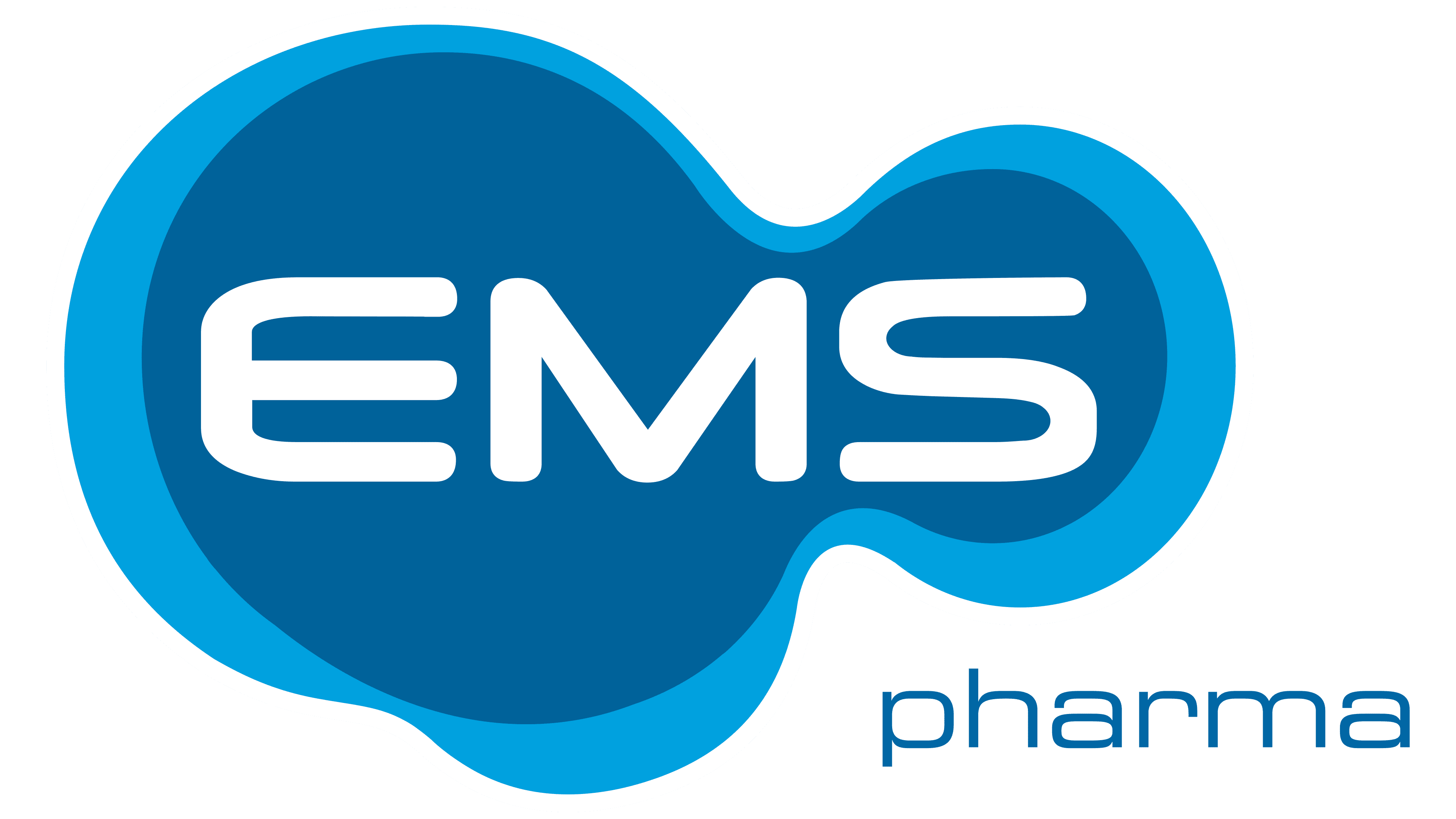
The Brazilians chose a smooth and flowing typeface without a single corner for the pharmaceutical firm. This is an original custom font. The “S” is identical to its counterpart from Clonoid Semibold or Space Colony Semi Bold. At the same time, the “M” and “E” resemble glyphs from Micro Extend FLF Bold and Zebulon Condensed Hollow Regular, respectively. The only difference between them is in the rounded ends. The corporate palette combines two shades of blue (light blue and cobalt) and white, which is used for the logo inscription.