


Philbrook is updating its name and image to better show a place where art, architecture, and gardens are experienced together. The complex in Tulsa was built in 1927 as the private mansion of oil magnate Waite Phillips. In 1939, the house was given to the city, after which it became a municipal museum with a botanical park. Today, Philbrook Art & Gardens welcomes more than 160,000 visitors a year, holds over 16,000 works, and is surrounded by 26 acres of Italian Renaissance-style gardens.
The new name moves the brand away from the “art museum” formula toward a fuller description of the place. Philbrook now speaks of a cultural complex in which the collection, the house, nature, a walk, and light work together. The brand was developed by Nominee, a studio from Oklahoma City that won a competition among creative teams from the state.
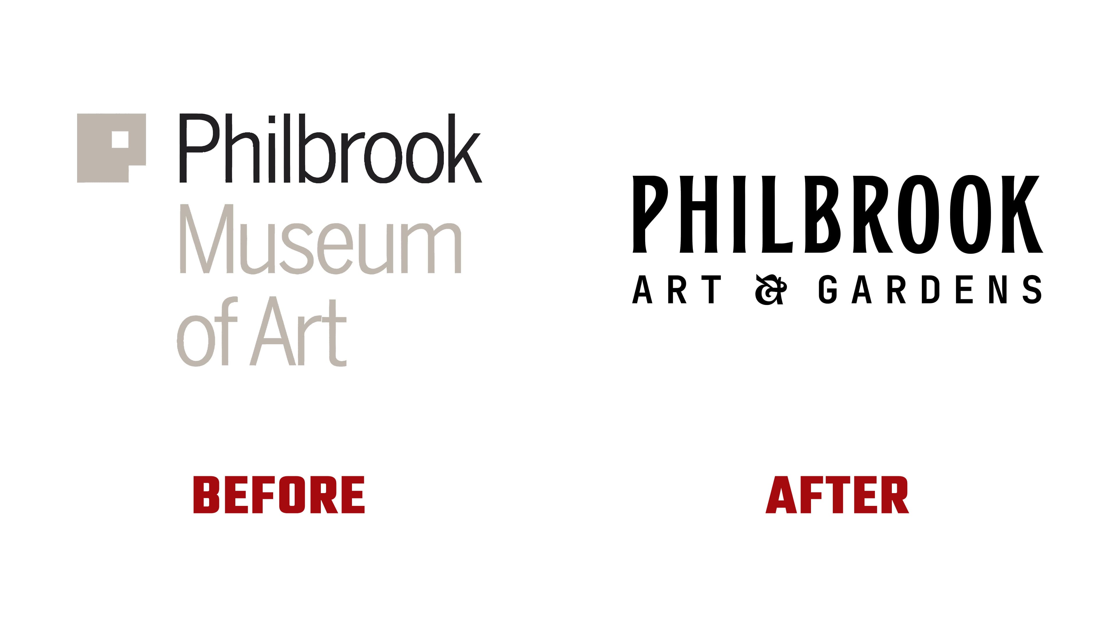
Michael Bierut of Pentagram created the previous logo from 2012. The mark was built from intersecting squares. It could be read as the letter “P,” a face, a plan of the buildings, and a frame for art. It suited the museum theme, but over time, it began to feel too dry. For a place with gardens, a rich collection, and vivid architecture, the former mark looked too restrained.
The new logo consists of a symbol and a name. The icon grew out of the golden spiral motif, connected to Philbrook’s architecture and the natural forms of plants. The two sides of the complex, the museum and the garden, come together in the mark. Rays, soft triangles, and a circle form a kaleidoscope image, with the eye moving among the collection, facades, flowers, and garden paths.

The symbol conveys Philbrook’s experience through shifting viewpoints, reflections, light, and connections among the complex’s different parts. For a visitor, the mark promises a walk through a place where art extends beyond the walls. For the institution, it supports the new Philbrook Art & Gardens formula. It helps tell the story of the collection in broader terms.
The tagline “Kaleidoscopic Collection” strengthens the idea behind the logo. The collection includes classical and contemporary art, along with Native American, European, African, and Asian works. Beside them are gardens, architecture, and the seasonal change of impressions. The logo translates this idea into a visual form, in which different elements come together to create a complete mark.
The text portion was set in the custom typeface Philbrook Display. Kyle Read of Badson Type Foundry developed it. It replaced the former Benton Sans Condensed and made the brand warmer. Expanding letterforms, soft lines, and a decorative ampersand give the logo a welcoming museum tone.
The new Philbrook Art & Gardens logo better conveys the atmosphere of a place with light, gardens, a house, a collection, and a walk. The logo connects the mansion’s history, the museum’s civic role, and the complex’s natural aspect into a single image. The image feels livelier, softer, and closer to people.