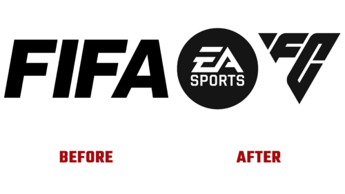
In May of last year, the 30-year contract between EA Sports and FIFA came to an end. Now, the Californian developer of legendary video games is preparing for the debut launch of its products after the FIFA era. To achieve this, in early April 2023, they unveiled an updated logo that will accompany their flagship soccer franchise, now called EA Sports FC.
The total rebranding prompted a change not only in the name but also in the logo. From now on, the publisher’s aesthetics will be centered on triangles, which have a significant meaning in the world of soccer. However, some fans disagree with this, as well as with the new shape of the emblem. They believe that soccer is more associated with round symbols. But the developers have tried to explain their choice of the triangle.
This geometric figure:
- is the primary tactic of soccer passes between players;
- consists of isometric polygons that make up the video game;
- is part of the chemical triangles in Ultimate Team;
- is a cult indicator of athletes in each match.
Since the advent of total soccer in the 1970s, the triangle has once again revolutionized team play and has now become a key symbol for its further evolution. In this case – in the form of a logo with three angles. According to Electronic Arts, the image of this figure is tightly woven into the DNA of the popular game and dominates soccer culture.
The new EA Sports emblem features an isosceles triangle composed of the letters “FC.” They vary in size and are arranged diagonally. The nearest glyph is larger than the middle one. At the top is a small white triangle. The letters are uppercase, block-style, and have pointed edges. The name of the developer company has retained its previous spelling and occupies a space on a long trapezoid.


