More than seven hundred years of history of Fabriano paper production is indisputable proof of the creation of a strong brand whose products never cease to inspire people to creativity and self-expression. Four production facilities in Italy, 3000 products in the range, 100 countries with talented customers – the rich heritage of Italian artistic craftsmanship.
In 2002, Fabriano became part of the Fedrigoni Group, which specializes in the production of paper for various tasks – from packaging to graphic images, the solutions of the VIP-level self-adhesive materials.
Creative agency Pentagram improved the almost flawless logo.
It was decided to make the design even more perfect and refine some of the graphic details of a slim and harmonious logo.
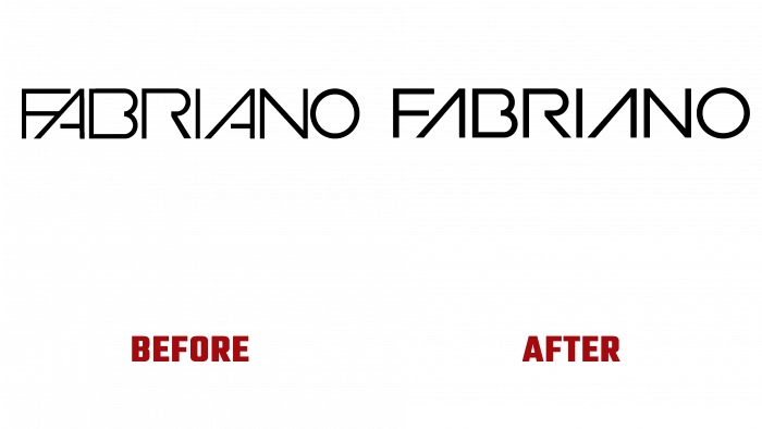
Granted: the logo is blue in color, made with smooth neat capital letters, in which there is an incomplete outline if the shape of the letter has an internal detail. Solution: make the entire logo black, remove the middle rung in the letters A, separate the first letters F and A, and spread the letters wider apart.
The changes were barely noticeable, but they were not that important. The most important thing is that the brand has an heir logo, which does not break the associative links with the brand, is recognizable and concise.
If we were talking about some young brand, we could allow for the possibility of drastic decisions. For freshness, to attract attention, to create a buzz. But such a respectable paper manufacturer with hundreds of years of experience and an excellent reputation deserves respect and remains a rock in the industry, which is emphasized by the new design.
One cannot complain about the lack of taste of the initiators of the rebranding. The logo has become a beautiful monolith that convinces customers that their creative spark deserves to be captured on high-quality Fabriano paper.


