


 Timex Logo PNG
The Timex logo embodies durability and timeless classic style. Its clean, straight lines evoke confidence and stability, reflecting the brand’s core values. The emblem harmoniously combines strength, simplicity, and reliability, highlighting the products’ character and longevity. This minimalist yet powerful symbol accurately conveys the company’s mission: creating high-quality, durable products that last for years.
Timex traces its roots to the Waterbury Clock Company, founded in Connecticut in 1854 to produce affordable clocks with brass parts. Mass production later supported low-cost pocket watches, including the one-dollar Yankee of 1887. Wristwatch production began around 1900, while military models followed in 1914 during World War I.
In 1933, the company worked with the Walt Disney Company on a Mickey Mouse watch that supported sales during the Great Depression. It became United States Time Corporation in 1941 and produced watches and military fuses during World War II. The Timex name appeared in 1950, followed by the 1956 “Takes a licking and keeps on ticking” campaign. By 1962, the label represented about one-third of US watch sales.
Quartz competition intensified in the 1970s, prompting the introduction of digital watches in 1972. Indiglo electroluminescent lighting arrived in 1986 and became a major technical feature. The company adopted the Timex Corporation name in 1994. During the 2000s, its portfolio expanded through licensed and acquired businesses, including Versace, Nautica and Opex, before Timex Group was formed in 2008.
Timex IQ+ launched in 2015 with activity tracking inside an analog format. American Documents followed in 2019 as a US-made collection. In 2020, the company revived Marlin and Q Timex models as interest in vintage styling increased. By 2023, its catalog covered analog, digital, connected, and heritage watches sold through international retail and online channels.
Meaning and History
What is Timex?
This well-known American watch company has established itself through its products’ affordability, cost-effectiveness, and durability. The brand has become synonymous with everyday watches, offering a range of models, from modern digital and smartwatches to vintage analog styles. The company skillfully combines innovation and nostalgia, regularly reissuing popular classic models with added modern features. One of the brand’s key achievements is the Indiglo backlight technology, which has improved watch visibility in low-light conditions. Partnerships with artists, designers, and other brands allow the company to maintain the relevance and variety of its products.
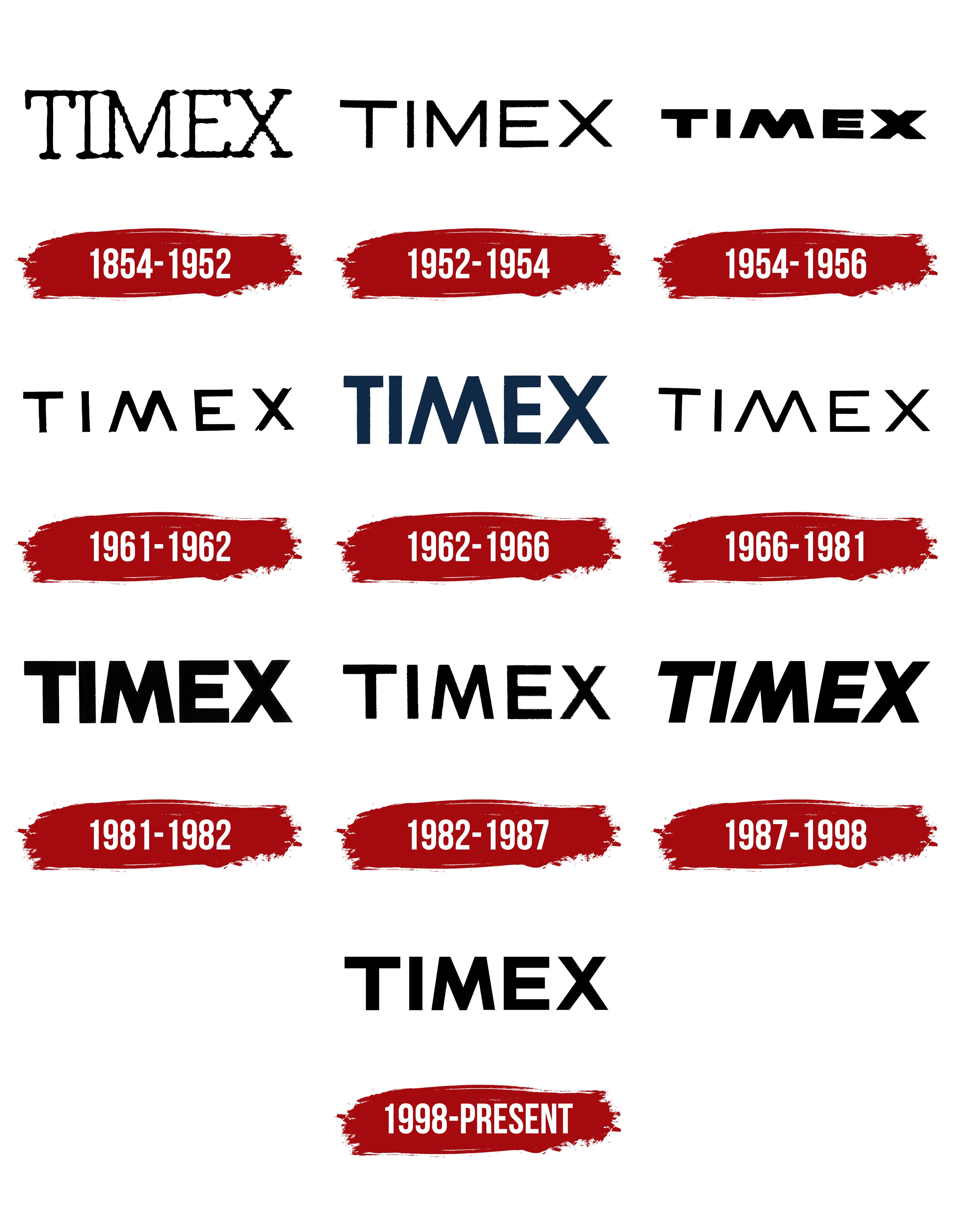
1854 – 1952

The first Timex logo is a wordmark with thin, craft-like lines that resemble handwriting. The capital letters emphasize the brand’s key goal of offering the market watches that combine high accuracy and durability at an affordable price. This approach became possible because a new alloy replaced expensive precious materials. The narrow, elongated glyphs symbolize the products’ accessibility and the company’s commitment to continuous improvement and development.
1952 – 1954

Two years later, the logo’s sans-serif font became wider and more defined, reflecting the brand’s confidence and strengthened market position. The straight lines of the glyphs emphasize simplicity and accessibility, which align with the company’s philosophy and drive for widespread success. The font change symbolized the growth in sales and the company’s increasing influence in the watch industry.
1954 – 1956

The logo used broad, massive letters to highlight the reliability and durability of Timex watches. The small font size hinted at the compactness and convenience of wrist models, which were renowned for their long lifespan. In advertising campaigns, the company showcased durability tests of its products, where the watches withstood challenges and continued to function flawlessly. This focus on endurance was successfully reflected in the emblem’s bold, sturdy lines, conveying the brand’s strength and quality.
1961 – 1962

The logo uses medium-sized, moderately thick letters, symbolizing elegance and the brand’s continuous renewal. This highlighted the company’s development and adaptation to new technologies when it entered the market with electric watches after the acquisition of Lacher & Co. AG. This transformation marked an important milestone in the brand’s history, and the logo successfully reflected the drive for innovation while maintaining sophistication and style.
1962 – 1966

The company secured its position at the top of the American market, as symbolized by large, vertically elongated dark-blue letters. The font size represents impressive sales volumes, while the elongated symbols reflect continuous growth. One in every three watches sold in the U.S. is a Timex. The brand is actively expanding, increasing its retail presence from small shops to gas stations. With each iteration, the logo reflects this development, its letters growing along with the company’s success. The dark blue color emphasizes the brand’s professionalism and stability.
1966 – 1981

The brand once again turned to a thin font, symbolizing the pursuit of new beginnings and an emphasis on developing and introducing fresh models to the market. This move reflects the search for innovative solutions and the desire to maintain growth momentum. The company that owns the brand also changed its name to Timex Corporation, which demonstrates a focus on the brand’s most successful and promising line, solidifying its significance and leadership in the industry.
1981 – 1982

In 1981, the brand introduced its largest and most powerful visual symbol. This emblem was designed to emphasize the company’s strength and reliability as it faced increasing competition from Asian manufacturers. The logo was conceived as a visual affirmation of the brand’s resilience, reflecting its confidence in its market position.
1982 – 1987

The logo changed again, becoming more refined and restrained. This reflected the company’s reorganization, forcing it to reduce its workforce from 30,000 to 6,000. The brand’s previous era of mechanical watches took a backseat, giving way to quartz and digital models. The visual symbol’s appearance represented these changes, conveying a new era in Timex’s development and adaptation to the demands of the time.
1987 – 1998

Focusing all resources on improving and refining its watches, the company strengthened the mechanisms, making them even more durable and long-lasting, while refining the appearance to make them more stylish. Following this, the Timex Ironman sports watch series was released and gained widespread popularity. This led to the logo returning to larger sizes, with the italicized design symbolizing swift forward movement. The brand demonstrated its determination to maintain its position and continue to grow.
1998 – today
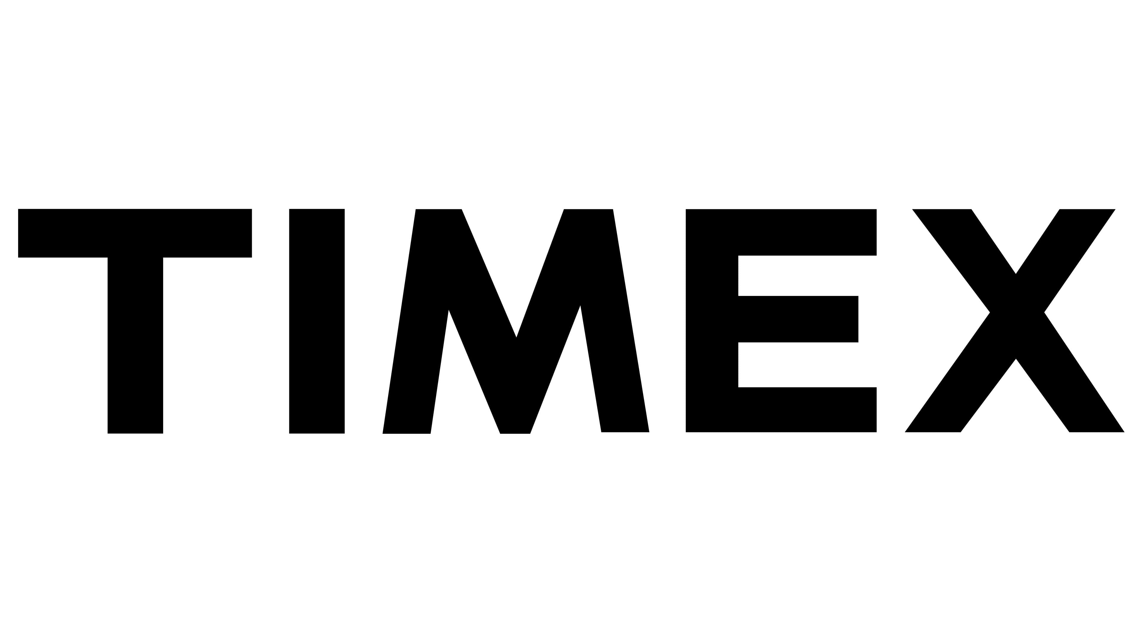
The brand’s logo stands out for its perfect harmony and balance, reflecting the nature of watches with precise and reliable mechanisms. The proportions of the symbol’s size, height, and width are carefully considered and perfectly align with the image of a modern brand offering high-quality, striking models. The minimalist design of the entire composition emphasizes the accessibility of the products, aimed at a business and active audience.
These watches are not considered luxury items but important tools for everyday life. Clear lines and a simple style highlight functionality, which is important for people who need watches as accessories and reliable aids for managing their time. The logo reflects this approach, maintaining a balance between aesthetics and practicality.