


 Bvlgari Logo PNG
The Bvlgari logo emphasizes a connection to history, reflecting the passage of time and encompassing services in demand for several generations. The emblem elements closely link the brand to the grandeur and luxury of Ancient Rome, symbolizing the products’ impeccable quality and refined style. The visual mark hints at the craftsmanship of working with precious stones and intricate patterns in settings, highlighting the brand’s historical heritage and pursuit of perfection.
Bvlgari was founded in Rome in 1884 by Greek silversmith Sotirios Voulgaris, born in Paramythia in 1857 and trained in his father’s workshop. After moving to Italy in 1881, he opened a shop on Via Sistina, followed by the Via Condotti location in 1905. Early collections focused on silverware influenced by Greek craft traditions before the business moved further into jewelry during the 1910s.
In the 1920s and 1930s, Sotirios’s sons Giorgio and Costantino joined the company. They developed a style less dependent on French platinum-and-diamond conventions. A Naples store opened in 1932, while the Via Condotti flagship was enlarged in 1934. During the 1940s, bold combinations of colored stones became a defining feature of the house.
By the 1950s and 1960s, cabochon gems, geometric forms and vivid color pairings shaped its jewelry. Sophia Loren, Audrey Hepburn and Elizabeth Taylor became clients. International boutiques opened in New York, Paris, Geneva and Monte Carlo during the 1970s, while watches entered the range. The first fragrance appeared in 1992, the company listed publicly in 1995 and accessories followed in 1996.
A partnership with Marriott International created Bvlgari Hotels & Resorts in 2001, with the first hotel opening in Milan in 2004. LVMH acquired the company in 2011. The Via Condotti flagship reopened for the 130th anniversary in 2014, while later expansion covered high jewelry, leather goods, hotels and Octo Finissimo watches through 2023.
Meaning and History
What is Bvlgari?
This Italian luxury brand has gained international recognition as a symbol of elegance and extravagance. Founded in Rome as a jewelry shop, the company expanded its offerings to include luxury goods such as watches, accessories, and fragrances. The brand stands out in the luxury market thanks to its bold use of vibrant gemstones and ancient Roman and Greek art elements, which together create its distinctive style. The brand gained particular fame with the Serpenti collection, based on snake imagery, which became a symbol of bold design and creativity. The brand has also made strides in watchmaking, setting several records for creating the world’s thinnest watches.
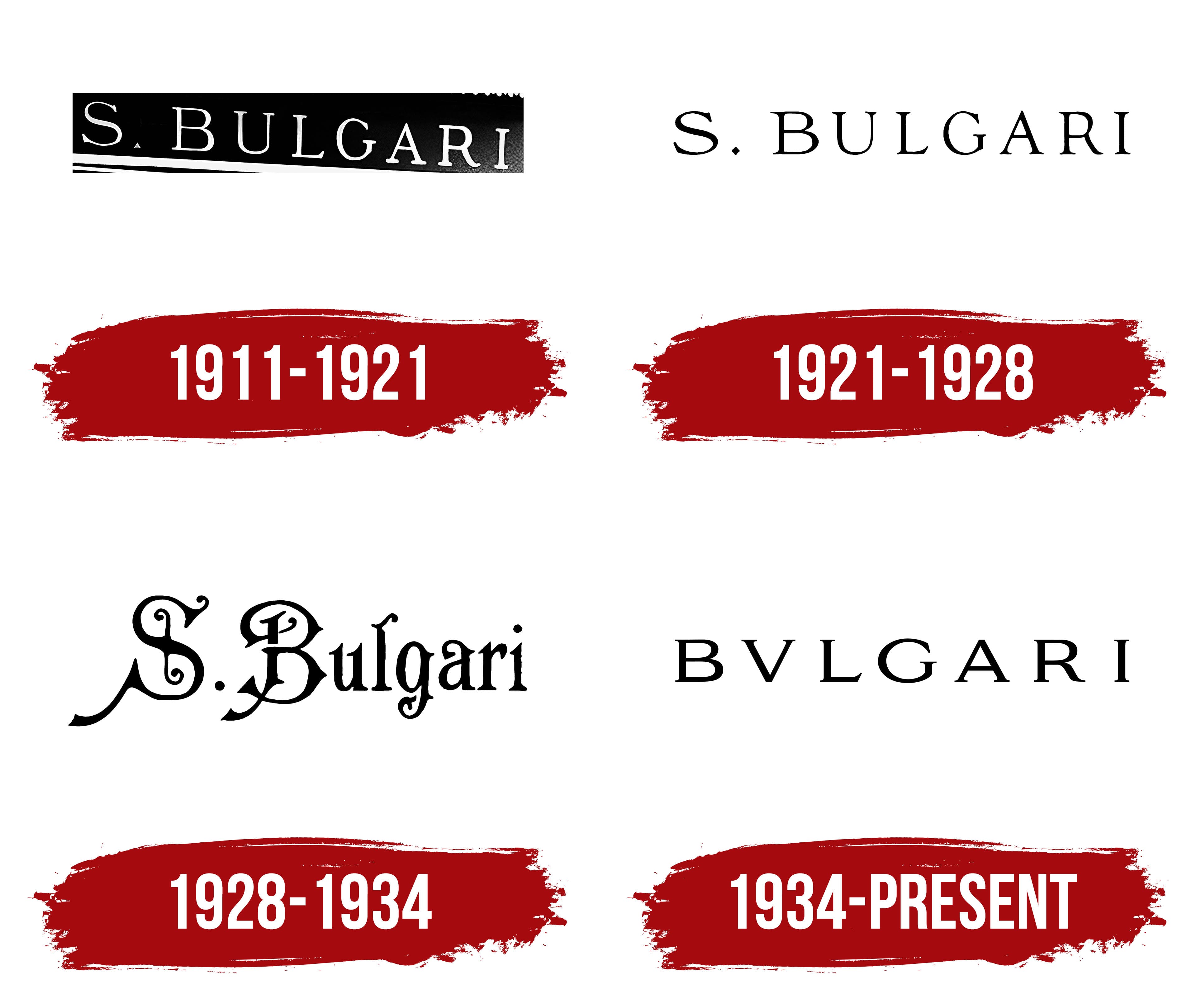
1911 – 1921

The brand’s first emblem is a delicate signature in fine font. This mark resembles a nameplate on a door, connecting the brand with its founder and creative visionary, the Greek Sotirio Bulgari, which explains the presence of the letter “S” at the beginning of the inscription. The logo appeared after the store’s opening and most likely adorned its sign.
The thin lines of the visual mark emphasize the jewelry’s elegance, aligning with an aristocratic style that avoids bulkiness and excessive luxury. The slight tilt of the inscription adds an elegant ease to the logo, subtly suggesting the lightness and free arrangement of the jewelry adorning ears, wrists, and necks.
1921 – 1928

The 1921 emblem differs little from the original version. The font and style of the inscription retained their previous forms, but the visual mark was stripped of its dark background and tilt. One interesting element is the dot after the letter “S,” shaped like a diamond, a subtle nod to precious stones. This element reflects the influence of geometric motifs characteristic of the products of that time, which, in turn, underscores the brand’s adherence to Parisian fashion.
1928 – 1934

The logo from this period is considered the most unusual and extravagant due to its use of an antique font. The intricate endings of the glyphs and sharp spikes on the bars and curves create the impression of twisting plants, connecting the inscription to roses. The font refers back to the brand’s origins. The name Bulgari is derived from royalty, adding a sense of importance. In the early days of its existence, Sotirio Bulgari created silver jewelry adorned with floral motifs inspired by Byzantine and Islamic styles.
1934 – today
The modern inscription, introduced after the founder’s death, was modified, giving the Bvlgari logo a unique character. The main innovation was the stylized writing, where the letter “u” was replaced with “v.” This deliberate choice references Ancient Rome, as the brand has Italian roots. Using the Latin alphabet emphasizes the company’s long-standing history, founded in 1884, and its historical connection to classical heritage. In Ancient Rome, there was no clear distinction between the letters “U” and “V,” and this form of writing was characteristic of Roman inscriptions on stone, adding an air of ancient grandeur to the brand and highlighting its prestige and luxury, evoking the image of the Roman Empire.
This stylization became a landmark step in the company’s development, foreshadowing its future success when the brand joined the large conglomerate LVMH in 2011. This change gave the logo a classic look and became a symbol of the transformations that took place within the company. In addition to replacing the letter “u,” the letter “S” was also removed from the name, reflecting that the business passed to the founder’s sons. This decision emphasized generational continuity and the continuation of the family tradition in the brand’s development.
Changes were also made to the font, which became simpler and more concise, reflecting a new stage in the company’s style evolution. While continuing its traditions, the brand adapted to modern demands, retaining elegance while introducing more restraint and minimalism into the design. This updated style harmonizes well with changes in jewelry collections, demonstrating a shift toward contemporary sophistication that blends with the brand’s rich history and prestige.