The Marriott logo shows two parallel related lines of business. The company’s hotels and restaurants are equally renowned and enjoy an enviable position in the market. All thanks to the convenience, comfort, and unobtrusive high-class service.
Marriott: Brand overview
| Founded: | March 5, 1927 |
| Founder: | J. Willard Marriott, Alice Marriott |
| Headquarters: | Bethesda, Maryland, U.S. |
| Website: | marriott.com |
Marriott’s history began in 1927 when American entrepreneurs Frank Kimball and John Willard Marriott bought a grocery stall and named it Hot Shoppe. A little later, they expanded their scope of activity by opening a catering division. In 1957 the company moved to the hotel business. Ten years later, it was renamed the Marriott Corporation.
It operated successfully until 1993 when it was split into Host Marriott Corporation and Marriott International. The first company dealt with real estate issues, and the second specialized in HoReCa services, some of which were transferred to the flagship brand Marriott Hotels & Resorts.
Meaning and History
The logos of a multinational corporation and its subsidiary have a lot in common. In the past, they were united by the stylized Marriott lettering. There are more differences: the parent company uses a wordmark with a new font, where only the letter “M” remains from the original version. Her main brand, in turn, moved to the big “M” logo.
What is Marriott?
It is a full-service American hotel brand. The Marriott Corporation was founded in 1957 by John Willard Marriott and is located in Bethesda, Maryland. Its structure includes a huge number of hotels in different countries of the world.
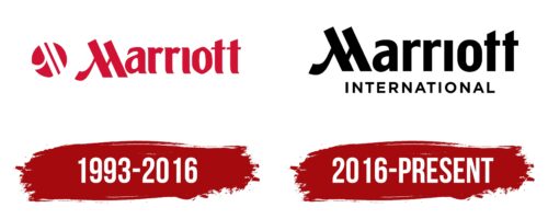
1993 – 2016
Since 1993, Marriott Hotels have used a logo with the first word of the corporation name. To attract attention, the designers opted for a dark red color and an unusual font with short serifs and a hexagonal “o.” The letter “M,” which consisted of strokes of different thicknesses, deserved special attention. The lettering left was a red circle with three white stripes resembling the “M” fragments.
2016 – today
Marriott International changed the color and font of the wordmark in 2016. Only the distinctive “M” remains from the previous version. The serifs have been removed from the other letters, so they are less streamlined. The lowercase “o,” in turn, has acquired an oval shape. The circle on the left disappeared, but at the bottom appeared the word “INTERNATIONAL,” written in grotesque. As for the color, the designers opted for the classic black.
Marriott Hotels & Resorts
Marriott Hotels & Resorts is a subsidiary of the American company Marriott International, Inc., which provides property management services. Along with Sheraton Hotels and Resorts, Marriott Vacation Club, and Delta Hotels, this brand belongs to the premium category. It operates more than 600 resorts and hotels located both in the US and abroad. The network expanded to Europe in 1975, and by 1999 it covered 47 countries. The trademark logo shares a common element with the Marriott International logo – a stylized “M” in burgundy. This indicates a close relationship between the parent company and its flagship brand.
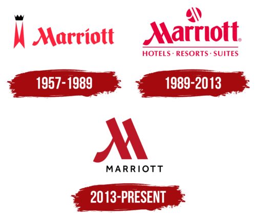
1957 – 1989
1957 – the year of the creation of Marriott Hotels & Resorts. At first, there were only two motels, one of which worked at the airport and the other nearby. With the opening of the second hotel complex, Marriott officially became a brand and acquired its own logo, where its name was presented. Even then, the original letter “M” was used in the inscription, consisting of two diagonals with a thin connecting line and an elegantly curved stripe. But in this version, the largest strokes were not parallel – they curved in opposite directions.
To decorate the word, the designers developed a custom set of glyphs based on the Gothic type font. This made the emblem memorable and distinctive. Brightness was added by a light shade of carmine-red, in which the inscription was painted and the symbol located to its left in the form of two narrow and vertically elongated triangles, folded together in the form of butterfly wings. This is probably how the logos authors presented the stylized letter “M.” On top of the figure was a small black crown with four points. It denoted the high level of services provided by Marriott hotels.
1989 – 2013
The first emblem of the flagship brand was similar to that of Marriott International. It contained the red word “Marriott” and a mini-circle, which in this version was not on the left, but at the top. A long thin line was drawn under the name, separating another inscription: “HOTELS RESORTS SUITES.”
2013 – today
The new Marriott Hotels & Resorts logo features a large “M” in dark red. Below it is the first word of the brand name, written in black sans serif letters and aligned to the right.
Marriott: Interesting Facts
Marriott International is a leading name in the global hospitality sector, known for its rich history and innovative approach to hotel management and growth.
- Starting Small: The Marriott story began in 1927 with a root beer stand in Washington, D.C., opened by J. Willard Marriott and his wife, Alice. This small venture eventually led to their first hotel in 1957.
- Opening the First Hotel: Their first hotel, the Twin Bridges Marriott Motor Hotel in Arlington, Virginia, was opened in 1957, setting the stage for a worldwide hotel network.
- Innovative Steps: Marriott has been a trailblazer in the hotel industry, being the first to offer online reservations in 1995 and adopting smoke-free policies across North American hotels in 2006.
- Global Footprint: Marriott operates or franchises thousands of properties worldwide under 30 brands, ranging from luxury to budget-friendly, making it one of the world’s largest hotel chains.
- Starwood Acquisition: In 2016, Marriott acquired Starwood Hotels & Resorts, significantly increasing its global presence and combining loyalty programs into Marriott Bonvoy, one of the biggest loyalty programs globally.
- Diversity and Inclusion: Marriott is recognized for its commitment to diversity, equity, and inclusion. It has won awards for being a great place to work and for promoting diversity in its workforce.
- Sustainability Goals: The company is dedicated to reducing its environmental impact, setting goals to cut water use, carbon emissions, and waste while increasing renewable energy use.
- Marriott School of Business: Named after J. Willard Marriott, the Marriott School of Business at Brigham Young University focuses on ethical business leadership.
- Disaster Relief Support: Marriott’s Disaster Relief Fund helps employees and communities affected by natural disasters, showing its commitment to social responsibility.
- Tech Forward: Marriott uses technology to improve guest experiences, including mobile check-ins and check-outs, digital room keys, and AI and chatbots for personalized service.
From its beginnings as a small root beer stands to become a global hospitality leader, Marriott International’s story reflects its spirit of innovation, excellence in service, and adaptability to market changes.
Font and Colors
Both the parent company and its subsidiaries are recognizable by the distinctive stylized “M” symbol. On the Marriott International emblem, it is part of the lettering, and at Marriott Hotels & Resorts, it stands separately as an independent graphic sign.
A multinational company uses a corporate typeface designed specifically for it. The main color of the logo is black. Marriott Hotels & Resorts has a classic pairing with American Red (# b41f3a).
FAQ
What is the Marriott logo font?
The logo uses the Effra Regular font for all communications, giving it a consistent and professional look across different platforms. Effra Regular is used for headlines and body copy, making it a versatile choice for the brand’s messaging.
Effra Medium is the secondary typeface used when a slightly bolder look is needed for emphasis or clarity. These two typefaces help maintain a cohesive and polished appearance in all the brand’s materials.
These fonts are clean, legible, and sophisticated, matching the brand’s image and values. Consistently using these typefaces makes the brand’s communications easily recognizable and professional.
Is Marriott International the same as Marriott?
Marriott International Inc. is a top hospitality service provider operating hotels and restaurants worldwide. The brand manages, franchises, and licenses properties under luxury, premium, and select brands, including The Ritz-Carlton, JW Marriott, and St. Regis.
The company’s meaning lies in its commitment to providing exceptional hospitality experiences. The brand delivers high-quality service, comfort, and luxury to guests across its diverse portfolio. By offering a wide range of hotel brands, the brand caters to various customer needs, from luxury travelers seeking opulence to business travelers needing convenience. With an extensive network of hotels and resorts around the globe, the brand serves millions of guests each year.
What is the Marriott logo?
The logo features the hotel chain’s name in a strict sans-serif typeface, giving it a clean and modern look. A key part of the logo is the stylized “M,” formed by two large diagonal stripes slanted to the left, with two small lines.
This simple yet distinctive design makes it easy to recognize and remember. The logo’s sleek and sophisticated appearance reflects the brand’s focus on high-quality services and a strong presence in the hospitality industry.
Which hotels are owned by Marriott?
Marriott International owns and operates a wide range of hotels in 130 countries, catering to different market segments from luxury to budget. Here are some of the well-known brands under the brand:
- Courtyard by Marriott: Designed for business travelers, offering comfort, functionality, and quality service.
- Protea Hotels: Prominent in Africa, catering to business and leisure travelers with various hotel options.
- Sheraton: One of the oldest names in hospitality, providing upscale accommodations and services worldwide.
- Gaylord Hotels: Known for large convention centers and resort-style amenities, catering to business and leisure guests.
- SpringHill Suites: Offers stylish and comfortable suites with separate living and sleeping areas for travelers needing more space.
- Aloft Hotels: Targeting modern travelers, featuring contemporary design, vibrant social scenes, and tech-forward amenities.
- The Luxury Collection: A selection of unique and legendary hotels providing exceptional service and memorable experiences globally.
- The Ritz-Carlton: Synonymous with luxury and exceptional service, offering opulent accommodations and personalized experiences.
- Renaissance Hotels: Focuses on discovery and exploration, providing unique stays with local flair and upscale amenities.
- Element by Westin: Eco-friendly hotels emphasizing sustainability and wellness with spacious accommodations and modern amenities.
- Fairfield by Marriott: Offers reliable and straightforward stays with consistent quality and service for business and leisure travelers.
How many countries have Marriott hotels?
As of 2020, Marriott hotels are in 130 countries across 665 cities. This broad presence shows the brand’s global reach and influence in the hospitality industry. The brand offers various properties for travelers, from luxury seekers to business professionals.
This global network serves millions of guests annually, providing accommodations and services tailored to various cultural and regional needs. The brand’s expansion strategy aims to offer reliable hospitality experiences worldwide.
What are Marriott’s colors?
The main color is red-pink, with the hexadecimal RGB code #b41f3a. This color is key to the brand’s identity, creating a strong visual presence and recognition.
Red-pink reflects the brand’s vibrant and welcoming image. It conveys energy, warmth, and hospitality, aligning with the brand’s commitment to providing exceptional service and memorable experiences. The color is used in the logo, signage, and marketing materials, ensuring a consistent brand image.

