


 Citizen Logo PNG
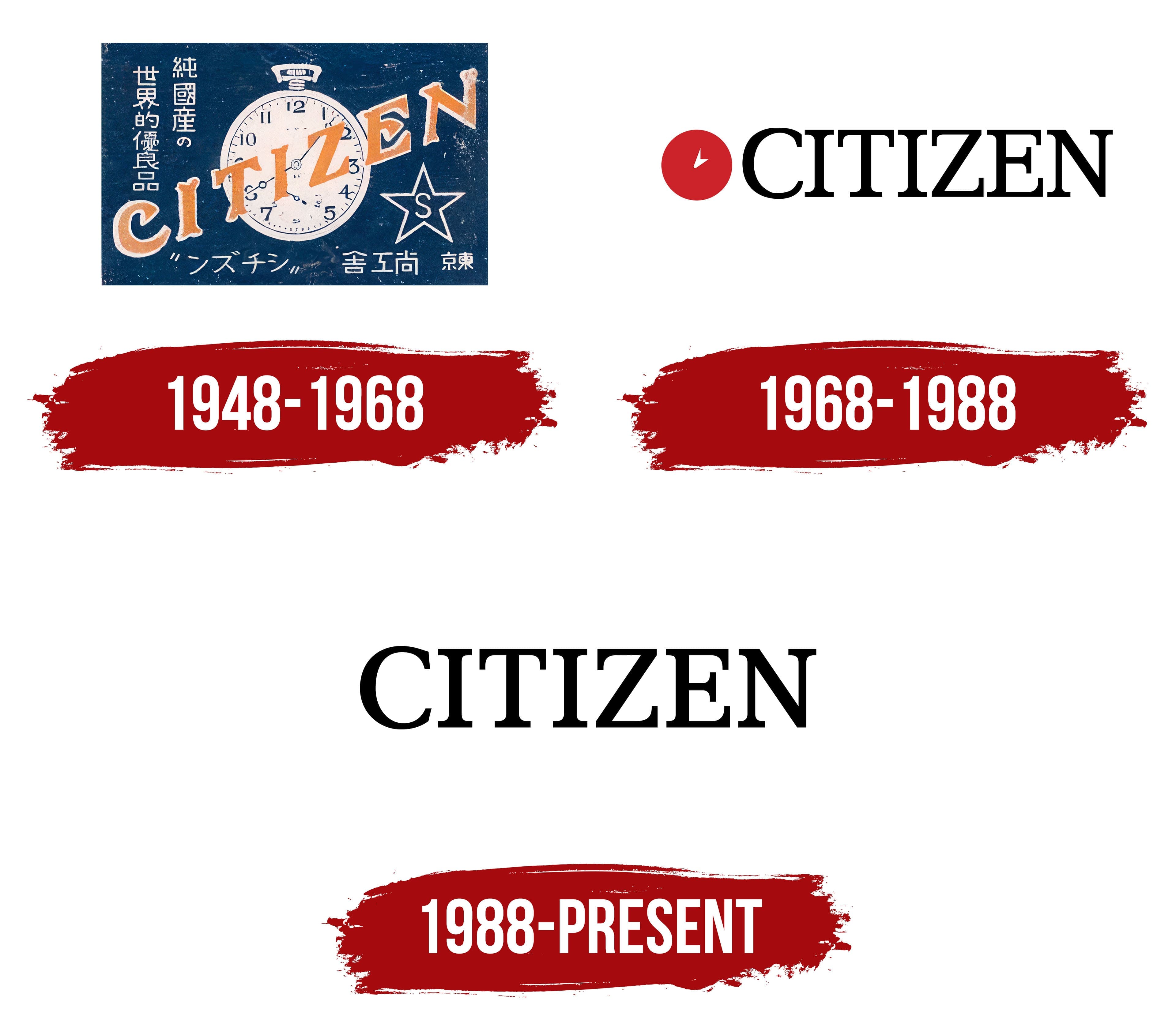
The Citizen logo stands out for its simplicity and lightness, creating an impression of sophistication and refinement. Small accents in the font emphasize the brand’s uniqueness, which stands out for its harmonious blend of affordability and high quality. The emblem subtly reflects the mission the manufacturer has successfully fulfilled, creating watches worthy of every person on the planet.
Citizen traces its history to 1918, when Kamekichi Yamazaki founded the Shokosha Watch Research Institute in Tokyo. In 1924, it released a pocket watch named Citizen, a title suggested by Tokyo mayor Shinpei Goto for timepieces intended for ordinary people. Citizen Watch Co., Ltd. was established in 1930, followed by exports to Southeast Asia and Oceania in 1936.
After wartime production, civilian manufacturing resumed with Parashock in 1952, Japan’s first shock-resistant watch. Citizen Automatic followed in 1956, while the X-8 electronic-balance model arrived in 1959. International offices opened during the 1960s, and Parawater, rated to 100 metres, became the first diving watch in 1966.
Quartz production began in 1973, followed by Crystron Solar Cell in 1976, the first analog solar-powered watch. Voice Master appeared in 1981, a professional diver with an electronic depth gauge in 1985, and a watch with altitude display in 1989. Eco-Drive arrived in 1992, using light as its power source, while radio-controlled timekeeping followed in 1993.
Eco-Drive gained a 180-day reserve in 2002 and a perpetual-calendar model in 2003. Satellite Wave arrived in 2011 with satellite synchronization. Citizen acquired Swiss watch group Frederique Constant in 2016 and marked its centenary in 2018 with limited editions. Later development included smartwatches with classic styling. By 2023, its range covered Eco-Drive, Satellite Wave, diving, mechanical and electronic watches.
Meaning and History
What is Citizen?
This is a leading player in the watch business, based in Japan. The brand, known for democratizing watchmaking, has expanded its global reach with its refined timepieces. The company’s most notable innovation is the Eco-Drive technology, which uses light to power the watches, eliminating the need for batteries and making the brand synonymous with environmentally responsible solutions. In addition to solar-powered watches, the brand offers a wide range of products, including elegant dress watches and rugged diving watches equipped with advanced features such as satellite synchronization and atomic timekeeping.
1948 – 1968

The Citizen Watch Co., Ltd. logo was shortened to the concise name “Citizen,” highlighting the brand’s goal of creating watches for citizens of a developed, progressive country. The founders aimed to make high-quality watches accessible to a wide audience, which influenced the name choice.
The emblem is designed as a stamp with white edges and a blue center. In the middle is an image of a watch, with the brand name placed diagonally over it. In the bottom right corner is a star with the letter “S,” likely referencing the Shokosha Watch Research Institute, where the brand’s production began.
The Japanese name is spread across the emblem, emphasizing the collaboration between Swiss and Japanese partners. However, many inscriptions and graphic elements make the visual sign somewhat overloaded and cramped.
1968 – 1988

When the company began exporting watches to Europe and the United States, the logo was adapted to adopt a more patriotic Japanese style. On the left, an image of the sun, taken from the national flag of Japan, was added to emphasize the brand’s connection to its homeland. The red circle also symbolizes the shape of a watch, and the white hands in the center reinforce this association.
The company name is displayed in a large yet elegant black font, maintaining a sense of dynamism and modernity. This highlights the company’s relevance and pursuit of progressive solutions.
1988 – today

The Citizen emblem, presented as a single, concise name, conveys minimalism and simplicity. The clarity and brevity of the font emphasize the brand’s core concept, where functionality and practicality are at the forefront. The brand’s collection includes affordable models equipped with quartz and electronic mechanisms, highlighting the company’s key principle of combining high quality with a wide variety. This approach enabled the brand to successfully merge its main strengths, helping it become the world’s largest watch manufacturer by 1986.
Uppercase letters symbolize reliability and confidence, aligning with the company’s high status and products. The simple and strict style of the lettering fully reflects the company’s philosophy of creating durable, functional, and accessible watches. This underscores the brand’s seriousness and adds stability and longevity to the logo, perfectly matching the company’s products.