


 Chopard Logo PNG
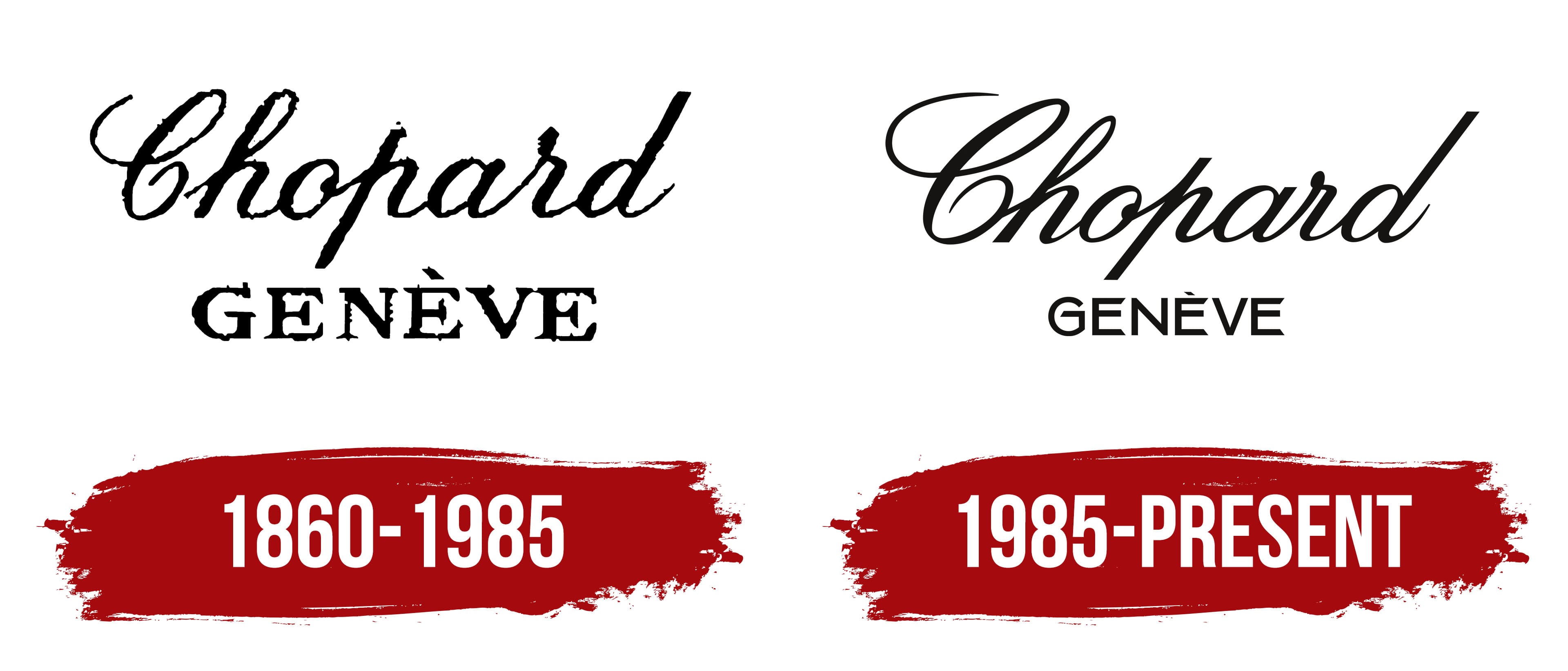
The Chopard logo embodies elegance and refined beauty. The unique design of the inscription highlights the brand’s approach and commitment to creating original jewelry that harmoniously complements the image of affluent and respectable clients. Every detail of the emblem reflects the brand’s status and prestige, aligning with its products’ high quality and impeccable style.
Chopard was founded in Sonvilier, Switzerland, in 1860 by Louis-Ulysse Chopard, a watchmaker from a farming family. His workshop produced precise pocket watches and later supplied timepieces to Swiss railways in the 1880s. By the early 20th century, the firm had built a wider reputation, and wristwatch production began in the 1920s. After he died in 1915, his son Paul-Louis took control, and the company moved to Geneva in 1937.
With no family successor ready to continue the business, Paul-André Chopard sold it in 1963 to German jeweler Karl Scheufele. The new owners expanded Chopard beyond watches into jewelry. Happy Diamonds appeared in 1974 with free-moving stones between sapphire crystals. During the 1980s, the company entered sports watches, and a partnership with the Mille Miglia race began in 1988.
In 1996, Chopard opened a movement manufacture in Fleurier, strengthening internal production. A partnership with the Cannes Film Festival followed in 1998 and led to the annual Red Carpet jewelry collection. In 2001, the company introduced the L.U.C 1.96 caliber, named after its founder and developed as an in-house mechanical movement.
Chopard marked its 150th anniversary in 2010 with commemorative collections and a new Geneva facility. The Green Carpet jewelry line appeared in 2013. By 2023, the Scheufele family still controlled the independent company, whose main operations covered mechanical watches, jewelry, high jewelry, and international boutiques.
Meaning and History
What is Chopard?
This Swiss company masterfully combines the art of jewelry making with fine watchmaking. As a family business, the brand has earned a solid reputation for creating stunning jewelry and watches, often blending both industries in innovative designs. The brand’s watchmaking expertise is showcased in the L.U.C series, known for its complex and high-quality in-house movements. Their Happy Diamonds concept has become iconic in jewelry and watches, where diamonds move freely between two sapphire crystals. The brand has strengthened its position in the luxury market by forging close ties with the film industry, including a partnership with the Cannes Film Festival.
1860 – 1985
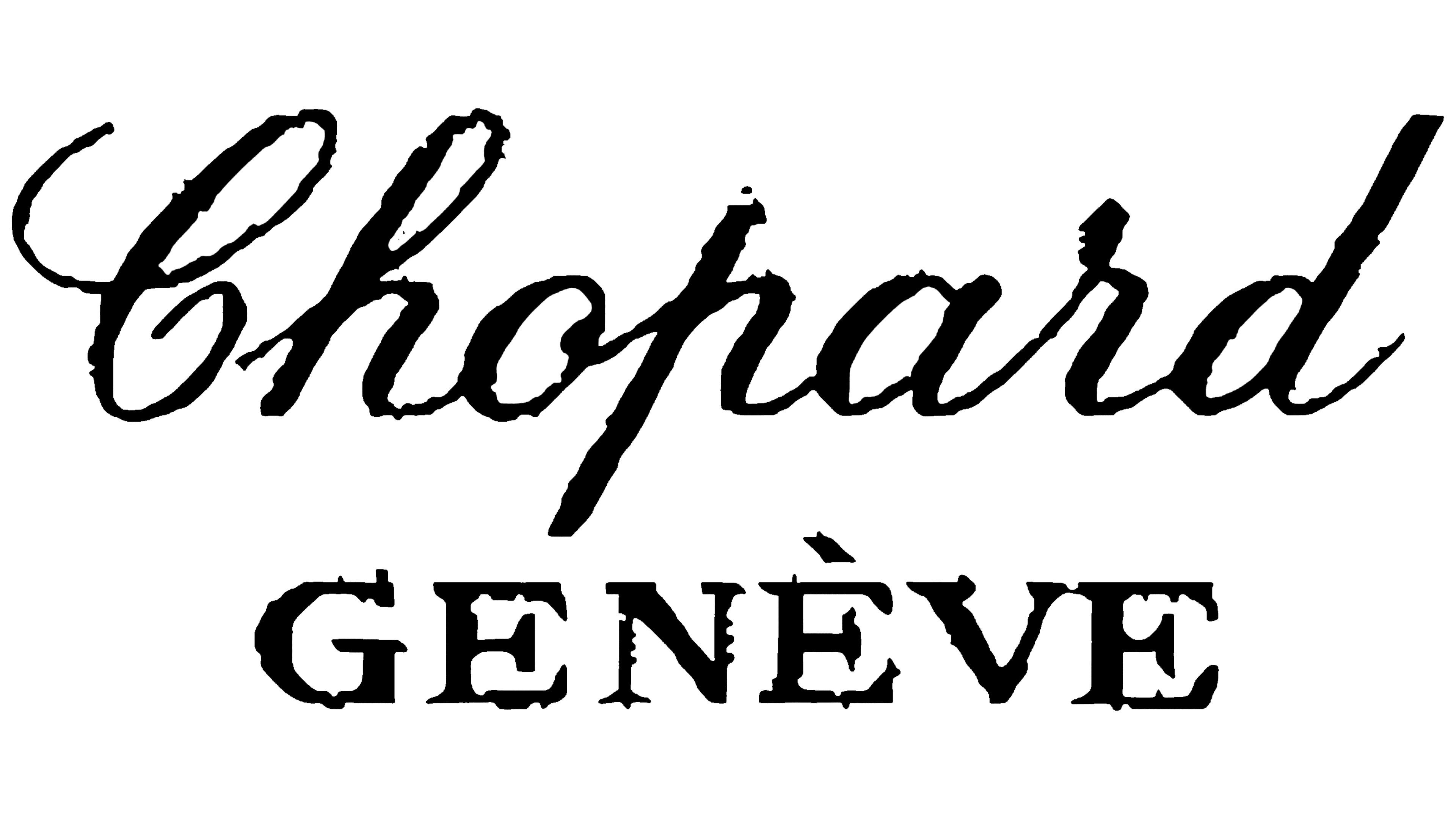
The Chopard emblem is based on a script font, giving the brand uniqueness and connecting it to the company’s founder, Louis-Ulysse Chopard. Each piece reflects the creator’s imagination and ideas, so the surname is written in cursive on the logo. This adds individual characteristics and emphasizes the personal connection to the author.
Beneath this inscription, the capital of Switzerland, Geneva, is written in large letters. This decision helps to associate the brand with the prestige and global status of the city, even though the company was originally founded in Sonvilier, another canton of Switzerland. It was not until 1937 that the production was moved to Geneva.
The equal size of both parts of the logo symbolizes two key aspects of the brand: the creator and his homeland, reflecting the harmony between personal heritage and the country of origin.
1985 – today
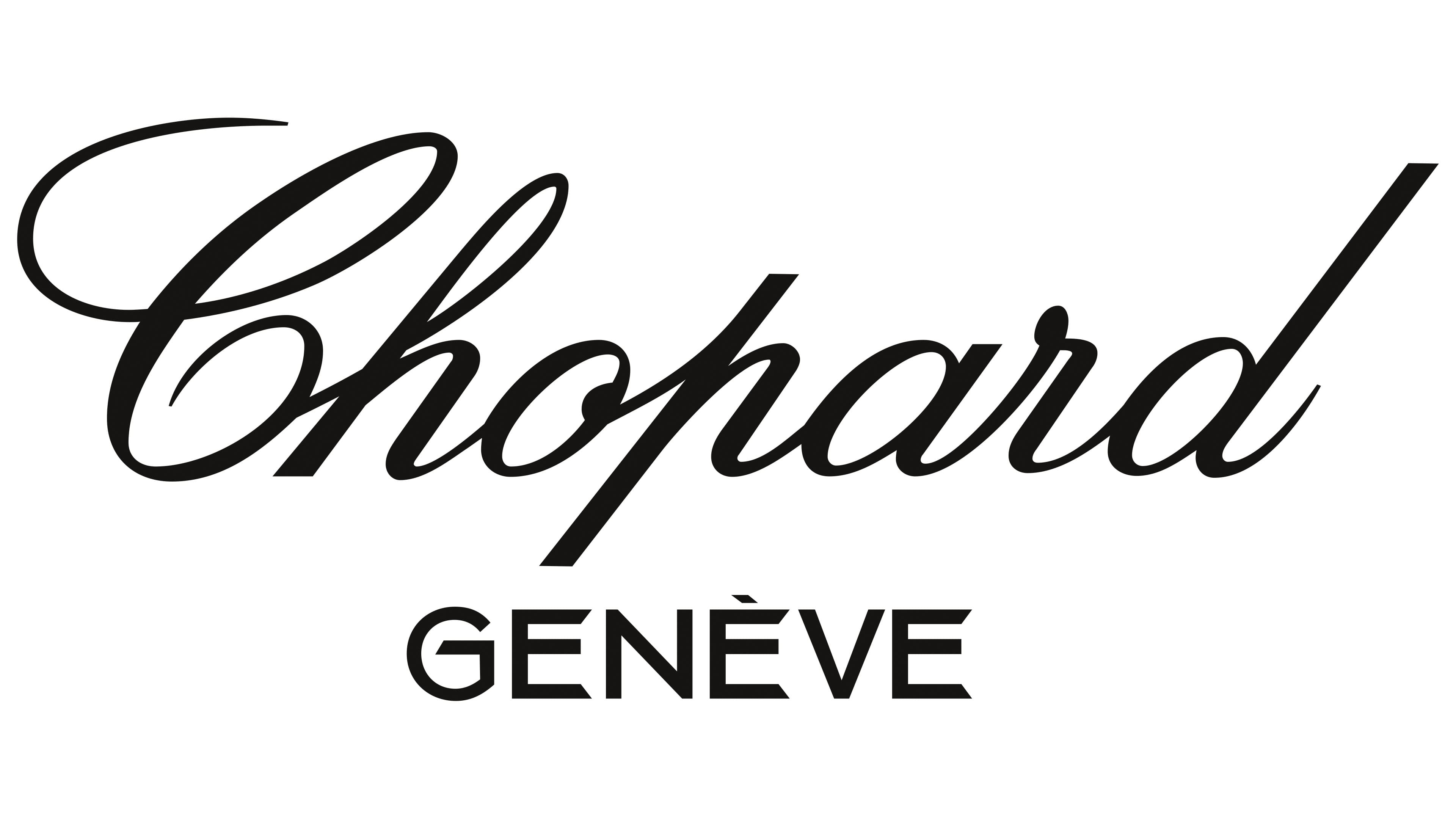
After expanding production, Karl Scheufele III updated the logo, adding even more elegance, purity, and refinement. While remaining in its original cursive form, the founder’s surname acquired smoother, more rounded lines, highlighting the brand’s renowned grace. These changes made the logo visually lighter, reflecting the brand’s philosophy, the pursuit of the perfect balance between sophistication and modernity.
The font for the word “Geneva” also changed: it became more refined and smaller, with a sans-serif style chosen to emphasize the brand’s modern character. This move gave the visual emblem a fresh, elegant look, and the absence of heavy details made it easier to perceive, highlighting the brand’s effort to keep up with the times while preserving its traditions.
In the updated version, the emphasis is placed on the brand name, and the stylish, minimalist font underscores its prestige and exclusivity. The entire logo aesthetic embodies the brand’s pursuit of perfection, reflecting the luxury and sophistication of the jewelry it is consistently associated with. This enables the brand to continue symbolizing high quality, refinement, and unparalleled craftsmanship without losing its uniqueness in the modern market.