


 Patek Philippe Logo PNG
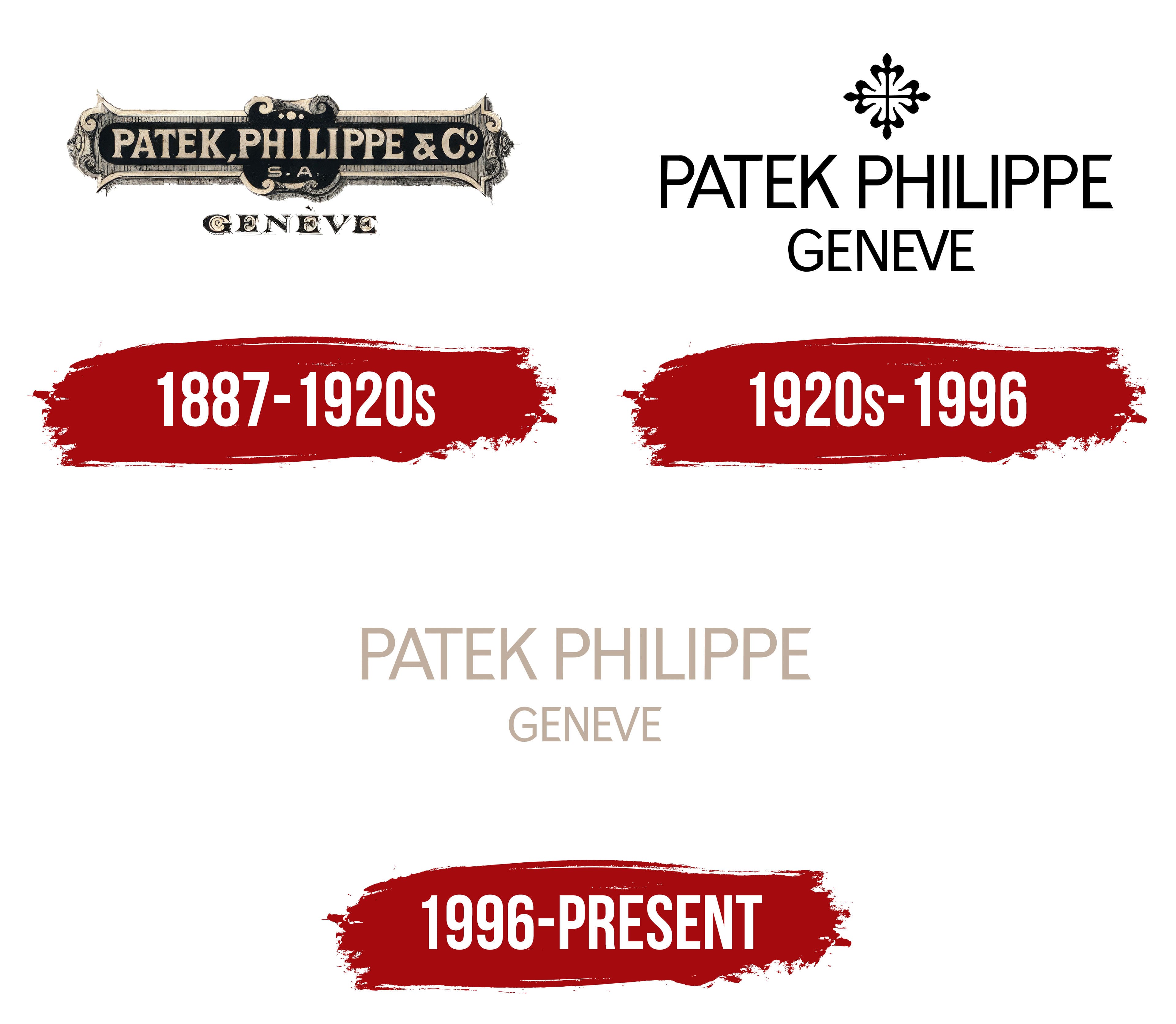
The Patek Philippe logo symbolizes the brand’s dedication to precision and refined craftsmanship. It reflects connections to European history and cultural values, upholding traditions that make the brand unique. The elements and colors of the emblem suggest exclusivity and convey the brand’s prestige and status. Every detail creates an impression of sophistication, thoughtfulness, and artistry, emphasizing its long history and commitment to the ideals of elegance and grandeur in watchmaking.
Patek Philippe began in Geneva in 1839, when Polish émigrés Antoni Patek and Franciszek Czapek founded Patek, Czapek & Cie. The workshop produced precise, decorated pocket watches. In 1844, Patek met French watchmaker Adrien Philippe, inventor of a crown-based winding system. Czapek left in 1845, Philippe joined the business, and the company adopted its present name in 1851.
At London’s Great Exhibition in 1851, its watches drew the interest of Queen Victoria. In 1868, the house made an early Swiss wristwatch for Countess Koscowicz. Patents followed for a perpetual calendar in 1881, a minute repeater in 1889, and a split-seconds chronograph in 1902. In 1925, it produced the first wristwatch with a perpetual calendar.
The Stern family acquired the company in 1932 during the Great Depression. Reference 1518 appeared in 1941 as the first serially produced wristwatch combining a perpetual calendar and chronograph. Further milestones included an electronic watch without moving parts in 1956, an observatory precision record in 1962, and the steel Nautilus, designed by Gérald Genta, in 1976.
“Calibre 89” marked the 150th anniversary in 1989 with 33 complications. An annual-calendar model followed in 1996, a wristwatch tourbillon movement in 2001, and a consolidated production facility in Plan-les-Ouates in 2009. For the 175th anniversary in 2014, the company released Grandmaster Chime with 20 complications. By 2023, it remained independent under Stern family control, in Geneva.
Meaning and History
What is Patek Philippe?
This Swiss brand represents the best in watchmaking, craftsmanship, and exclusivity. This family business combines traditional artisanal techniques with advanced technologies to produce some of the most coveted watches in the world. The brand is known for its complex models that feature multiple complications, such as clocks, minute repeaters, and perpetual calendars. Due to limited production and high demand, some models have multi-year waiting lists. Both historical and modern watches from this brand often sell for record amounts at auctions, making them even more appealing to collectors and connoisseurs.
1887 – 1920s
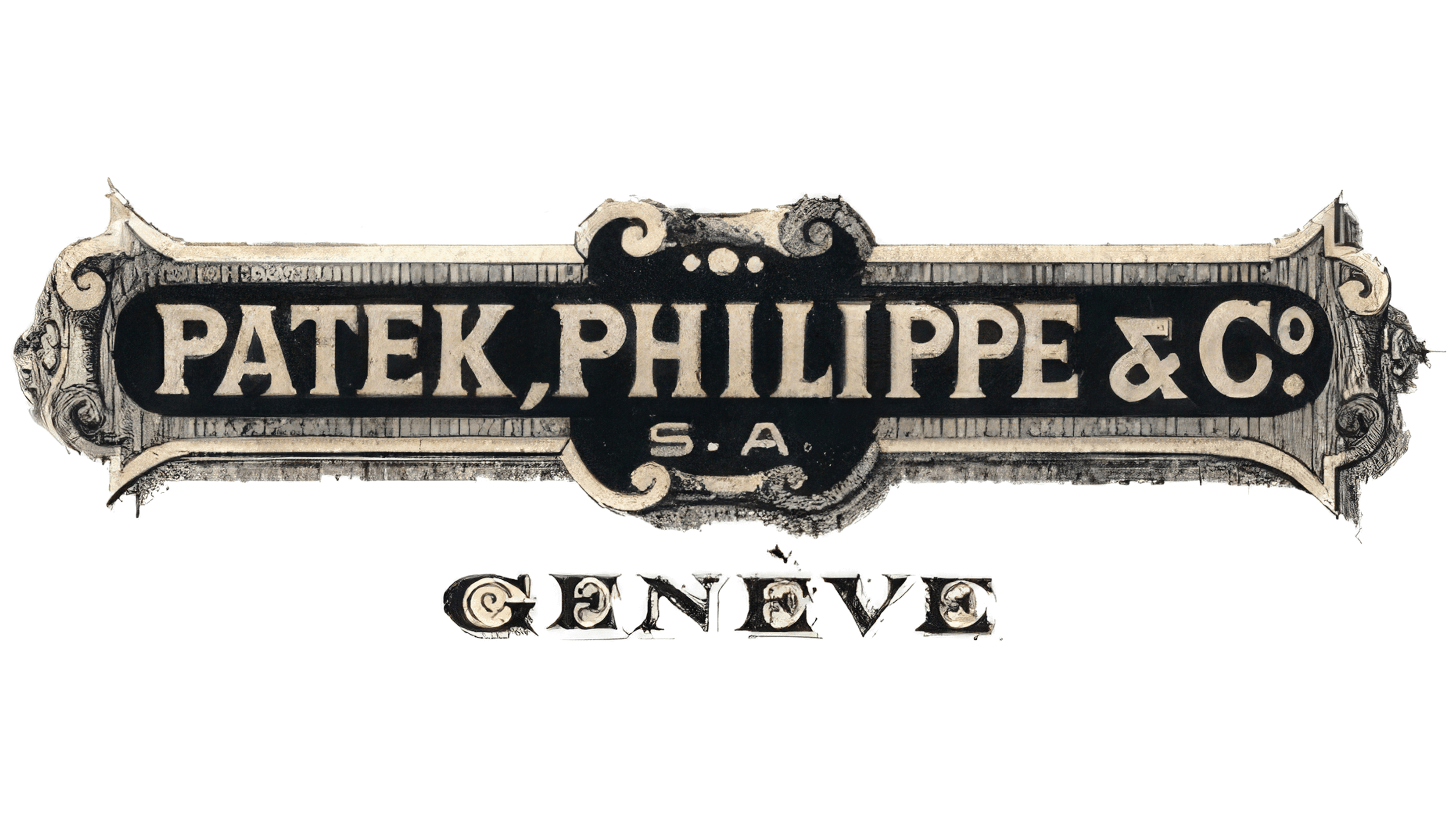
The brand’s first logo is based on a decorative motif that resembles a carved parchment scroll or a piece of fabric. The image’s twisted edges connect to ancient knowledge and traditions. The flourishes and dot decorations reference the times of nobility and royal courts. The company aims to position itself as a connoisseur, carefully preserving the secrets of the past and emphasizing the brand’s rich history, dating back to the early 19th century.
The flourishes in the logo symbolize elegance, which is highly valued at royal courts. This decision is no coincidence: in 1951, the Queen of Great Britain purchased the brand’s watches, and the early design featured gemstone inlay. The company’s products have always been aimed at the elite and wealthy.
The company name is written in large capital letters in the center on a black oval background. Initially, Antoni Patek and Franciszek Czapek owned Patek, Czapek & Cie. The logo, adopted after the union of Drienne Philippe and Antoni Patekin in 1951, underscores the brand’s great importance. The capital letters draw attention to the elite audience and innovations, such as the first keyless-winding watches.
Below the main element is an inscription indicating the capital of Switzerland, the city where the company was founded. This detail symbolizes the high quality of the products, as Swiss watches have long been associated with precision and excellence in watchmaking.
1920s – 1996
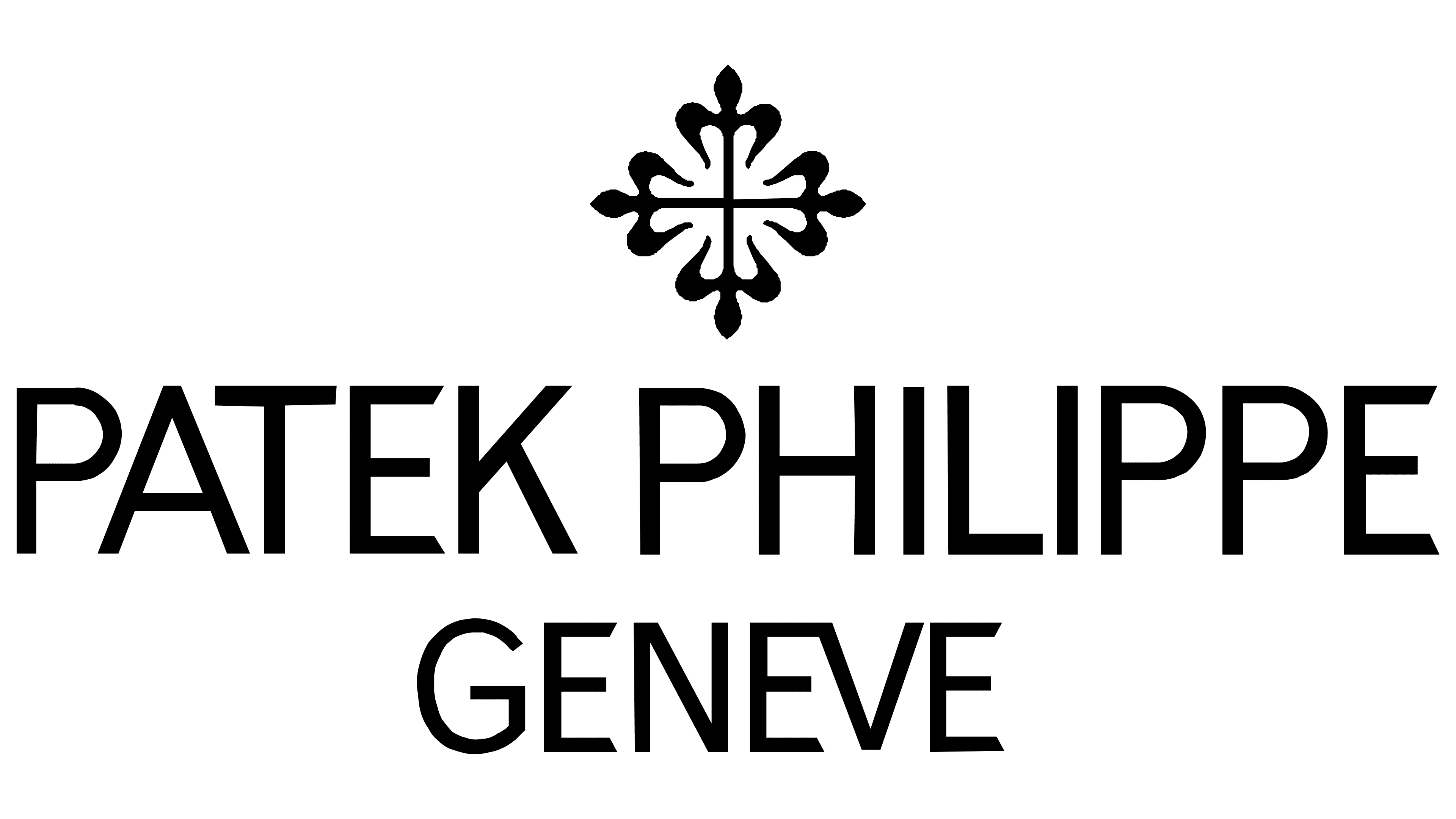
The new logo is crafted in a more refined and sophisticated manner. At the top is the Calatrava Cross, a symbol of knighthood, nobility, and tradition. Patek Philippe chose this cross to emphasize the brand’s commitment to high standards of craftsmanship and quality. The cross-shaped symbol also resembles an element of an old watch mechanism that regulates the spring.
Interestingly, the Calatrava Order has historical ties to the Cistercian Order and was under the jurisdiction of a French abbey, which can be linked to the French roots of Adrien Philippe, one of the company’s founders.
The inscription on the logo is made in large yet light characters. The simplicity and clarity of the lines highlight the prestige and precision of the brand’s products. At the same time, the size of the letters symbolizes the high quality and ease of use of Patek Philippe watches.
All additional details have been removed, and the comma between the founders’ last names has been removed, making the inscription more unified. This symbolizes the brand’s transition to a new phase, as the company’s management passed into the hands of the Stern family.
1996 – today
The Patek Philippe logo stands out for its use of white-gold letters, which emphasize the products’ high status and exclusivity. This choice of material symbolizes the brand’s prestige and luxury, which is entirely justified, given that nine of the ten most expensive watches sold at auction are by Patek Philippe.
Philippe Stern, who led the company and gave new momentum to its development, significantly influenced the redesign of the emblem. In his effort to highlight the brand’s importance and heritage, Stern launched a magazine dedicated entirely to Patek Philippe watches in 1996. This move became an important part of strengthening the company’s image, helping the brand maintain its reputation as a leader in luxury watches and further solidifying its position in the global market.