


 LVMH Logo PNG
LVMH’s logo appears significant and robust. Despite its compactness, the emblem evokes a sense of harmony and grandeur. Each element of the inscription feels like a separate page from the history of some of Earth’s oldest and most renowned brands.
LVMH’s roots reach across several French luxury houses. Moët & Chandon dates to 1743, Hennessy to 1765, Veuve Clicquot to 1772, and Louis Vuitton began in 1854 as a maker of travel trunks for Parisian elites. In 1971, Moët & Chandon merged with Hennessy. On June 3, 1987, Moët Hennessy and Louis Vuitton formed LVMH Moët Hennessy Louis Vuitton, then a group of 10 houses, 12,000 employees, and about €3 billion in revenue.
The new group quickly fell into conflict between Alain Chevalier of Moët Hennessy and Henri Racamier of Louis Vuitton. Bernard Arnault entered through that dispute. In 1984, he bought the bankrupt Boussac Saint-Frères for one franc and focused on Christian Dior. In 1988, with Lazard Frères and Guinness, he began buying LVMH shares. By 1989, he had control and became chairman and CEO.
Arnault then built LVMH through acquisitions. Givenchy joined in 1989, Kenzo in 1993, Loewe and Céline in 1996. In 1997, Marc Jacobs became creative director of Louis Vuitton, and LVMH bought Sephora. TAG Heuer followed in 1999 for $739 million, along with Fendi, after competition from Prada.
The group added Bulgari in 2011 for €5.2 billion, Loro Piana in 2013 for €2 billion, and full control of Christian Dior in 2017 through a €13.1 billion deal. Its largest luxury deal was Tiffany & Co, announced in November 2019 for $16.2 billion and closed in January 2021, strengthening LVMH against Richemont, owner of Cartier and Van Cleef & Arpels.
Meaning and History
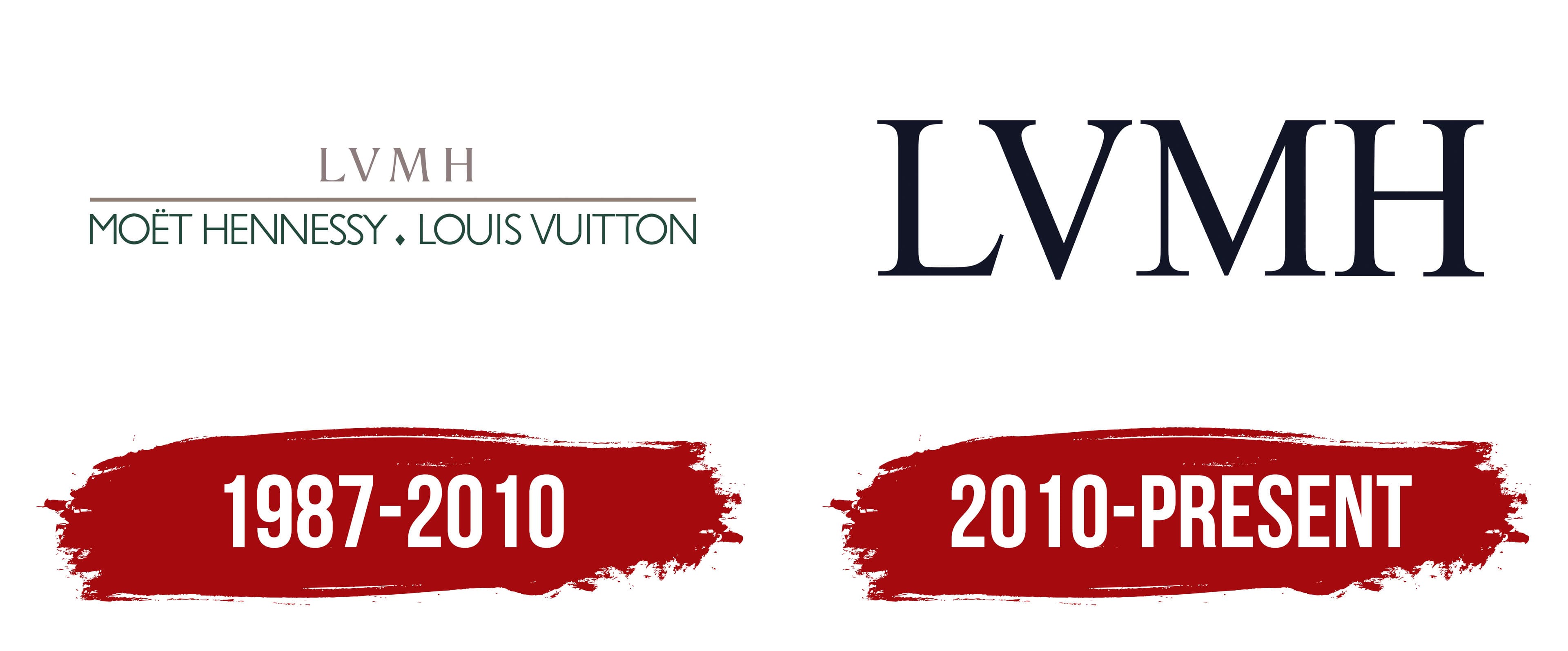
True elegance and luxury do not imply extravagance. The company’s logos are simple and airy, yet they look expensive and respectable. The rebranding showcased the company’s growth and significant expansion by 2010. The four letters are easily remembered and pronounced in any language. The concise name creates a stable association with the group by placing logos for LVMH member brands.
What is LVMH?
A conglomerate with an annual profit of 14 billion euros. It specializes in luxury and acquires globally renowned elite product brands. It owns almost 100 brands across fashion, cosmetics, beverages, yachts, and jewelry. The group’s headquarters are in Paris. Every two years, the company allows the public free access to its properties on four continents to admire luxurious items (Journées Particulières).
1987 – 2010
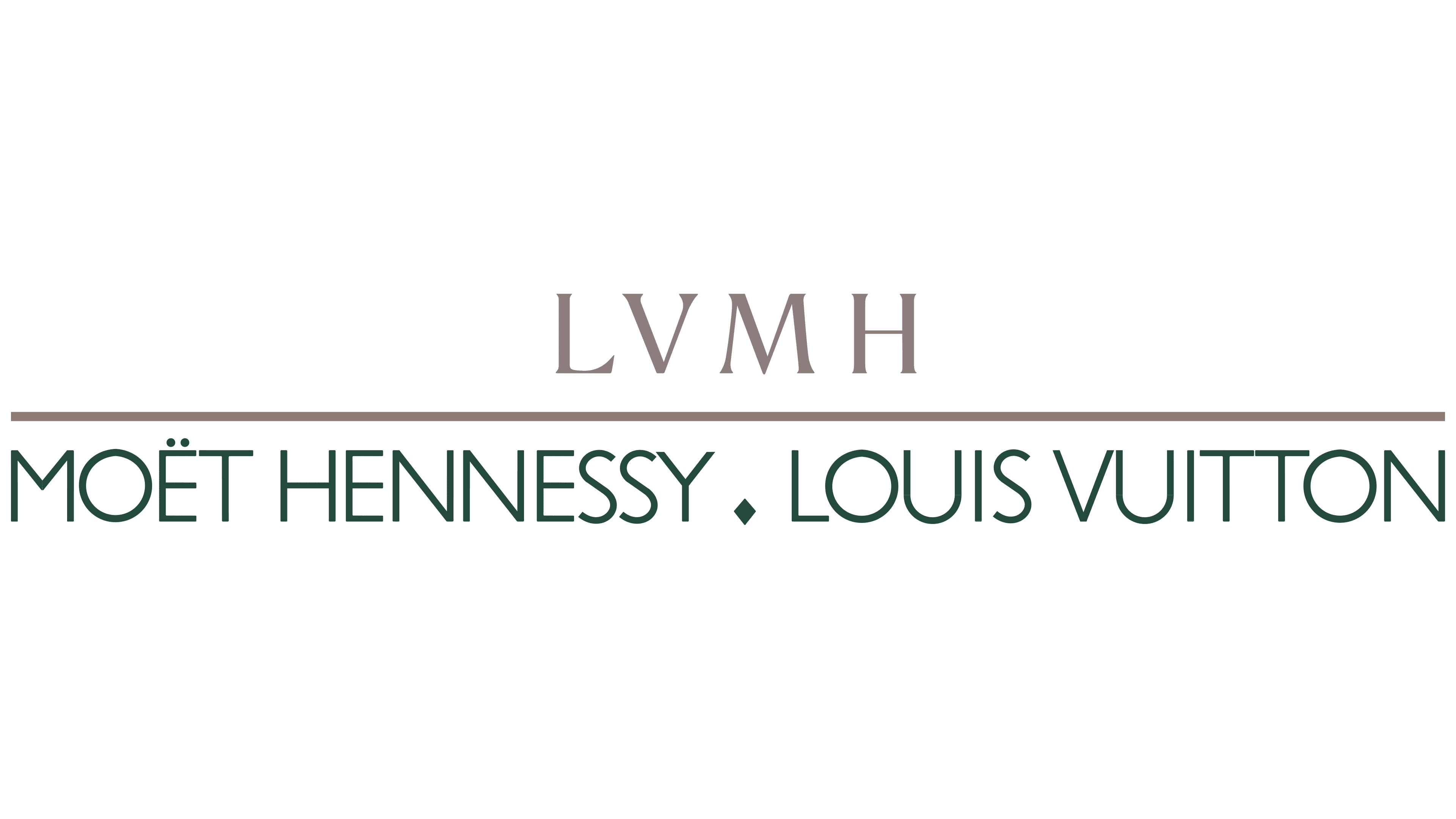
The first logo features an elegant inscription in two levels, each in a separate color. At the top center, in a noble mother-of-pearl gray, is the abbreviation LVMH.
Below, in a deep emerald, are written the names of the companies whose union gifted the world a renowned luxury brand.
- Moët Hennessy is an ancient wine house established in France in 1743 by Claude Moët. In 1833, it was named Moët and Chandon, and in 1971, it formed a union with the cognac production Hennessy.
- Louis Vuitton, a French fashion house, was opened in 1854 by designer Louis Vuitton, who crafted convenient suitcases and bags for the elite and wealthy.
The emblem prioritizes the older company, highlighting the conglomerate’s rarity and experience to ensure customer trust. After all, today’s clients’ great-grandfathers might have heard of Moët wines.
The companies’ sizes also played a role, as Moët Hennessy is three times larger than Louis Vuitton. Therefore, it took the leading positions in the union and logo. Interestingly, the secondary role in the emblem somewhat foreshadowed future events: when Louis Vuitton’s owners only held 17% of LVMH shares, and with the arrival of Bernard Arnault, they entirely lost their share in the group.
However, in the joint venture abbreviation, the fashion house comes first, as LVMH stands for Louis Vuitton Moët Hennessy. This choice is dictated by the designer’s greater global recognition in the luxury fashion sphere rather than in Moët beverages.
The LVMH logo design demonstrates how the new company is based on the preceding two. A line between the first and second levels intensifies the impression. This line seemingly divides the old and new eras, showcasing the inception of a more luxurious and formidable house post-merger.
The mother-of-pearl shades speak of fashion, beauty, and premium-class items, while the malachite tones indicate antiquity, nobility, and wealth. This choice makes the emblem exclusive and exceptional in terms of luxury.
2010 – today
The modern logo consists of four large letters with subtle serifs. Mentions of the founders were removed from the emblem because the group’s membership has increased from 2 to 90.
The size of the inscription signifies the conglomerate’s leadership in the luxury world. LVMH surpasses its main competitors, including Estée Lauder Companies Inc., L’Oréal Luxe, and Compagnie Financière Richemont SA. The giant has made its owner and president the wealthiest person in Europe. Arnault’s net worth is estimated at more than $243 billion.
Font and Colors
The inscription’s black color demonstrates a lack of competition. It’s a dominant position in the market. This shade is considered universal and suitable for denoting brands of various directions, with the company having more than 70. Both in fashion and in logos, black looks solemn and ornate.
The chosen font for the inscription is the timeless Dutch 801 Std Roman, which combines refined antiquity with luxurious modernity. The delicate serifs point to the premium, exclusive nature of the products. The use of all uppercase letters underscores the equal importance of the group’s members.