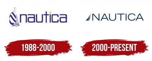
The succinct logo of Nautica actually hints at broad horizons and a sea of possibilities. It directly testifies to this, using just a single element, which, by the way, is highly recognizable even among those not familiar with the fashion brand.
Nautica: Brand overview
Meaning and History
A year after the brand’s appearance, it was acquired by State-O-Maine, a clothing manufacturer. Thanks to its accessible pricing policy, the newly acquired trademark became so well-known that the sewing enterprise decided to rename itself Nautica. This happened in 1994. Then, it was purchased by VF Corporation, which significantly expanded the assortment: now, the logo with a stylized sail decorates not only clothes but also other products, including perfumes, accessories, and home-use items. Nothing other than an allusion to a ship could be in it, as the name is related to sailing and the water element.
What is Nautica?
Nautica is an American brand of sportswear for women, men, and children. It also offers perfumes, watches, and various kinds of accessories. All its products fall into the mid-price range. The company was formed in 1983 by designer David Chu and is now part of ABG (Authentic Brands Group). Its headquarters are located in New York City.
1983 – 1988
The brand’s name is derived from Latin: it comes from the word “nauticus,” which has its roots in the Greek language, where it denotes the naval fleet. In the modern world, it is also associated with seafaring (by Italians). Therefore, the entire visual identity of the company revolves around a ship – both as a verbal and a drawn image.
1988 – 2000
The emblem of Nautica consists of two parts that form an indivisible whole because they are united by a common idea. The first is a drawn sign – several ships with tightly inflated sails. In total, there are three sailing vessels: the first has a white-and-blue striped triangular sail, the second – is completely blue, and the third – is white with thin parallel lines.
On the right side is the company’s name, set in semi-bold font with large characters. The letters are lowercase, with smooth edges and softly rounded corners, making it seem as if they are cut at the bends. The exceptions are “t” and “i”: one has the shape of a classic cross, and the other looks like a miniature post with a lantern on top. This association is probably linked to the past when sailors ventured out to sea at their own risk, as many did not return from the vast waters, and the survivors could only navigate by the light of a coastal lighthouse. Why would a clothing manufacturer need this? Probably to emphasize protection from dangers, as it deals with goods for extreme activities.
2000 – today
Designers decided to move away from the intimidating theme of the Nautica logo and proposed a calmer version with a balanced combination of text and graphics. Now, it has two sails – narrow, tall, and slightly curved. They are directed towards the inscription, which remains on the right. This adds dynamism, as it creates the impression that the ship is sailing across open water, driven forward by a strong wind. However, the font in the emblem is completely different: firstly, the letters are in uppercase, and secondly, they are made wider. In addition, the glyphs have lost the hint of trimmed and rounded corners. Now “U” and “C” look like brackets; both “A”s have their tops cut off, and “T” and “I” are straight and maximally geometric.
Font and Colors
The inscription in the Nautica logo is set in a typeface reminiscent of Trade Gothic Extended. The font was created by Jackson Burke in 1948. The letters are wide, smooth, and grotesque, to let nothing hinder their representation of freedom of movement across the waves.
The usual palette of this fashion brand is associated with blue – a color that conveys the concept of sailing, ships, yachts, and navigation across endless waters. In one version of the visual identity, lilac-blue is used; in another, dark blue symbolizes the unexplored depths of seas and oceans. These are harmoniously complemented by yellow, representing the life-saving light of a lighthouse.


