The Tissot logo reflects the brand’s unwavering commitment to tradition, highest quality, and precision. The design emphasizes the company’s connection to the history of the country where it was founded, reinforcing associations with reliability and prestige. The solid, clear lines of the symbols add weight, shaping an image that consumers have trusted for many years. This emblem embodies the brand’s stability and high status, maintained through years of experience and a pursuit of excellence.
Tissot: Brand overview
Tissot’s history began in 1853 in the small Swiss village of Le Locle in the Jura Mountains. Charles-Félicien Tissot and his son, Charles-Émile, established a small workshop to produce pocket watches. Their commitment to innovation and high-quality craftsmanship helped the brand quickly gain a reputation as a reliable watchmaker.
In the early years, Charles-Émile traveled to the Russian Empire to sell gold pocket watches, which gained immediate popularity among the Russian nobility and helped expand the business.
In 1866, the company opened its first factory in Le Locle, increasing production and diversifying its product line to include watches with additional complications, such as chronographs and repeaters.
By the 1890s, the company was expanding internationally. It opened offices in Moscow and New York, significantly growing its global market presence.
At the beginning of the 20th century, the company began producing wristwatches, gradually becoming more popular. 1910, the brand introduced its first women’s watch with precious stone embellishments, followed by its first men’s mechanical wristwatch in 1917. The latter quickly gained popularity due to its precision and reliability.
The 1930s were a time of technological innovation for the company. 1930, it made history by launching the world’s first anti-magnetic watch. In 1933, the company introduced the first synthetic watch movement made from non-metallic materials.
A major milestone occurred in 1943 when the business merged with Omega to form SSIH (Société Suisse pour l’Industrie Horlogère). This merger allowed both companies to share resources and technology while maintaining their identities.
The 1950s and 1960s saw many innovations. In 1951, the company introduced the Navigator, the first mass-produced watch that could display time in 24 time zones. In 1965, the brand launched the Seastar 1000, its first diving watch with a water resistance of 1,000 meters.
The Swiss watch industry faced the “quartz crisis” during the 1970s. The brand was at the forefront of quartz technology and introduced the first plastic quartz watch, the IDEA 2001, in 1976.
1983, the company joined the newly formed Swatch Group, opening new growth opportunities.
Bold innovations marked the 1980s and 1990s. 1985, the company launched the RockWatch line, which featured a natural stone case. In 1988, it introduced the WoodWatch, with a wood case. The brand also revolutionized watch technology in 1999 with the launch of T-Touch, the first watch with a tactile touch screen.
The advancement of T-Touch technology continued into the 21st century. In 2004, the company released the T-Touch Expert model, offering a wider range of features. In 2014, the brand introduced the T-Touch Expert Solar, the first tactile watch powered by a solar battery.
The brand celebrated its 160th anniversary in 2015 by releasing several commemorative models.
The company continued refining its key collections and technologies in the following years. It increased its presence in the sports world by becoming the official timekeeper for events like the NBA and the World Cycling Championships. By 2023, the company remained a leading Swiss watchmaker in the mid-range market. It continued to develop its classic mechanical collections, such as Le Locle and Chemin des Tourelles, alongside cutting-edge electronic models like the T-Touch.
The brand’s legacy is continuous innovation and a commitment to quality. From its humble beginnings in Le Locle to becoming globally recognized, the company has consistently produced watches that blend Swiss craftsmanship with the latest technology.
Meaning and History
What is Tissot?
This Swiss watchmaker has successfully bridged the gap between luxury and affordability in the watch industry. As a member of the Swatch Group, the brand offers a wide range of watches, combining cutting-edge technology and Swiss craftsmanship, catering to various tastes and preferences. The brand is known for its innovations, including using stone, wood, and pearls in watchmaking. The company maintains strong ties with the sports industry through its role as the official timekeeper for numerous global sports events and leagues. Their collection covers everything from durable sports chronographs to elegant dress watches, including the T-Touch series, equipped with touch-sensitive sapphire glass. With affordable prices and a strong commitment to quality and precision, the brand has become popular for those seeking Swiss watches at a reasonable price without compromising prestige and craftsmanship.
1853 – 1880
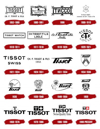
The company’s emblem features floral motifs, reflecting the dynamic growth and development. The central element is a rectangular plaque with the brand name, taken in honor of the founders, father and son: Charles-Félicien and Charles-Émile. Around the inscription, buds, and leaves grow from the corners and sides, symbolizing the company’s blossoming. The sharp edges of the elements convey the idea of readiness to face competition. Below the main plaque is the abbreviated name, including the first letters of the father’s name, “Ch-F,” with the son’s name indicated as “fils,” highlighting the continuity of the family business.
1880 – 1891
The company’s emblem is framed by patterns resembling climbing plants with lush foliage. This choice symbolizes prosperity, vitality, and continuous growth, aligning with the elegance of the watch models of that era. In a fine font and two levels, the logo’s center is the brand name: “Ch.F.Tissot & fils.” Above it is the Swiss cross, behind which two crossed arrows are visible, symbolizing the watchmaking craft. This emphasizes the company’s Swiss origins and speaks to the high craftsmanship traditionally associated with elite Swiss watches.
1906
The emblem retains its original design without the company name at the bottom. The brand name is now presented in Russian, reflecting an important stage in the brand’s history. Charles-Émile, the founder’s son, moved to Russia and established a successful pocket watch production. This logo symbolizes the Russian branch of the company, highlighting its significance and contribution to the brand’s development on the international stage.
1906 – 1910
The symbol embodies the continuity of several generations. The central element resembles a crown and its reflection, emphasizing the connection to the production of “Tsar’s Watches” for officers of the Imperial Guard. This is why the crown became a key element of the logo. Inside the thin lines is a monogram featuring the Russian letter “T,” combining uppercase and lowercase forms. This visual mark was used by Charles Tissot, son of Émile, who managed the company’s affairs in Moscow. The signature below the crown read: “Charles-Émile successeur Ch.F. Tissot & fils,” presenting Charles-Émile as the successor of the family business. This logo likely became part of the design of the “Tsar’s Watches.”
1910 – 1911
The emblem retains the company’s signature style, emphasizing attention to detail and handcrafted production. The symbol is designed in a rectangle, with edges outlined by thin straight lines with barely noticeable gaps at the joints, hinting at handcraftsmanship. In the logo’s center, the brand name and its main focus are displayed in large letters in English: “Tissot Watch.” This design was likely used for promotion and sales in the European market.
1911 – 1918
The new emblem retains its rectangular shape but adds more depth by combining thick and thin lines, creating contrast in the white border. An inscription in the logo’s center represents the third generation of the company’s owners: “Ch. Tissot fils Locle.” This name refers to Charles Tissot and the establishment of the first real factory in Le Locle. It became an important milestone for the brand, allowing it to move away from hand assembly and mechanized production.
1918 – 1920
The emblem is crafted in an elegant Art Deco style, which was popular then. The inscription, adorned with flourishes and elongated lines, harmonized with the watch’s design. Once again, the name features the founder’s initials and the company’s original name: Ch. F. Tissot & fils. This choice emphasizes a return to the roots, signifying unwavering quality. Below is the name of the factory, “Locle,” with the elongated first letters “T” and “L,” creating a unique frame, accentuating the composition from top to bottom. The logo blends tradition with new technologies, demonstrating that even with automation, the production maintains its high precision and reliability, which was previously ensured through hand assembly.
1920 – 1921
The emblem is presented in a circle, symbolizing the company’s transition to producing wristwatches, which replaced pocket watches. The brand name at the top and the factory name at the bottom are curved to create the effect of a watch dial. In the center is a monogram made up of the first letters of the brand name. The central letter “T” stands out with its large size, drawing attention to the founders’ surname and emphasizing the importance of tradition and the continuity of the brand.
1921 – 1924
With the expansion of production and the growth of industrialization, a need arose for simpler and more concise forms. As a result, the logo was drastically simplified, leaving only the brand name and a reference to its Swiss origin. This design emphasized two key symbols of quality — the Tissot name and the world-renowned reputation of Swiss watchmaking. This minimalism showcased trust in tradition and craftsmanship without needing extra embellishments or complex details.
1924 – 1931
The brand returned to its previous emblem, with the full company name at the top and the factory name at the bottom. The distinctive feature of the logo is the unusual letter “C,” stylized as half of a heart. This element symbolizes the company’s commitment to staying true to its traditions while remaining original and unique. It highlights the brand’s uniqueness and dedication to continuity without losing individuality over time.
1931 – 1934
For the release of the first anti-magnetic watches, a new logo was developed using the lettering style from 1918. The glyphs themselves took on bolder outlines, highlighting both the visual appeal and the impeccable quality of the brand’s products. A broad stripe running across the top of the name symbolized the confident growth in sales and the brand’s strengthening position in the market.
1934 – 1936
The emblem was transformed into a shield, symbolizing the reliability and protection of the watch from magnetic influence. This technology became foundational for other manufacturers, and the brand aimed to emphasize its leadership in its development. Inside the shield, two lines form the peaks of mountains, referencing the Jura Mountains, where the city of Le Locle is located. This element highlights the brand’s leadership, which is “at the top.” Above the mountains, the brand name is displayed in Art Deco style, and the word “Dienst” indicates a comprehensive approach to production and service.
1936
The logo was transformed into the image of a watch, with thin and elegant lines that give it an aristocratic feel. A small shield on the left side of the dial hints at the precision and craftsmanship of Swiss technology. The brand name is at the bottom of the composition, emphasizing its status and heritage. The concise and complete composition symbolizes the brand’s long history, making it expressive and memorable.
1936 – 1949
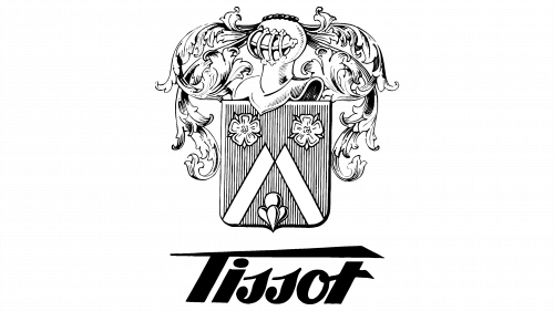
The heraldic logo was created specifically for Tissot, with elements that highlight the brand’s history and origin. The shield, etched with vertical lines, represents the two ridges of the Jura Mountains at the foot of which the company’s factory was founded. Edelweiss flowers are depicted on both sides of the peak, with a third blooming at the shield’s base. These flowers symbolize the Swiss mountains and the continuity of the family business, which a fourth-generation family member manages.
The flower elements echo the image of the Tudor rose—two flowers symbolizing union, possibly hinting at the company’s subsidiaries in Germany and Russia. The similarity of the two stripes forming the mountain peak to the first coat of arms of the English dynasty may be coincidental, but it adds visual depth to the logo.
Above the shield is the knight’s armor, symbolizing the company’s nobility, quality, and long history. This element emphasizes that the brand fights for its position in the market and maintains high production standards. The “feathers” of oak leaves surrounding the shield symbolize the strength of the business and its connection to the family as part of a long and distinguished dynasty.
The company name at the bottom is styled in a way that was used from the 1930s to the 1960s, completing the harmonious image that ties the past to the present and highlights the brand’s prestige.
1949 – 1959
The emblem has been given more elegance, reflecting the spirit of the knightly era. The brand’s crest is now located in the upper left corner, and the color of the shield has been changed to black to harmonize with the font’s shade. An elegant monogram with several loops extends from the crest, gracefully framing the inscription on the right. This element refers to the beauty of the decoration and the chain of pocket watches, which the brand’s founders started with, symbolizing the gradual development of the company and its drive toward the future.
Below the crest, the founding year has been added, emphasizing continuity and the unbroken connection between generations. As if passing the baton of time, the founders express their values and traditions, which remain relevant today.
1959
The crest was transformed in Art Deco style, harmoniously combining with the inscription. The geometric shapes of the knight’s helmet and feathers and the play of contrasts between black and white fragments are reflected in the triangular extensions that emphasize the brand name placed above the image. This fusion of modern style with elements of the past highlights the connection between tradition and innovation, reflecting the company’s evolution.
1959 – 1976
The logo design was updated after the brand was handed over to Paul Tissot’s sister, Maria. The Art Deco style remained in the letter “T,” positioned at the top of the emblem. Two lines along the sides symbolize the thread of time, along which the brand confidently moves forward. Generations change, eras pass, yet the company maintains its presence. Below, the brand name is written in capital letters using a sans-serif font. This play on writing styles — blending tradition with modernity — emphasizes the company’s heritage and development.
1976 – 1986
The logo with the letter “T” and strokes is placed on a black square next to a similar square with the Swiss cross. This symbol emphasizes the brand’s close connection to Switzerland’s history and roots in the country’s culture. The brand name has remained unchanged, and capital letters highlight the brand’s importance and significance in global watchmaking.
1986 – 1999
The size of the squares in the emblem was reduced, but their symbolic meaning remained the same. The company is still associated with Switzerland; any mention of the country consistently brings the brand to mind. At the bottom, an inscription in an old elegant font was added, indicating Swiss quality. This emphasizes the company’s core positioning, which prides itself on stability, reliability, and adherence to high standards of product longevity.
1999 – today
The logo was updated, gaining a more simplified and modern look. The letter “T” is now designed in the same style as the main inscription, creating a harmonious and unified appearance. The black square with the cross was replaced with red, referencing the color palette of the Swiss flag, adding a touch of national character. The contrast between the strict and classic fonts emphasizes elegance and sophistication while retaining the brand’s signature features. This updated logo continues to convey the prestige and high quality of the products while adapting to modern design requirements.


