


![]() CumLouder Logo PNG
CumLouder Logo PNG
The adult content studio CumLouder has opted for a serious logo, signaling its intention to compete with more popular rivals. The simple style of its branding is linked to the desire to veil the emblem and easily adapt it to all information carriers without arousing suspicion.
CumLouder launched in 2010 in Gijón, a port city in Asturias, Spain. The project came from Techpump, a tech company founded by Borja Mera in 2007, focused on web development for desktop and mobile platforms.
In 2008, Mera worked on various websites, from e-commerce sites to health blogs, and noticed strong ad revenue from adult content. He aimed to build a platform with controlled production and consistent quality, rather than random uploads.
Two years went into building production capacity. By 2010, CumLouder entered the market with no direct rivals in the Spanish-speaking segment. Global platforms like PornHub and Brazzers, part of Aylo, already dominate worldwide, while the Spanish-language niche remains open.
From the start, the studio focused on high standards for video and audio and maintained an active feedback loop. This approach contrasts with large aggregators built on third-party content.
The project targeted international competition rather than local sites, aligning production with leading U.S. studios. Under Mera’s direction, Techpump scaled to over 20 million daily users across its platforms.
CumLouder featured both Spanish performers and international names, including Lexi Belle. Actresses like Nekane, NoeMilk, and Hanna Montada gained visibility on the platform before moving to studios such as Vixen and Brazzers.
Its audience became global, with strong positions in Spain and Latin America. The content often included humor aimed at adult viewers.
CumLouder remains a core Techpump project alongside Siroko. The network expanded to 25 niche sites, distributing content worldwide while staying based in Gijón.
Meaning and History
![]()
The brand’s visual identity has evolved significantly, with only minor changes to the logo. Mainly, they involved color play and changes in textures and fonts, while the original structure always remained unchanged.
What is CumLouder?
CumLouder is a site specializing in adult content. It has an international audience but is particularly popular in Spain and Latin America. The studio often uses a humorous approach in its videos for a mature audience.
Old Logo
![]()
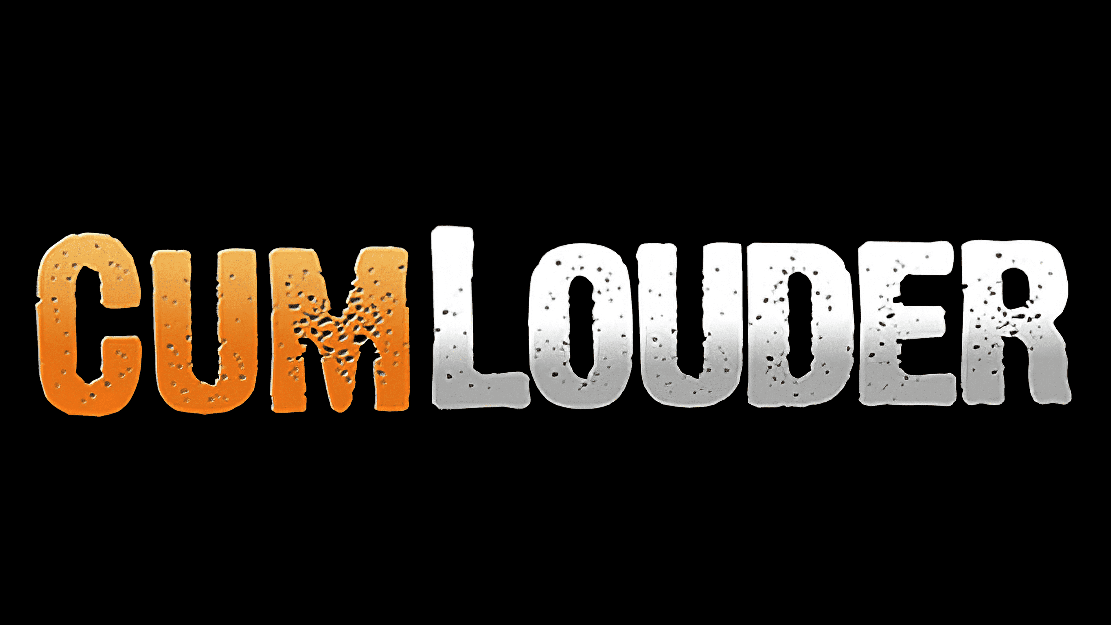
The CumLouder logo is a simple inscription consisting of hand-drawn symbols. Although all letters are uppercase, “C” and “L” are taller than “U,” “M,” “O,” “U,” “D,” “E,” and “R.” Another interesting feature is the custom font. It’s elongated vertically and lacks sharp corners.
Equally notable is the emblem design. The studio’s name is divided into two segments, each in a different color. The first part of the word (“Cum”) is orange or blue, and the second (“Louder”) is white-grey. To make the inscription eye-catching, designers used a smooth gradient: the bottom is darker, and the top is lighter.
To achieve maximum effect, the designers “aged” the logo, covering the inscription with numerous dots. Moreover, they made the edges uneven, instantly conveying that the letters were drawn.
New Logo
![]()
In the current version, designers have opted for simplicity. They removed the black dots and roughness from the letters, aligned them in height, and smoothed them. Thus, now all edges are intact, and the symbols are even. The inscription is in lowercase, without emphasis on individual characters. The name still contains two connected bases, “cum” and “louder.” The first part is painted orange, and the second is black. Designers have removed the grey color.
Font and Colors
The logo is executed in a neutral style. The first version is more rugged due to the “perforation” and rough texture of the letters. The second, in contrast, is strict and business-like. At the same time, they have much in common:
- The division of the name into two parts
- The color highlighting of each
- The absence of serifs
- The horizontal arrangement in one line
In developing the logo for the “Adult Cinema” brand, they transitioned from a complex design to a simpler one, making it easier to read.
The designers chose a sans-serif font. It does not visually overload the inscription: the letters are clear, distinct, and simple, with minimal spacing between them. The color palette transitions from emblem to emblem: despite the style change, orange and black remain on a white background. However, designers removed the grey color from the modern version.