


![]() Brazzers Logo PNG
Brazzers Logo PNG
The Brazzers logo epitomizes privacy and protection. Anyone who enters the safe zone can use the service. The emblem hints at “hot” content for community members, but it is subject to all regulations and laws.
Brazzers was founded in 2004 by Montreal investors and became part of Mansef, a wider adult-site network named after founders Stephane Manos and brothers Sam and Hassan Youssef. The brand name was a playful pronunciation of “brothers,” tied to the Middle Eastern background of several founders, many of whom are Concordia University graduates. In 2004, Manos and Wissam Youssef launched Mansef as a holding company for affiliate networks. Brazzers and its production studio were later folded into that structure.
Feras Antoon, born in Damascus and educated in engineering in Montreal, was part of the founding circle and helped build early Mansef adult sites. Brazzers used a paid subscription model and focused on a niche built around older women. This brand marker has long endured. In 2009, free tube sites put pressure on paid studios. Brazzers answered with an anti-piracy campaign and, in 2010, a Times Square billboard promoting “Get Rubber!”
In March 2010, German entrepreneur Fabian Thylmann bought Mansef, including Brazzers, for about $140 million and renamed it Manwin Inc. Thylmann also acquired Pornhub, YouPorn, RedTube, and other platforms, creating a large, vertically integrated adult media group. Reality Kings and Digital Playground competed with Brazzers in paid subscriptions. Still, Manwin’s tube-site traffic gave the brand stronger distribution.
After Thylmann’s 2012 tax case, he sold Manwin to MindGeek, led by Feras Antoon and David Tassillo, in 2013 for about €73 million. Brazzers marked its 10th anniversary in 2014 with another Times Square billboard. In 2016, about 1 million forum accounts were exposed in a data breach. In 2023, MindGeek rebranded as Aylo and was sold to Ethical Capital Partners, with Brazzers continuing under the new ownership.
Meaning and History
![]()
Initially, this project belonged not only to Matt Kizer but also to his comrades, including Feras Antoon. Deciding to pay tribute to Feras’s foreign origin, they named their brainchild Brazzers, exactly as Middle Easterners pronounce the English word “brothers.”
The development team handled the site’s content and design, in particular, the logo, the main visual component. It ensures the film company’s recognizability and its Internet resources, as the owners have never changed it. This element of identity has always been based on the word “BRAZZERS” in capital letters.
What is Brazzers?
This is a leading premium adult entertainment network under the MindGeek conglomerate, known for its high-quality standards and extensive content library. The network stands out for high-budget productions and supports a variety of themed channels and websites, attracting a global audience. The company’s main operations are based in North America, where it runs several studio locations and employs experienced teams to create materials across various genres. Content is available through both network-wide and individual site subscriptions.
2007 – 2008
![]()
The Brazzers logo is a long horizontal plate with the company name. The letters are capitalized, smooth, and chopped. The double “Z” letters are set against a lighter background that repeats their outlines, so they appear duplicated. In addition, the background characters are connected in a single design by oppositely elongated lines. The rectangle has a convex center and rounded corners with screw caps. The site’s domain name is indicated at the top and bottom.
2008 – 2009
![]()
The designers removed the sign, leaving the word “Brazzers” on a blurred background. A gray gradient became visible on the letters. The font was kept unchanged.
2009 – 2012
![]()
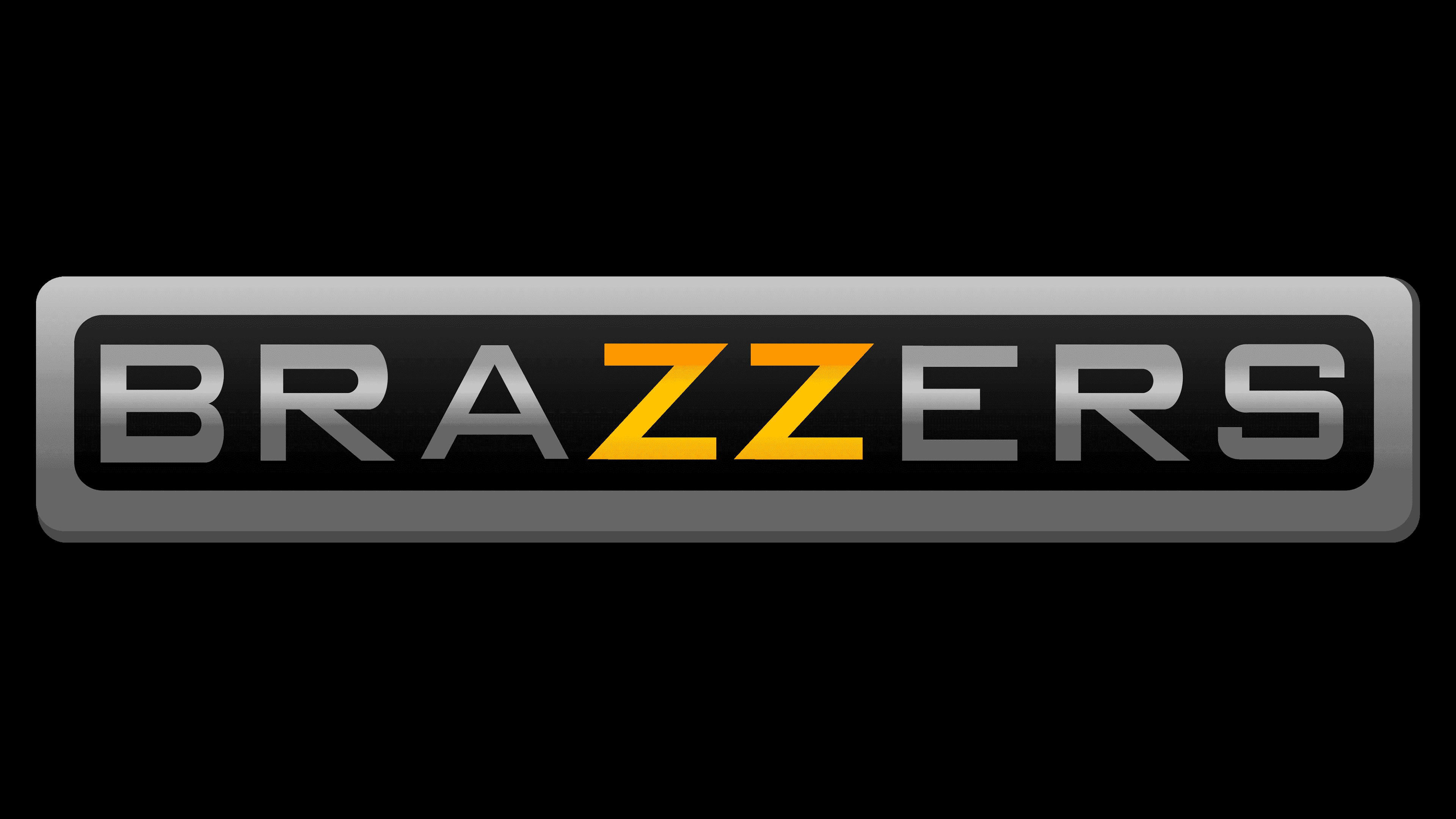
After modernization, the emblem has acquired a noble look: a black rectangle framed in silver, reminiscent of a car company’s logo. In the middle, along the entire length, a conventional line divides the inscription into two halves. This effect was achieved through a dark gradient and light highlights on the letters. The central letter “ZZ” remains yellow.
2012 – 2020
![]()
The designers removed the background but kept the gradient. The result is a sign with blurred letters in the upper part: they are white and barely visible. The bottom part, on the other hand, is crisp and clear, painted in dark gray. The two letters “Z” are gold-colored.
2020 – today
![]()
This logo is practical and businesslike. It is clear, strict, and smooth. There is no gradient. The letters are painted in two colors: black and yellow. The redesign was made to simplify the emblem so that it is easily perceived across any medium, whereas the transitions in shades prevented this.
The emblem exists in several variants. The first and main one is the one presented on the official Brazzers website. It contains only two colors: yellow for the letter “ZZ” and white for all other letters. There is no background as such, but it should be dark.
If the surrounding space is light, it is advisable to use a wordmark with a different structure. In this case, the company name is painted in gold (in the center) and gray (on the edges). The inscription is placed inside a black, rounded rectangle. A gray outline runs along the edge. All colors, including black, have a gradient.
There is also a variant with lighter shades and a double contour around the plate: first, there is a wide white stripe, then a thin gray line. The gradient is retained in this variant, although it looks slightly different.
A distinctive sign of Brazzers was, and remains, the inscription, which contains only the site’s name. The designers did not assign a specific meaning to this logo; they created a neutral design that does not indicate the content’s specifics. The company does not have a separate graphic logo.
Font and Colors

All variations of the Brazzers logo use the Bank Gothic Medium font. It is a sans-serif font with slightly asymmetrical letters. The top horizontal line “Z” seems shorter than the bottom, and the bottom curve of the “S” protrudes slightly more than the top. The middle stroke “E” is half the size of the others.
The color palette is quite diverse. The basic variant includes yellow and white colors. Other color schemes contain various shades of gray, from very light to almost black. The golden gradient contains tones from pale yellow to orange.
![]()