The emblem invites customers to look into the camera lens and select the content they are interested in. The OnlyFans logo guarantees the uniqueness of photos and videos. You can get them in full use only after payment.
OnlyFans: Brand overview
| Founded: | November 2016 |
| Founder: | Fenix International Limited |
| Headquarters: | London, United Kingdom |
| Website: | onlyfans.com |
Meaning and History
The platform for the exchange of media products has existed since 2016 and is part of the structure of Fenix International. Its creator, Timothy Stokely, wanted to bring public figures and their fans closer together so that some could earn from their talents while others could gain access to exclusive materials. Public figures, models, fitness trainers, makeup artists, culinary instructors, and YouTube bloggers often monetize their work. But OnlyFans has a dark side: the service is used to pay-per-view adult content. Therefore, the site has strict age restrictions of 18+. Despite the absence of a ban on the publication of candid photos and videos, moderators still monitor “trigger words.”
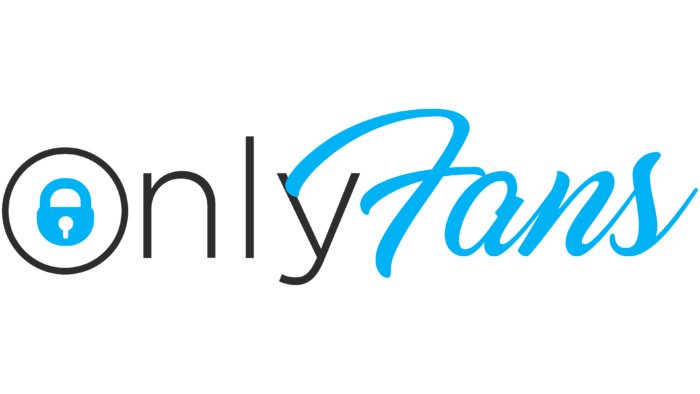
The second most popular topic is beauty and makeup—for example, lessons on applying makeup or styling hair from professional stylists. Musicians, fitness enthusiasts, and chefs have also found regular audiences. They use OnlyFans as an add-on to their social networks, a place to charge subscription fees. The authors block posted videos and photos to make them paid. This concept is reflected in the logo of the online platform: the lock-shaped icon alludes to restricted access. It is integrated into the letter “O” from the name of the service.
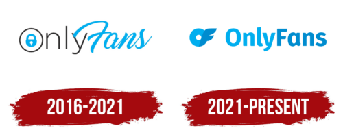
2016 – 2021
The main graphic symbol of OnlyFans is an inscription that combines several styles. Its left side (“ONLY”) looks very concise, thanks to a simple sans-serif font and black lettering. The only striking element is the blue padlock depicted inside the first letter. It consists of a semi-circular body and a semi-circular bow. The keyhole is a small white circle with a dash at the bottom.
In the case of OnlyFans, the lock symbolizes closed access to copyright content. But in the culture of different countries, it is considered a talisman that attracts wealth, luck, and happiness. So its meaning can be interpreted in two ways.
The second part of the logo (“FANS”) stands out against the background of the first, differing both in color and style. With its brilliance and careless form, it balances the minimalistic half of the inscription because the service’s main purpose is digital entertainment.
The OnlyFans wordmark combines two types of fonts. The first is a subtle grotesque with the same line width. It looks like a classic typeface with neat round glyphs. The second font is handwritten, and the design resembles calligraphy. The line goes up a little because of the careless inclination of the letters. The color scheme includes only black and light blue, while white is used as a background and can be replaced.
2021 – today
The current logo is radically different from the previous version:
- Instead of a cursive inscription, a printed one appeared.
- The lock-in ring disappeared.
- The ring turned into an almost continuous circle resembling a donut with wings.
Despite the ridiculous comparison with the wing, it is still there: according to the designers, these are the horizontal strokes of the letter “F,” which is connected to the “O.” They stylized her protruding parts, making them more graceful and flowing so that they look like wings. Instead of a miniature lock, the first characters from the name of the service are now used, combined into the preposition “OF.”
Font and Colors
The developers decided to make the text readable, for which they chose a typeface instead of an italic font. The inscription is made in rounded grotesque. The color palette has been expanded: in addition to light blue, the logo now has dark blue, which is used to color the second half of the name and the visible elements of the letter “F.”
OnlyFans color codes
| Ruddy Blue | Hex color: | #00afef |
|---|---|---|
| RGB: | 0 175 239 | |
| CMYK: | 74 15 1 0 | |
| Pantone: | PMS 299 C |
| Bleu de France | Hex color: | #008ccf |
|---|---|---|
| RGB: | 0 140 207 | |
| CMYK: | 92 37 4 0 | |
| Pantone: | PMS 2925 C |
