


![]() Pornhub Logo PNG
Pornhub Logo PNG
Behind the elements of a specialized site’s emblem lies a secret, forbidden video inaccessible to uninitiated users. The Pornhub logo reflects the company’s legal work and its commitment to maintaining its customers’ confidentiality.
Meaning and History
![]()
In 2020, this platform ranked among the top three thematic leaders, as it is available in many international languages: Japanese, English, French, Russian, Portuguese, Polish, Italian, Spanish, and German. It is currently open to the public everywhere except China, India, the Philippines, Thailand, and Pakistan.
The resource is associated with many high-profile international scandals due to inappropriate content. Guided by the majority opinion, the administration removed videos that did not meet the mandatory requirements from the site, reducing the number from 13.5 million to 4.7 million.
Despite the difficult situation and the risky topics, the web platform participates in various charity events and social projects, supports the fight against breast cancer, and supports various environmental initiatives. Moreover, she chose a neutral logo for herself, which conveys the site’s content only through its name, not through graphic images or symbols. In general, the resource has six emblems of the same type.
What is Pornhub?
This world’s largest adult entertainment platform, operated by MindGeek, integrates user-generated and professional content. The portal combines robust hosting capabilities with social networking features, offering users free access and premium membership through Pornhub Premium. The platform serves a global audience, offering multiple language versions and localized content, and is equipped with an advanced classification system and enhanced search features that simplify navigation through millions of videos across categories and genres.
2007
![]()
The debut logo was temporary. It was used until the designers offered a full-fledged version. This one consisted of a web address: name and domain zone. Was executed in gray sans-serif block letters.
2007 – 2008
![]()
In the same year, the emblem underwent its first redesign, adopting a consistent color palette of orange and black. Also, the logo’s unchanged shape, a horizontal rectangle, has appeared. The name of the web resource was set in bold, with a marbled pattern and serifs. The first half (Pornhub) was large, the second (com) was small.
2008 – 2009
![]()
The adjustments made helped achieve a radically new emblem design, which finally took root. If it subsequently changed, then it is minimal. This mark of the site’s visual identity has stayed forever. The word “Porn” was written in white sans-serif type and set against a dark background. To its right was the black inscription “hub.” She got an orange background as a miniature inner rectangle with rounded corners. At the bottom was a dashed line composed of four segments.
2009 – 2012
![]()
After the next update, the emblem looks clearer. The first half of the title, placed on a black background, has been slightly enlarged, and the second, on the orange part, has been given a gradient transition. The developers made the upper zone a little lighter than the lower one, which added expressiveness and volume to the inscriptions.
2012 – 2014
![]()
The word “hub” now looks softer, without sharp accents and gradient transitions. The designers added muted shades of black and orange to the composition, enlarged the rectangle on the right, and made the bottom dashed line massive.
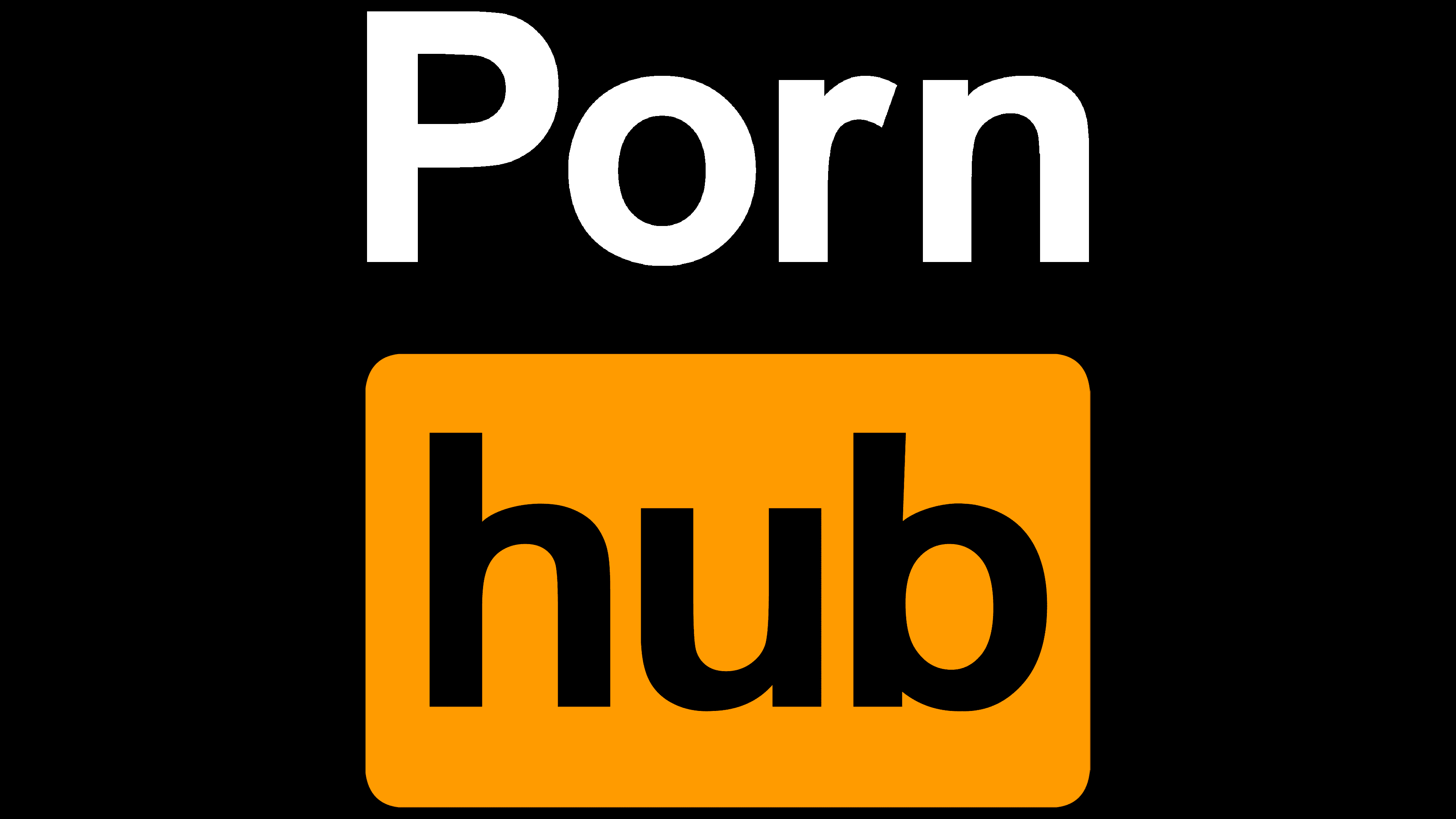
2014 – today
![]()
The modern version of the emblem features a white background, the black word “Porn,” and an orange rectangle labeled “hub.” The designers left the writing style unchanged but made it cleaner, smoother, and more distinct. Therefore, it is now noticeable that both parts of the name are executed in the same font. The authors have removed underlining and do not use it in any current version. Still, several of them have a vertical arrangement of elements in a black square and a horizontal inscription in a long rectangle.
Font and Colors
This service has a stable logo. It always contained the site’s full name, divided into two parts. The first half is on a white background, the second on an orange one. The exception is the early versions, where the inscription was in a black oblong rectangle. Most of all, the very first option, which was used temporarily, is different. It was an enlarged domain address.
The Pornhub logo uses a sleek sans-serif typeface that closely resembles two fonts: the commercial Deansgate Bold and the free Roadgeek 2005 Series 6B Regular. The difference concerns the upper level of the letter “r”: the original has it, but the intended typefaces do not. The logo’s signature colors have always been black (dark and soft powdered), orange (two shades), and white.