


 SEMO Redhawks Logo PNG
The SEMO Redhawks logo represents Southeast Missouri State University’s athletic strength and competitive spirit. The hawk embodies the athletes’ speed, power, and determination, underscoring the team’s pursuit of excellence and victories in collegiate sports.
The State Normal School in Cape Girardeau, Missouri, was established in 1873, marking the beginning of Southeast Missouri State University (SEMO) and its athletic history. The university’s early athletic programs began forming in the 1900s, with teams initially competing as the “Indians.”
The university founded its first official football team in the 1920s. It competed primarily in regional games against other Missouri universities and nearby states. The university built Houck Stadium, its first athletic stadium, in 1924, and it became the team’s home.
Basketball took shape in the 1930s, with the team regularly competing in intercollegiate tournaments and earning early wins that laid the foundation for the institution’s athletic traditions.
The 1940s and 1950s saw further growth in university athletics. The university joined the Missouri Intercollegiate Athletic Association (MIAA), which gave it a more structured competitive framework. The football team captured several conference titles during the 1950s, solidifying the school’s presence in college athletics.
In the 1960s, the athletic department expanded, adding sports like baseball and track and field. The 1964 opening of Houck Field House provided a modern facility for training and competition.
In response to Title IX requirements, the university introduced women’s sports programs in the 1970s, establishing basketball, volleyball, and other teams. The women’s basketball team quickly became a strong conference contender.
The 1980s saw successes across multiple sports. The men’s and women’s basketball teams frequently qualified for postseason tournaments, while the football team won additional MIAA titles.
A pivotal moment came in 1991 when the university transitioned from NCAA Division II to Division I by joining the Ohio Valley Conference (OVC), ushering in a new era for its athletic program.
In 2004, SEMO rebranded its teams and mascot. In 2005, the university officially changed the team name to the “Redhawks” to reflect a more contemporary identity.
Significant achievements marked the 2010s. The football team qualified for the NCAA Division I FCS playoffs in 2010, a first in school history, while the women’s volleyball team excelled in the OVC and won multiple titles. In 2015, renovations to Houck Stadium enhanced the experience for athletes and fans alike. The men’s basketball team also had one of its best Division I seasons that year.
In 2019, the football team captured its first OVC Division I championship, a milestone that led to another FCS playoff appearance.
From 2020 to 2022, SEMO continued advancing its athletic programs. The renovation of Houck Stadium, which began in 2021, included building new facilities for student-athletes. In 2022, the women’s volleyball team continued its conference success.
By 2023, the athletic program was recognized as a leading force within the Ohio Valley Conference. Starting as a small teacher training institution, the university has grown over its 150-year history into a distinguished NCAA Division I school known for producing skilled athletes.
The athletic program has grown by building a robust support system for student-athletes and continually improving sports facilities. The university remains dedicated to supporting athletic and academic achievement, investing in programs that balance academic excellence and athletic success.
Meaning and History
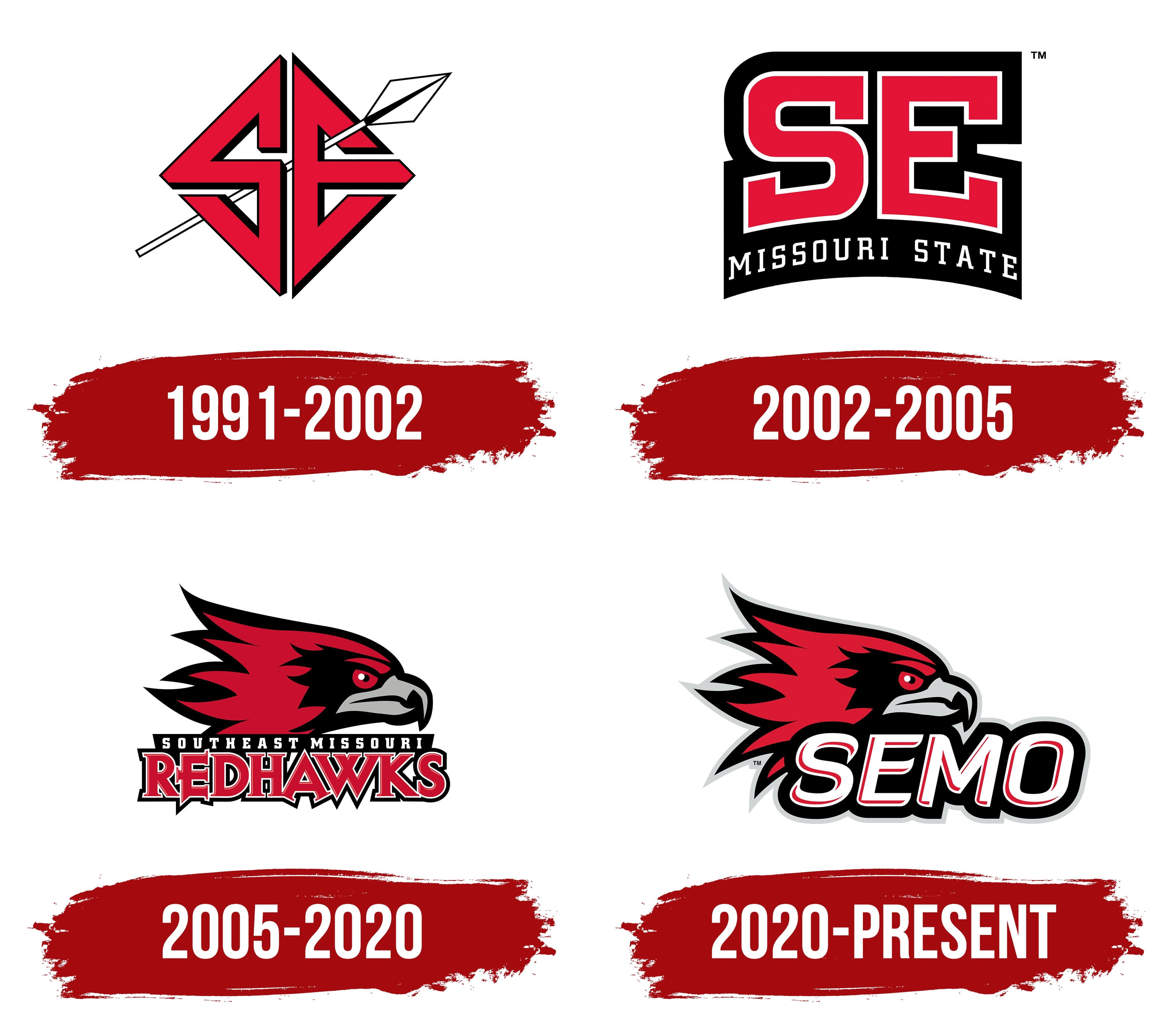
What is SEMO Redhawks?
These athletic teams proudly represent Southeast Missouri State University in the Ohio Valley Conference at the NCAA Division I level. They are best known for their basketball and football teams, which draw a loyal fan base from Southeast Missouri. Across volleyball, track and field, and other sports, their mascot, Rowdy the Redhawk, symbolizes this coastal university’s resilience and sportsmanship.
1991 – 2002

Southeast Missouri State University’s 1991 symbol featured a monogram of two interwoven letters, S and E, shaped like a diamond. The university created the logo for its athletic teams to reflect their unity and fighting spirit.
The letters were red, a color traditionally used in the university’s athletic branding. It adds brightness and emotional intensity to the entire image. To enhance the visual effect and give the letters volume, I added a black shadow to create a sense of significance and strength.
A stylized spear runs diagonally through the letters, pointing upward and to the right. It emphasizes the university’s teams’ activity and competitive attitude. The white spear is outlined in black, standing out clearly against the red background.
The diamond-shaped composition appears balanced and powerful, expressing the university’s team spirit and athletic energy.
2002 – 2005
The Southeast Missouri State University logo, updated in 2002, featured the SE monogram in large red letters, set in a clean sans-serif font. The design creates a solid, straightforward image that conveys strength through simple form. The diamond-shaped lettering was removed.
Each letter is outlined in white, making the monogram stand out against the solid black background. The white color adds expressiveness and depth. Below the main letters, the inscription MISSOURI STATE appears in thin, elongated white characters forming a smooth arc that completes the composition and adds visual balance. The black background follows the design’s outer contours and enhances the bright red image.
2005 – 2020
In 2005, Southeast Missouri State University’s athletic symbolism changed again with a new image: a red hawk’s head. This change followed the university’s 2004 decision to discontinue the old team name, the Indians. That fall, the university officially announced the new team name, Redhawks, and in January introduced fans to the new mascot, Rowdy the Redhawk.
Phoenix Design Works developed the updated emblem, following NCAA recommendations to move away from imagery tied to Native American themes. As a result, the university gained a bright, modern athletic identity that marked the start of a new chapter.
The logo’s main symbol is the hawk’s head, with an aggressive, stern gaze directed to the right. The feathers on the back of the head point backward, extending like fiery streaks. The expressive eyes and powerful gray beak emphasize the bird’s predatory nature. Various shades of red, along with black and gray shadows and outlines, create depth.
Below the bird’s head is a small black rectangular panel with the white inscription Southeast Missouri. Beneath it appears the large word Redhawks, written in red type with sharp serifs and a striking white-and-black outline that gives the letters visual strength and volume.
2020 – today
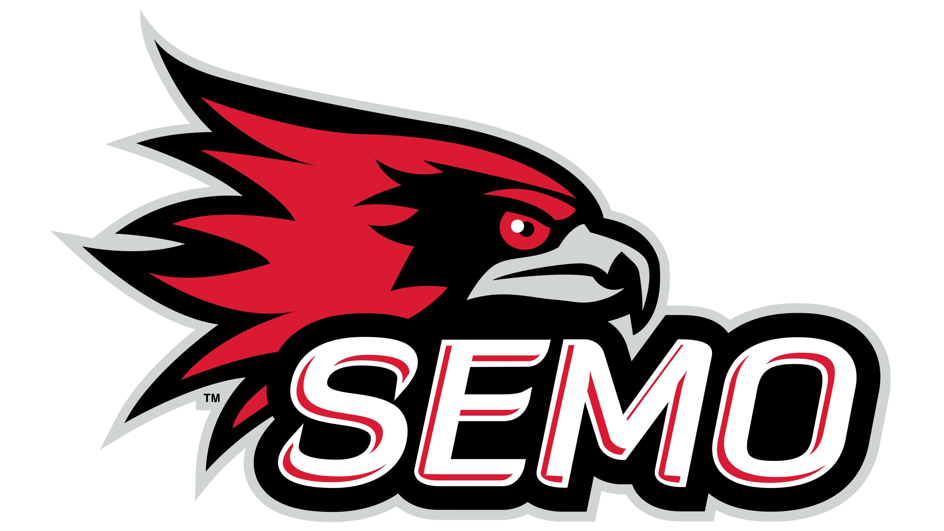
Following an extensive 2018 study by the agency Ologie, SEMO Redhawks University introduced an updated logo on July 1, 2020. Researchers found that the abbreviation SEMO is perceived as more emotional and vivid than the full name, Southeast Missouri, especially among students and fans of university sports. As a result, the university created a new version of the emblem that emphasizes the SEMO abbreviation to strengthen its connection to its athletic teams.
The composition’s main element remains the hawk’s head, shown in profile in the university’s standard colors: red, black, and gray. The mascot features more defined contours, clearly drawn feathers, and an aggressive expression. The eyes and sharp, gray beak highlight the bird’s predatory nature, creating a vivid image for the team.
Below the hawk, the name SEMO appears in massive white letters slanted forward and accented with an inner red shadow. The shadow creates a sense of volume. The text sits on a black background with a thin gray border, adding depth and contrast.
A custom font was designed specifically for the new logo; it has no official name and is presented as an exclusive element of the SEMO style.
The color palette of energetic red, black, and gray reflects the athletic spirit, maintains continuity with the previous logo, and shows the evolution of the university’s visual identity.